|
|
|
|
|
|
|
|
|
 Posted: Wed Oct 03, 2007 4:51 pm Posted: Wed Oct 03, 2007 4:51 pm
I hope you weren't expecting gore.
Edit: ok, so I really suck with bg, I've never really added them into my art. So I'm looking for help on improving this style here, and also tips on backgrounds/background content I guess?

I know they look vectory but they're not, and idk any good free vector programs, plus I'm cool with doing it in Photoshop anyways.
|
 |
|
|
|
|
|
|
|
|
|
|
|
|
|
Posted: Fri Oct 05, 2007 10:58 am
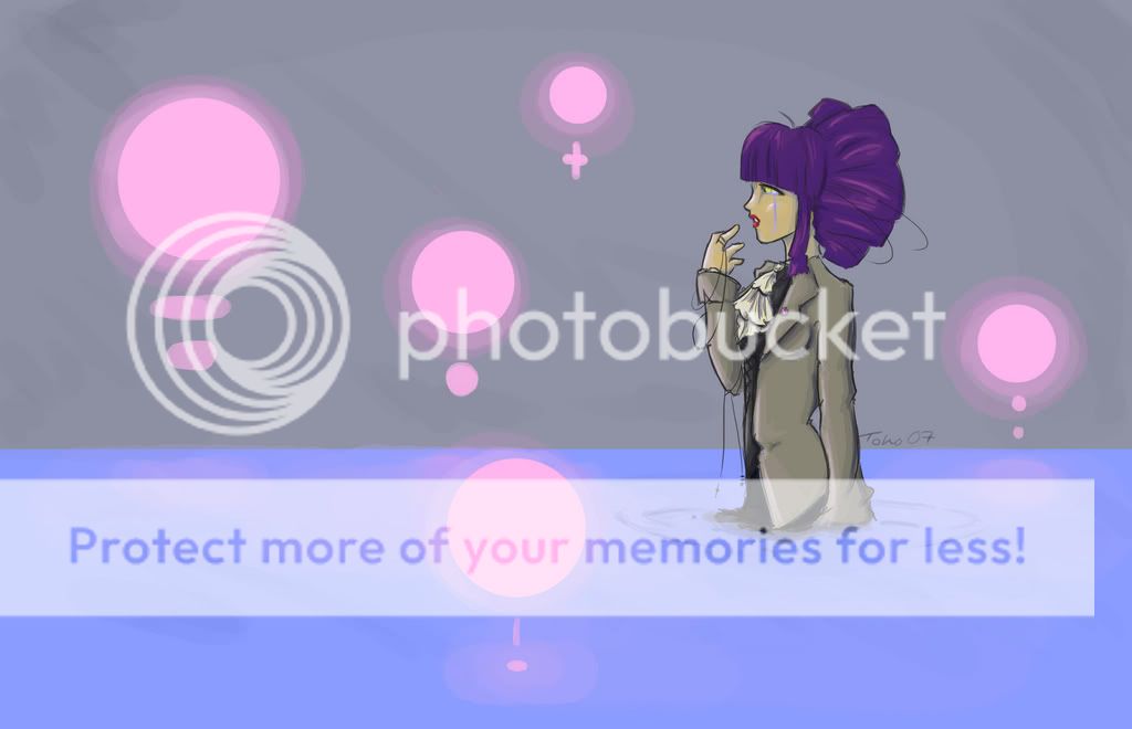
try making the background in the first image more atmospheric by darking the sky/water and playing up the reflected light
There's almost not surface quality to the water, it should be more rippled and more reflective of the lights and objects near it.
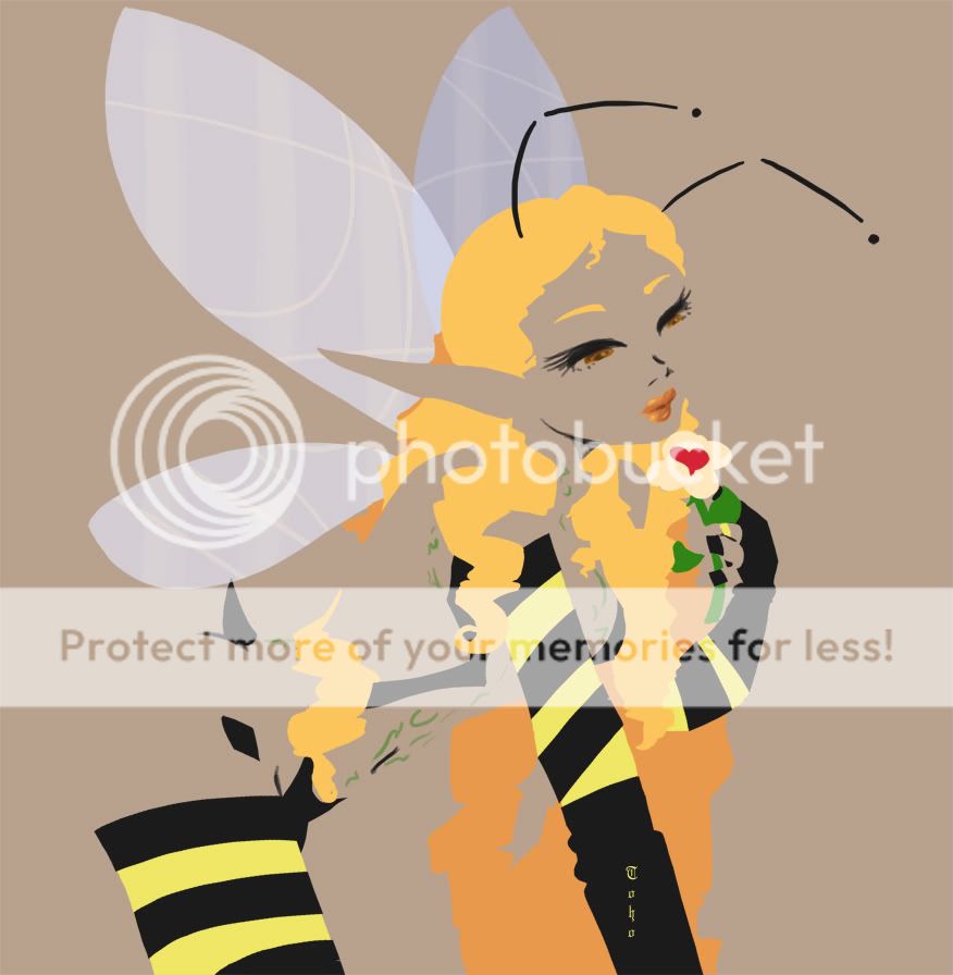
I like that last two images better than the third. The forms of the figures are better implied with negative space. In the bee girl one, it's too hard to tell where everything is, it looks mostly like a bunch of disjointed colored shapes
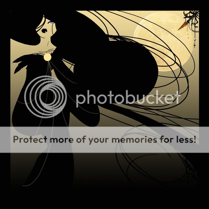
The first of the moon-lady pictures is the best IMO. the composition is a lot better with the way her body and hair engage the space around it. Unfortunately, that thing in the corner reminds me of a carrot.
The third looks a little static and doesn't fill up the frame in a very engaging way by comparison.
|
|
|
|
|
|
|
|
|
|
|
|
|
|
|
|
Dr. Valentine Vice Captain
|
Posted: Sun Oct 28, 2007 11:57 pm
I thought I posted about this already - crap. Well I did form an opinion, and here it is:
I love the vectory looking ones. Stylish without over-stylizing, if you know what I mean - You did a lot of abstract stuff there without losing the natural attractiveness of the subject by overdoing it. It's nice to see something smooth and slick like that that doesn't look too-weird-to-exist or too-generic-to-be-interesting, which, IMO, are very common failings.
As for the first one, I am not entirely sure what is meant to be going on there - I suppose I'd have to suggest that you add more context to the background. On a purely stylistic note, the pinks and blues there sap some of the presence from the character, and it seems to make the focus unclear. I think that the pink deals need to be more detailed and interesting or made to stand out less intensely, because at the moment they are stealing focus a bit and then not really being interesting enough to seem to warrant attention.
|
|
|
|
|
|
|
|
|
|
|
|
|
|
|
Posted: Thu Nov 01, 2007 5:58 pm
the last ones remind me of crazy spork am i's work a lot.
|
|
|
|
|
|
|
|
|
|
|
|
|
|
|
|
|
|
|