|
|
|
|
|
|
|
 Posted: Fri Sep 28, 2007 9:54 pm Posted: Fri Sep 28, 2007 9:54 pm
Help please? I'm trying to translate this photo into a portrait. So I'm sketching it out on canvas board before I do any paintwork. I want it to be recognisable. And I find that fresh eyes are often the best critics. SO CRITIQUE AWAY! 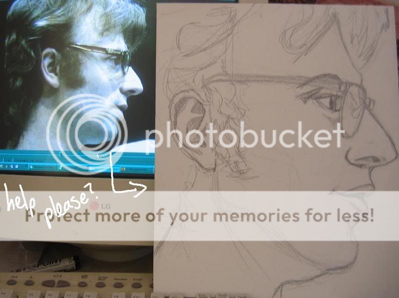
|
 |
|
|
|
|
|
|
|
|
|
|
|
|
|
Posted: Fri Sep 28, 2007 10:02 pm
That guy has a weaker chin and a more pronounced nose than you've given him.
|
|
|
|
|
|
Dr. Valentine Vice Captain
|
|
|
|
|
|
|
|
|
|
|
|
Posted: Fri Sep 28, 2007 11:32 pm
  current status. i pushed the chin back a little. do you mean 'weak' by the distance it extends from the jaw or the tautness of the throat? and i gotta put in the angle where his nose bends
|
|
|
|
|
|
|
|
|
|
|
|
|
|
|
Posted: Sat Sep 29, 2007 1:09 am
receded the chin and did a little bit to the nose 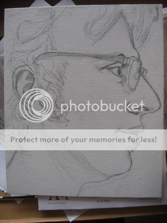
|
|
|
|
|
|
|
|
|
|
|
|
|
|
|
|
|
|
Posted: Sat Sep 29, 2007 1:57 pm
looks like you're getting closer.
Personally, if i had been attempting to draw this portrait directly from a photo reference, i probably would have used a grid, just to see the subtleties of the facial features more easily.
It's really not too late to do that here. Just throw a light grid over the photo and the canvas and you can easily tell if there's an eye too low/too large or if the mouth is located where it's supposed to be.
|
|
|
|
|
|
|
|
|
|
|
|
|
|
|
Posted: Sun Sep 30, 2007 1:12 am
well, i overlaid the photos onto the reference photo, and it looks like it's proportioned all good now. i moved the ear up to compensate; the glasses arm just wasn't making sense the way it was. it is now in the first stages of oil painting 
|
|
|
|
|
|
|
|
|
|
|
|
|
|
|
|
|
|
Posted: Wed Oct 03, 2007 2:02 pm
I like to say thanks to the crit round here, it really does help. It's nearly finished now, just put in the glasses and darkened the eyes. From now on it's all fiddly bits. 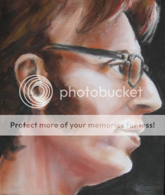
|
|
|
|
|
|
|
|
|
|
|
|
|
|
|
Posted: Wed Oct 03, 2007 11:15 pm
I think the forehead is a bit too over slanted, like it needs that indent and go up more from the middle. If that makes any sense. sweatdrop
|
|
|
|
|
|
|
|
|
|
|
|
|
|
|
|
|
|
Posted: Thu Oct 04, 2007 2:48 am
The side burn is coming down too low as well. Its progressing well and aside from a few aspects which aren't exactly like the photo, it *does* look like him 3nodding
|
|
|
|
|
|
|
|
|
|
|
|
|
|
|
Posted: Thu Oct 04, 2007 4:42 am
Siin Adonai I think the forehead is a bit too over slanted, like it needs that indent and go up more from the middle. If that makes any sense. sweatdrop I'll have to look into that bit. I know that the painting is slanted slightly differently to the photo, but i'll be sure to overlay it and see what it looks like. i get what you mean. i'll have to patch it up with white paint and fleshy bits if it is so. slopii The side burn is coming down too low as well. Its progressing well and aside from a few aspects which aren't exactly like the photo, it *does* look like him 3nodding i forgot to mention, the photo is from abut six years ago, and he has huge sideburn mutton chops now. the painting is a happy medium between his actual sideburns and the six-years-ago sideburns. i spent too long on that jawline to cover it up with sideburns!
|
|
|
|
|
|
|
|
|
|
|
|
|
|
|
|
|
|
Posted: Fri Oct 05, 2007 10:53 am
looks good, but it also looks like you need more paint on the canvas, since the surface texture is showing through in a lot of areas. don't use the white of the canvas to lighten areas or make highlights. I think the painting will look better if it's covered entirely in paint. Also, shadows and highlights on a colored surface aren't made from black and white, so try mixing your own light colors.
Also, there are a lot of warm hues in there, lots of red and orange and umber. Would be cool if you could work some cooler tones into it.
|
|
|
|
|
|
|
|
|
|
|
|
|
|
|
Posted: Fri Oct 05, 2007 1:51 pm
 I'm pronouncing this 'un finished, and I'll be sure to use more paint on projects with more than one week deadline. Is there any way of painting layer upon layer in oils without the paints slipping everywhere, because I find it nigh impossible to manage thickness or proper layering without waiting for it to mostly dry. The portrait has now gone to see its subject, and has been signed all nicely. Wonderful funtimes smile
|
|
|
|
|
|
|
|
|
|
|
|
|
|
|
|
|
|
Posted: Sun Oct 07, 2007 9:56 am
Well done, it's so nice to see the progression through the painting. pirate
I had the same problem as you on the last acrylic portrait I did, which was sticking true to the lines and flow of the picture while trying to get enough damn paint on there to cover the white canvas.
My thoughts were that next time, I might try to cover the canvas in a light undercoat, as it were, just to get rid of the white and sketch my lines on top of that. Not sure if it will work though.
I totally love that starry, spotty background you've got going there btw.
I hope see more paintings from you soon! mrgreen
|
|
|
|
|
|
|
|
|
|
|
|
|
|
|
Posted: Mon Oct 08, 2007 3:52 am
that is a good idea... would also make a smoother surface texture than the bare canvas. I shall remember that for next time, maybe a bright turquoise to brighten up the skintones (still very new to using cool colours in skintones).
I find it much easier to build up layers in acrylic. The paint sets very quickly, and I can paint at that pace, just piling more and more paint on. But when I try with oils, they just smudge, and you can't get that contrast unless you're really careful, or unless you reduce the paint to a dehydrated paste.
And there'll be more, there always is. xd
|
|
|
|
|
|
|
|
|
|
|
|
|
|
|