So I took it upon myself to make some mock-ups that re-position the tools to create a nicer -- and more consistent, in terms of the closet/"avatar" feature on Gaia -- user interface.
http://i.imgur.com/5ZuejYV.jpg
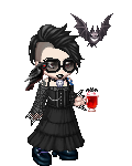
For this one, I've moved the avatar display to the side to better match the direction the human eye scans and it stays consistent with avatar displays throughout the rest of the site.
I've moved the "Equipped List" down to the bottom, so the item icons in the Equipped List and the searched items are separated just enough to tell the two categories apart and it is easier to compare the items in the two lists -- which will no doubt be done often in the avi making process -- than the original version.
I added some text, "Base Selection" next to "Save Image," that implies that the Base Selection is hidden from plain view. As the Base Selection is likely to see the least use, I've decided it's best to make the tool togglable.
The Base Selection tool might best appear, when toggled/clicked, at either the bottom of the screen (though that might make the appearance too subtle for the user to notice that clicking "Base Selection" has done anything) or at the side, which I (quickly) made an example of:
http://i.imgur.com/uzjqr72.jpg
I worked on tweaking the UI because I honestly thought that it wasn't all that user-friendly. Hopefully this sparks some creative ideas for the final product and I'm excited to test it out.


 250
250
 150
150
 200
200