My first impression is that the story is okay, and I actually read it through because of the story.
I'm going to go through the issues I have so far in a list, listed in no particular order:
- You have some inconsistencies, like on
page three. The chest has a round top at first however when he closes it, the top becomes a flat plane. Give closer attention to the details!
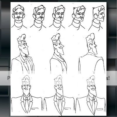
- Eyes are not aligned with
this character (the uncle). Unless he has lazy eye (and/or it is explained in the comic) there's really no need for making his eyes like this.
- Not enough establishing shots or wide-angled shots. For example when the girl exits the house on
page nine, the transition is strange because she's simply outside, however you don't get a good idea of where she is, if she's just walked outside, if she's a mile from her house, if her house is actually farther away from the main village and walking to the village, or if she's simply taking a stroll through either the village of surroundings.
Also on the same page, panel 5 is too obscure; I cannot tell what's going on in that panel at all. I suggest redrawing that particular panel.
- Still on page 9: The panels on the bottom feel too crammed, as we went from snowy scenery (which did not have much of an establishing shot in the first place) straight to a guy's face and in the next panel the man is sitting in a room. Where is the room located? What is the relation between the girl and the green-haired man? Also the page doesn't feel very exciting, as all the panel shapes are the same, except for the bottom two which have softer edges than the rest. What was the importance of this? Should the reader pay attention to this more? Are the blurry edges to imply that it is memory or something that happened in the past? Pay attention to your paneling. Smudging it from time to time (like the transition from dream to reality at the very beginning of the comic) is fine, but don't use it too often unless it truly fits with the comic.
- Page 9 yet again. The last two panels should probably actually be removed and placed on the next page, or at least altered. It's too crowded on the bottom there and the last panel would do better as a bigger, wider panel that shows the environment of the room (setting).
In addition to that I feel the scene with the two brothers talking about commissions should probably be removed altogether until later in the comic, for it ruins the pacing of the comic.
Summary: Slow down. Your story is fine and I actually read it until the end. However remember that you don't have to jam pack every bit of information in certain parts of the story. (A common thing for new comic artists is to rush everything to the point or action of the story, however do not think about things such as establishing shots, pacing, paneling, character development/actions.) Think about the flow. If a character is walking, and if you want to indicate time that time is passing as they walk, then slow the pacing of the comic a little to give that feel.