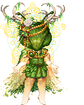
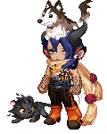
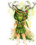
Definitely improving on the art front - it's nice to see stuff besides talking heads. Your characters are getting easier to tell apart, which is good, although Quinn and the blue-eyed kid are pretty similar when standing together.
Did Quinn have an eyepatch for a reason in the early pages?
Actually, keeping track of who is who in terms of names was challenging on the first run-through. Took me a few tries to work out that 'Ruley' is a last name.
One thing that bugged me was the speech bubbles- when there's more than two characters, it's hard to tell which floating bubble belongs to who. Making the tails more obvious, or giving each person a different font, color or speech bubble design would help differentiate them.
Speaking as a text geek, the spacing is a little wonky, like so:

It's good that you're using smaller text for the asides, but often you need more space between the lines ("useless" and "we aren't" ) to improve readability, flow and pacing. It's not shown here, but whenever you see T's and g's overlapping, there's a problem. The background speech bubble's spacing is good.
There's other little margin stuff, like in these panels:

You could use a little more space between the text and the edge of the panel. This goes for some of the speech bubbles (such as "going" hitting the edge in the first image), though it's less common there. This doesn't apply to the crazy red text, as making that all wonky is clearly an intentional (and effective) choice.
If you're concerned about paneling, I would look at comics like
Hanna Is Not A Boy's Name, the Coyote sections of
Gunnerkrigg Court, and action sequences in
Our Intrepid Crew for some inventive paneling inspiration.
I really like the trippy Lyle-monster from the early pages, especially page 15, and the little things like the text on the side of the medicine bottle. Overall, good show!