|
|
|
|
|
|
|
|
|
 Posted: Sat May 06, 2006 6:16 am Posted: Sat May 06, 2006 6:16 am
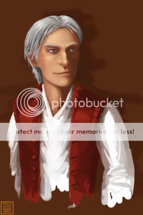
Getting back into the groove of digital painting after a long time away. To start with, I found a skintone tutorial that I decided to play around with, and here's the (currently unfinished) result:  I'm probably going to try and finish this up properly, but in the meantime would very much appreciate any crits, comments or feedback on how I'm doing so far. 4laugh
|
 |
 |
|
|
|
|
|
|
|
|
|
|
|
|
 Posted: Sat May 06, 2006 6:35 am Posted: Sat May 06, 2006 6:35 am
Oh wow.
I think that's really good.
I'm not like an expert or anythig & I've never rly done stuff on the computer before but I really like it.
Something about the forehead annoys me but I'm not sure what it is.
|
 |
 |
|
|
|
|
|
|
|
|
|
|
|
|
|
|
|
 Posted: Sat May 06, 2006 8:11 am Posted: Sat May 06, 2006 8:11 am
Nice. I like this way of digital painting which is very flowing and, well, paint-like. I keep meaning to try it but I'm stuck in my ways right now.
I like the waist coat alot, I'd like it to have some of those gold buttons, you know the ones that look like they are tied in a knot?
I think his head is also a little flat, even though his stylised face works well, the shape of his head and his hair on it don't quite work for me.
Although his hair does look very shiny and fluffy, I kinda want to stroke it.
|
 |
 |
|
|
|
|
|
|
|
|
|
|
|
|
 Posted: Sat May 06, 2006 8:48 am Posted: Sat May 06, 2006 8:48 am
ficklefiend Nice. I like this way of digital painting which is very flowing and, well, paint-like. I keep meaning to try it but I'm stuck in my ways right now. I like the waist coat alot, I'd like it to have some of those gold buttons, you know the ones that look like they are tied in a knot? I think his head is also a little flat, even though his stylised face works well, the shape of his head and his hair on it don't quite work for me. Although his hair does look very shiny and fluffy, I kinda want to stroke it. Glad you like the hair, it's usually one of the things I have the most trouble with. whee As far as the face goes, I'll have a go at deepening the shadows and see if that helps. domokun
|
 |
 |
|
|
|
|
|
|
|
|
|
|
|
|
|
|
|
 Posted: Sat May 06, 2006 12:25 pm Posted: Sat May 06, 2006 12:25 pm
Spanny Something about the forehead annoys me but I'm not sure what it is. Maybe that there's not enough of it? His forehead looks really short since his eyes are pretty high up on his head, though I think giving him more hair or rounding the top of his head off would fix it. I do like the colors, though. Especially on his face & the red jacket.
|
 |
 |
|
|
|
|
|
|
|
|
|
|
|
|
 Posted: Sat May 06, 2006 2:25 pm Posted: Sat May 06, 2006 2:25 pm
I like it. Although the texture of his flesh, and the texure of his cloths are very similar. It's kinda odd looking :b
|
 |
 |
|
|
|
|
|
|
|
|
|
|
|
|
|
|
|
 Posted: Sat May 06, 2006 2:28 pm Posted: Sat May 06, 2006 2:28 pm
SilverTiger Spanny Something about the forehead annoys me but I'm not sure what it is. Maybe that there's not enough of it? His forehead looks really short since his eyes are pretty high up on his head, though I think giving him more hair or rounding the top of his head off would fix it. I do like the colors, though. Especially on his face & the red jacket. OK, tweaked it a bit (mostly by shifting the top half of his face down a smidge xd ), and deepened that shadows - try refreshing if it doesn't show any change. Any better? whee
|
 |
 |
|
|
|
|
|
|
|
|
|
|
|
|
 Posted: Sat May 06, 2006 2:29 pm Posted: Sat May 06, 2006 2:29 pm
I was wondering if you were going to come back. 3nodding
As for the picture, I have the same first impression as the ladies seem to; there is something amiss about the forehead. I think that if you gave his hair a bit more volume on the top there, his head may look a little less flat.
One thing that bugs me a tiny bit is that his bottom button looks closer to the next than the rest do.
Overall impression is very good though. As far as style goes, I'd go for less saturation in general; very high saturation makes the pic look cartoonier than necessary. This may be your intent but I'd personally think it'd be cooler de-saturated some.
|
 |
 |
|
|
|

Dr. Valentine Vice Captain
|
|
|
|
|
|
|
|
|
|
|
|
 Posted: Sat May 06, 2006 5:26 pm Posted: Sat May 06, 2006 5:26 pm
Zahir SilverTiger Spanny Something about the forehead annoys me but I'm not sure what it is. Maybe that there's not enough of it? His forehead looks really short since his eyes are pretty high up on his head, though I think giving him more hair or rounding the top of his head off would fix it. I do like the colors, though. Especially on his face & the red jacket. OK, tweaked it a bit (mostly by shifting the top half of his face down a smidge xd ), and deepened that shadows - try refreshing if it doesn't show any change. Any better? whee Yeah! It definitely looks better now.
|
 |
 |
|
|
|
|
|
|
|
|
 |
|
|
|
|
|
|

