

▀▄▀▄▀▄▀▄▀▄▀▄▀▄▀▄▀▄▀▄▀▄▀▄▀▄▀▄▀▄▀▄▀▄▀▄▀▄▀▄▀▄▀▄▀▄▀▄▀▄▀▄▀▄▀▄▀▄▀▄▀▄▀▄▀▄▀
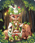
Shaman Tao
♣5/5♣
I love everything about this. The combination of red and green is beautiful, and even though Serene Green has been used twice, I don't mind because the intricacy and originality of the outfit design is not carried by the use of two of the same item. I love the design of the face as well, the texture and color is captivating and very strange in a good way. I also adore the background combos, very creative use of mid and foreground items to create depth and an interesting overall scene.
The Bottom Line: Amazing character design and color, very intricate and polished with a touch of whimsy.
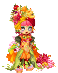
Rio Carnival
♣3.5/5♣
I really enjoy the fun colors and light-hearted nature of this avatar; the use of multiple dresses/skirts gives this a fluffy and layered look that is consistent with the theme, and the bright orange with pink and green catches the eye. My only complaint is that the layering feels a bit messy and choppy, the bodice is very cluttered which makes it difficult to read, and the way the dresses are layering doesn't look entirely believable (mostly it's the gogh reed dress causing this issue.)
The Bottom Line: A bit messy, but overall it sizzles with fun rio flavor.

Spirit Animal ~ The Jackalope
♣4/5♣
The best thing about this is the simplicity of the design. The color choices are striking and the limited use of items brings attention to the excellent combos that have been used. The combination of ears is delightful and amusing, and the spots of blue mixed with the spots of red add detail to the simple blocks of color that make up the rest of the character. The only thing I'd recommend changing would be the face, which feels a bit blank and lifeless in contrast to the whimsical and creative look to the rest of this.
The Bottom Line: Great use of simple design and interesting color combos to make this character stand out.

Learoux, the Blue Crimson
♣4/5♣
Though this is a fairly typical character concept, the bright colors and creative design make it stand out and feel original. I love the use of red and blue here, mixed with soft shades of gold and creamy brown. The simple background is perfect for this character, and doesn't compete with the bold choices for the outfit. Instead, it helps to draw attention to the cartoony colors and brings all the focus to the character. The only thing I'm not to fond of is the way the bodice has been designed; the skirt's belt is a bit chunky and flattens her out, while the top feels shallow and flat beneath the equally chunky shoulder armor.
The Bottom Line: Love the colors and overall design, a bright and fun take on the knight/adventurer character theme.

The Empress
♣3.5/5♣
The first thing that really stands out to me about this one is the background. The character/outfit is being carried by the awesome background in my opinion, because the actual design of the character is pretty typical for this type of avatar. The dress isn't really anything special (seen it many times before) and the face is also a bit uninspired, but the background makes her pop, and gives this a lot more "oomph" than it would have standing alone as an avatar. I like the creative use of the new ukiyo-e item though it starts to feel a bit cluttered with all the hair accessories and smoke. That said, the black and white looks lovely contrasting against the red/brown/gold hues.
The Bottom Line: Not particularly original, but the background and contrasting color combos make this pleasing to look at overall.

Guardian of the Treasure
♣4/5♣
Haven't had a good gimmick avatar in a while! I really like the way the avatar body has been hidden in this one, and the items used have been arranged in such a way that they are very believable as a pile of treasure. The only thing I could say about this is that it could use more. It feels somewhat sparse and while I like the simple and clear composition, I think a background and perhaps a little bit more treasure would be a nice addition.
The Bottom Line: Creative and appealing, great concept with a nice and tidy composition.

The Mythical Unicorn
♣3.5/5♣
While I enjoy the balance of ruffles and texture on this one, the all-white design leaves me feeling bored. The swirling blue element is neat, and the dress design is lovely, combining multiple skirts to get a layered look is always great for characters like these, but adding a little bit of pastel color would help to give it some staying power. I feel a sleeve element would help here too, just because her arms feel a bit bare, and the pearl bracelet looks kind of clunky.
The Bottom Line: Clean design and well-tailored, but it doesn't really hold me captive for very long.

Lotus Flower
♣4/5♣
Another of my faves for this week; the background design is so so so perfect for the character, I adore the dull red with the jewel tones. The face is gorgeous and captivating, and the outfit is something different that I haven't seen much of before. I like how the sashes and the head scarf thing all are moving in the same direction, which pulls everything together from top to bottom. The only complaint I have here is that it's a little difficult to read the torso (especially the bust/shoulder area) because of the cluttered textures, but it's a minor nit-pick.
The Bottom Line: Beautiful character with great color choices and a creative overall design.

Geisha
♣3/5♣
The colors on this one are striking, and the simplicity is somewhat pleasing but it's a little too simple to do much for me. I love the use of background elements to stage this character without overwhelming her, but I wish there had been more work put into the outfit design, because the simplicity is verging on boring and plain.
The Bottom Line:Aesthetically pleasing but a little too simple to have any staying-power.

Domina de Apocalypsi
♣5/5♣
Can you say texture-gasm? I love the attitude and mood of this, and the use of choppy textures with tiny black details to give this a graceful but rugged look. The use of gold/skin accents is subtle but brings this up from just monochrome to something more interesting. It's clear there's been a lot of attention paid to detail, every part of this fits and works together to give a really clear idea of who this character is.
The Bottom Line: Love the textures and the overall mood, very dramatic and captivating.
