Welcome to Gaia! ::


A muse decided to have some fun with me today.

User Image

Yuki is from ancient Japan. Back in those days people slept in a kosode, a kimono like garment that covered your whole body. Yuki doesn't know that what she is wearing is sexy lingerie, she just knows it to be modern nightwear.

Shh, don't tell her, you might ruin the fun for everyone else.

I have been wondering what quirk I could make my OC have to make her more fun to RP as. Then it hit me, she could try modernizing herself, and not really know how to go about doing it. I tried drawing the left arm at a bit of an angle, but it makes the arm look off with the way I did it. All in all I am rather happy with the outcome of this image.
awesome drawing smile

Witty Genius

Nice illustration. there are three things that I notice that are off, though:

1. Her nose is too close to her mouth
2. Unless she's wearing support (which I doubt she is) breasts don't naturally create cleavage, even if she has implants. there will always be separation between the breasts. Also, the placement of her breasts are a bit high
3. Her head is ever so slightly small for her body.

There's something else I can't quite identify that looks off, but other than that (from what I can tell), it's great.

Edit: her wrists appear to be too thick, and it looks like she has no pelvis because you didn't consider the understructure of your drawing. you should be seeing her hip bone on her right side. and that, in turn, makes her rib cage look weird. Also, having dark line weight on both sides of her hips make her look flat. you should consider light source when attacking line weight. you should also focus line weight with body parts that are closest to the viewers' eye, ie her hand. her hands and forearms should have thicker lines to indicate that they are in front, and also to show separation from the rest of her arm. it looks very merged right now.

there might be some alignment issues. if I get a chance (and if someone doesn't beat me to it) I'll red line and bring up anything else I find. I keep editing this (despite my only use of one edit note)
*nosebleeds*

emotion_dowant

7,550 Points
  • First step to fame 200
  • Flatterer 200
  • Autobiographer 200
Her hands need some work...
What is she holding?
eek

Witty Genius

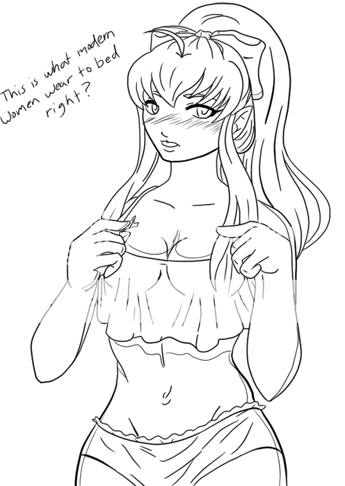
So, I did it. I excluded the arms 'cause I might make things look confusing. I'm not quite used to drawing directly on a tablet. I just use it for painting.

One - I used ovals to place the head, ribs and pelvis, then turned the ribs and pelvis into boxes. Ideally, ribs and pelvises are represented by boxes. If you can't get the hang of it, then use ovals. I generally prefer ovals better (At least for ribs). With the pelvis, the corners of the box represent the points of the ilium crest.

I also fixed the placement of the nose, ear, and eyes. I did stop the line of the top of the ear at the wrong spot. It should be a bit further back.

Two - I fixed my boxes. I added the lines for the pelvis, and added the breasts. This is how the breasts should sit naturally

Three and Four - The way I drew the ribs is a bit off, but you can see how one would start to fill things in. The back of the hip/butt should touch the back corner of the box. I moved down the breasts and readjusted the pelvis to be in the right place.

So, yeah. This is generally how the body should look like, give or take a few things. I'm more showing where everything's placed versus the full end result (you wouldn't be drawing in the ribs and abs exactly the way I did). When in doubt, look at yourself in the mirror naked and observe yourself (assuming you are woman), or look at nude photos of women to understand the woman form.

When it comes to line art, look to comics and observe how they do it. Right now the way you have it is very random. Also, pay attention to how the wrists tapers in to the hand. Her wrists should not be that big unless she has massive man hands.
Aaaand here is the colored version. Not bad for not having drawn a human form in over six years.

User Image

Newbie Regular

2,550 Points
  • First step to fame 200
  • Forum Sophomore 300
  • Forum Dabbler 200
Good so far, I just think she is a bit too wide around her waist!
You got to love it when you post a picture to a forum that is for posting pictures and people instantly assume it means you are asking for redlines and critiques. Even though you have not mentioned a single thing about it. sweatdrop rolleyes

Dapper Gekko

Hayashi Yuki
You got to love it when you post a picture to a forum that is for posting pictures and people instantly assume it means you are asking for redlines and critiques. Even though you have not mentioned a single thing about it. sweatdrop rolleyes


Yeah, I wonder why that is...


User Image
Escherichia coli
Hayashi Yuki
You got to love it when you post a picture to a forum that is for posting pictures and people instantly assume it means you are asking for redlines and critiques. Even though you have not mentioned a single thing about it. sweatdrop rolleyes


Yeah, I wonder why that is...


User Image
Hm, I wonder what that one was above the one you highlighted. *goes to check*

Shirtless Citizen

I think for the most part, most of the quirks were mentioned. definitely the nose is a little close, and the face is a little small, but I think the later is more of a personal choice depending how you want to depict her. Im assuming the lighter lines are just for shading, so if you color it, it won't really be noticed. One thing that's off though is the wrist on the right hand, the line seems a little awkward under the hand.
Great steady line art though, theres no little fringes or anything, so you did a pretty good job c;

edit: I apologize if you didn't want critique, you did do a really good job though. it is in the comment & critique form, but modernizing her was a different idea, I think you should work with.

Witty Genius

Hayashi Yuki
You got to love it when you post a picture to a forum that is for posting pictures and people instantly assume it means you are asking for redlines and critiques. Even though you have not mentioned a single thing about it. sweatdrop rolleyes


As Escherichia Coli has mentioned (and even as the new name for this forum implies), this is a place to expect critiques on art you post. I hope you see benefits from what I have to say and show you.

Fashionable Dabbler

Hayashi Yuki
You got to love it when you post a picture to a forum that is for posting pictures and people instantly assume it means you are asking for redlines and critiques. Even though you have not mentioned a single thing about it. sweatdrop rolleyes


I love it when people post pictures in the picture post and assume that they won't get a critique on what they posted. And then attempt to be sassy by using the Gaia emots (which don't make you look sassy at all btw).

The whole point in drawing is to constantly improve. There are flaws in your work. TekoaNaman was kind enough to give you constructive criticism and even went as far as to do some redlines to further your knowledge in anatomy so that your next drawing will be even better than the last.

To completely ignore them would be incredibly rude. Just acknowledge that you were given a critique and use what you learned from it to better your art instead of wallowing in your own sense of self-pride.

Quick Reply

Submit
Manage Your Items
Other Stuff
Get GCash
Offers
Get Items
More Items
Where Everyone Hangs Out
Other Community Areas
Virtual Spaces
Fun Stuff
Gaia's Games
Mini-Games
Play with GCash
Play with Platinum