

admin
(?)Admin Lead

Offline
- Posted: Mon, 06 Aug 2007 20:49:57 +0000
Hi everyone,
Our artists and user interface team have been hard at work for quite a while on a huge overhaul of Gaia's look and navigation. The first phase of their work is almost complete, and you'll be seeing some big changes in the next few days!
Allow us to break you off a little preview. Some of you may have already seen this information posted in staff journals, but we figured the time was right to show it to everyone!
First of all, here's a scaled-down image of what the new interface will look like:
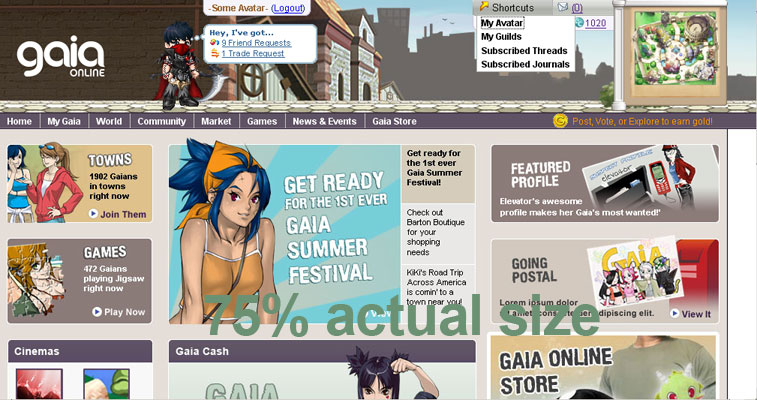
Check out the new header and logo! The title bar has all sorts of cool features: a shortcut menu to get to some of the site's most popular features, a mail indicator that shows how many messages you have, and a little map that shows you where you are in the Gaia world. Your avatar is also present and accounted for-- at FULL SIZE, finally! No more squished pixels!
(Don't worry, we haven't taken away the gold status thingie. In that screenshot, it just happens to be hidden under the shortcuts menu.)
As for the logo, we're very excited about the new look. Lanzer recently explained the change in his Journal.
Other cool stuff:
These changes should be happening later this week. We hope you like the new look as much as we do!
Our artists and user interface team have been hard at work for quite a while on a huge overhaul of Gaia's look and navigation. The first phase of their work is almost complete, and you'll be seeing some big changes in the next few days!
Allow us to break you off a little preview. Some of you may have already seen this information posted in staff journals, but we figured the time was right to show it to everyone!
First of all, here's a scaled-down image of what the new interface will look like:
Check out the new header and logo! The title bar has all sorts of cool features: a shortcut menu to get to some of the site's most popular features, a mail indicator that shows how many messages you have, and a little map that shows you where you are in the Gaia world. Your avatar is also present and accounted for-- at FULL SIZE, finally! No more squished pixels!
(Don't worry, we haven't taken away the gold status thingie. In that screenshot, it just happens to be hidden under the shortcuts menu.)
As for the logo, we're very excited about the new look. Lanzer recently explained the change in his Journal.
Quote:
We've been thinking a lot about Gaia's logo. When our logo was first created, there was no Gaia community. The Gaia logo reflected our vision of what Gaia was at the time, but the community has grown and matured so much since then that it no longer seems appropriate. Gaia was once a website that created a community, but throughout the years it's become a website that is defined by its community.
With that in mind, we decided to create a logo that does a better job of reflecting the style and spirit of our members. We wanted something that looked cooler, more unique and more fun. We put in a lot of thought about who we are as a site and as a community, and we came up with something that, in our opinion, really looks the way Gaia feels.
With that in mind, we decided to create a logo that does a better job of reflecting the style and spirit of our members. We wanted something that looked cooler, more unique and more fun. We put in a lot of thought about who we are as a site and as a community, and we came up with something that, in our opinion, really looks the way Gaia feels.
Other cool stuff:
-New landing pages! Gaia's main pages (Home, My Gaia, Community, etc) have been given a new style better presentation.
-The background changes depending on where you are on the site! We currently have one background for each town, but we're working on even more, as well as backgrounds for forums, marketplace, and other features/areas.
-Daily Chance will have a new look! You can't see it in this shot, but it's gonna be cool.
-New navigation! We've reorganized the dropdown menus and navigation elements to make it easier to get around.
-Though it looks all big and beautiful and vibrant, the new header actually takes up less vertical space than the old one.
These changes should be happening later this week. We hope you like the new look as much as we do!