[img]http://c.statcounter.com/#INSERTPROJECTNUMBERHERE#/0/#INSERTSECURITYNUMBERHERE#/0&var sc_security="#INSERTSECURITYNUMBERHEREAGAIN#"[/img]
Remember when you type the letters. They are case sensitive!
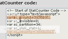
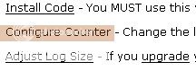
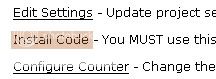
This is where that ugly screen comes to play. These parts are the only things you should
focused on. (Definitely not all the other crud that is meant to confuse you!) Basically you'll
just have to plug the numbers where the pound signs are. Project numbers and security numbers accordingly people. : ) : )
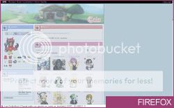
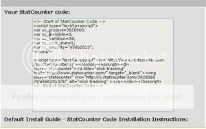
The finished product would look like this
[img]http://c.statcounter.com/3828060/0/e56b2013/0&var sc_security="e56b2013"[/img]
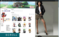
As of now you have created the counter I use to count you people who mingle in this thread. xD
Check out the bottom right corner of the first post!


Basic Cursors
#whateversection {cursor: xxx;}
Cursors offered & supported with browsers:
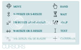
Replace the 'xxx' with the names above.
This attribute are mostly used with the body, link and images
classes/subclasses.
Your own Customized Cursor
#whateversection {cursor: url(filename.cur);}
I don't know how to create cursors, but if I do find a guide I'll point
them out to you. You just have to find a cursor thing file type that ends w/
.cur. If you go on yahoo or google, you can search, but it's NOT
recommended at all because most of the sites that offer cursors have
spyware embedded in them when you download them (same goes for
emoticons).
If you find a reliable one, use it.
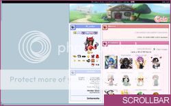
Please be reminded. Firefox doesn't support cursor imports. IE, however,
does. Proven from Ben Pond it is possible. I'm just too lazy
right now to figure it out. xD

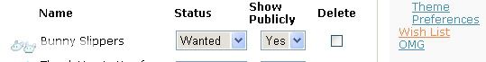
People use the status bar buttons to create their links, but people
wonder how can people create buttons, but the only links the status
bar offers are add friends, ignore, pm and trade. Well... people... it's
not much of a secret.
They create their own buttons using custom sections. Nothing special.
If you haven't bothered reading how to create custom sections, I suggest
scrolling back up a bit to refresh your mind, or if you don't know and skipped
ahead go back.
How does this work? Here's the logic.

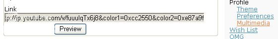
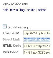
PUSHONE You have a custom section and you put the image you want seen when
hovered over. (This happens in your About me section) You must also link this
to your desired location. Let's say you want to link to your comments you would
have to go to your add comment link. Right click > properties > and copy that
long url. It should look something like this:
http://www.gaiaonline.com/profiles/?mode=addcomment&u=######
Basically if you know your gaia member number you just need to replace the
pound sign to your Gaia ID Number. In my case, it's 102800.

PUSHTWO The image you want when it is not hovered will be placed in the theme box.
PUSHTHREE Basically what happens with the coding, the background image appears and the image is hidden when the cursor is not on top of it.
PUSHFOUR When cursor is over it, the image that you put in the BBCODE (about me) will appear.
In summary, you need to use both your about me input text thing and your theme box.
In your About me would look like this.
[list=1][url=http://www.gaiaonline.com/profiles/?mode=addcomment&u=102800][IMG]http://i295.photobucket.com/albums/mm152/visualearner/hoverimage.gif[/IMG][/url][/list]
Please reminded that spacing is important. If you space the gap between the list=1 and
the url portion it will "move down." So, keep the spacing together.... so no... breakage.
Remember list=1 is a custom section. You can create multiple sections and have more buttons
this is just to create one button, but the concept still applies.
This is all mentioned in PUSHONE.
In your Theme Box would look like this.
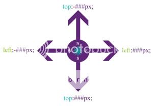
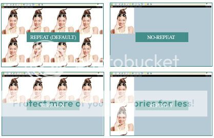
/*this allows me to move it*/
#about ol {background-color:black;position:absolute;top:500px;left:500px;}
/*this is the image that first appears*/
#about ol {background-image:url('http://i295.photobucket.com/albums/mm152/visualearner/regularbackground.gif')}
/*when the section isn't hovered over this hides the image in the ol*/
#about ol img {opacity:0;filter: alpha(opacity=0)}
/*when the section IS hovered the image you put in the BBCODE about me section appears*/
#about ol:hover img {opacity:1.00;filter: alpha(opacity=100)}
Where it shows the background-image that's where you place the image that first appears.
To make it compatible, had to use opacity and filter. Filter is for IE (100= show fully, 0 =
not to display, gone, kapeesh) and opacity is for FF (1.00 = same as 100 show fully, .0 =
not to show, byebye)
Read the comments to fully understand more. : 3

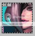
I bet the first thing you are wondering what is a patch. Well, it's
a 50x50px image that represents you or your profile. You don't
have to always have one patch. Nowadays, people create a patch
for every new profile they make.
Patches can be created in Photoshop or any other imaging
program.
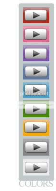
These are the collection of patches I have created over time. 3


* this tutorial is only available to users with Photoshop 7.0 or up
HOW TO ADD A BORDER AROUND YOUR PATCH
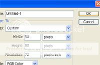
The first step is to start a new document and set up the dimensions for the patch.
Simply use CTRL + N to start a new document. Then change the specifications
of that document to 50px by 50px pixels. Click Okay.

Most patches are just a reflection of your new layout. So, copy ( CTRL + C ) and paste ( CTRL + V ) the image the exact way you want
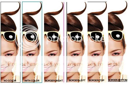
Make sure you are on the correct layer and select all ( CTRL + A ) (<--- when this happens
you should see something like white and black lines moving around the image as shown above) and cut ( CTRL + X ) then paste ( CTRL + V ) it back in, again. By doing this, this will only cut out an exact 50px by 50px patch to enable you to put a border. Think of a cookie cutter. xD
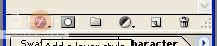
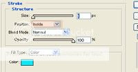
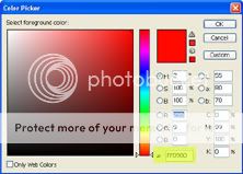
Look at your layers you should see a set of pictures at the bottom. Click on the one that
looks like an f > click on stroke. Make sure you set it "inside" and not outside. The higher the
number the thicker the border gets, and you can easily change the color by looking through
the color wheel.

After that, you can just slap on some text, and wala~~~~~ your gorgeous patch.

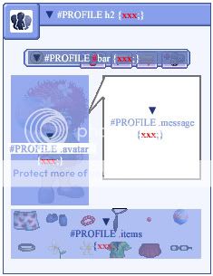
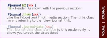
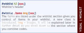
You can organize code however you want. It is all up to the each person's
personal preference. I (note: you don't have to follow, but is recommended) organize
my codes based on the overall page and work my way from the top to the bottom.
From there, you can alter the overall section (exp: #about) and then venture
to the details/aspects within a specific section (exp: #about h2).
I have created a sample theme you can alter/experiment with.
The best way to coding is to be organized and "comment" your work.
This is basically the easiest way to help you remember which part of
the coding does what, and you simply write them within slashes and
asterisks (exp: /* comment here */).
People are sometimes against commenting parts of their code
to keep others from stealing and altering it easily. For you, commenting
will help you brand your work, and allow you to remember things easily
without having to switch back and forth between this guide and your
profile theme box.
: )
So basically what I did was I created a sample theme, and commented
each segment/portion of code for your understanding. If you notice, I go
for the overall profile, then go from the top to bottom, and for all the stuff
I remove/omit tends to go at the end.
You'll notice sometimes my items are squished together.
SPACING IS YOUR FRIEND. You can space your stuff between the
portions of your code, so it's not all rammed together. If your list
of attributes tends to be long. DO NOT MAKE IT A STREAM LINE OF
CODING. It will be longer for you to sift through your coding instead
of doing this:
#about {background-color:red;color:white;letter-spacing:5px;position:absolute;top:200px;left:12px;text-transform:lowercase;text-indent:5px;padding:25px;border:1px solid black;text-align:justify;line-height:20px;}
Do this:
#about {
background-color:red;color:white;
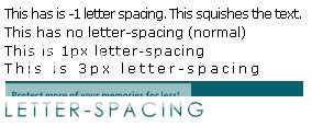
letter-spacing:5px;
position:absolute;
top:200px;
left:12px;
text-transform:lowercase;
text-indent:5px;
padding:25px;
border:1px solid black;
text-align:justify;
line-height:20px;}
This will make it WAY easier on your eye, and less troubling for you. When
you are looking for a specific part of your section, you can easily press CTRL + F
and type in keywords to alter. ; )
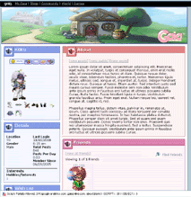
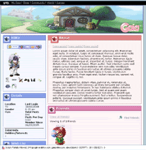
* The image is clickable to my profile.


 --&
--&