

raynbow penguin

Aulay

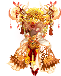
Kami - kun

glumbear

2,500 Points
-
 50
50
-
 200
200
-
 200
200
Kimiko Doll

Versatile Fashionista
HiddenReid

3,700 Points
-
 100
100
-
 200
200
-
 100
100
Kimiko Doll
Versatile Fashionista
Illusional Melodies

Kami - kun
Adulariah

Winner
Arvinia

Kimiko Doll
Versatile Fashionista
Adulariah

Winner
Arvinia

Adulariah
Winner