Alrighty, here goes. I actually ended up doing two different versions of the redline. I'm not sure which way you prefer, but at the very least you can compare which one suits your work better.
Anatomy/Proportion/General Drawing Stuff
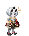
Your anatomy is actually not that off; just some of it was a little out of perspective. There were really only a couple main things to fix: the alignment of her chin, her eyes, and the width of her shoulders.
Her pose is fine, but her shoulders feel a little scrunched up.Bring down the pit of the throat (the area between the collarbones). (To check the distance from the chin to the pit of the throat, always remember that it's the same distance from the tip of the chin to about the middle of your nose. Remember that the neck length will always differ with characters.) Shoulder width from the pit of the throat to the sockets are about the width of the head in length.
Her left eye (our right) is also bigger than her left eye. I'd also recommend finding some reference to create her eyes. There are lots of ways to create realistic eyes. I highly recommend
this one by CG Society. Her chin is also a little too close to her neck - give her a bit more distinction in her chin and push out a bit.
The Redlines
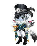
Here's a part you can ignore if you didn't actually plan to draw it in this way. As I was redlining I realized I wasn't sure if she was simply looking ahead or tilting her head to look at the viewer.
1

The first redline I outlined where her head would be positioned if her face was looking more towards the left. (Thus illustrated by the box on the left hand side.) If she was meant to be looking this way, then her chin would need to be filled out more, her nose nudged a little to the left, her lips lowered slightly, Her eyes would also be brought out a little further. Remember that the whole face is like a plane on a box. Where you point that particular plane on the box will determine where everything goes in your drawing.
2
The 2nd redline was created with the idea that she was looking down but had tilted her head a little bit to look at the viewer, as illustrated with the box on the left side. If this was the original approach, her eyeline and mouthline should be lowered and made parallel with her nose. Her left eye (our right) would also be brought in closer towards the left. Her ears would also be tilted in the same way her eyeline would be. (I actually forgot to move her left ear (our right) to the left. Woops!)
I guess I am being reaalllyyyy nitpicky/a**l here, but the left side of her hair (our right) would also rise up a bit (again, following the the rule of the box).
The Nitpicks
1. Her eyebrows are a little close to her eyes. Bring them up a bit to give her eyes some breathing space.
2. Her hair feels a little "big" to me, especially around the hairline, though I personally dislike drawing big hair, so it could just be an artist's preference. In any case, to indicate volume some shading in the crevice of her hairline would help.
3. Your highlights seem to be pretty even all around. Remember that when objects get further away from your light source, less light falls on it, so even though there will still be highlights on her right side (especially her cheek and shoulder), they will never be as bright as the areas of her body that are closer to the light (unless you have a secondary light source.) You have a bit of that going on but the variation is not that great.
4. I personally think that she could use more shadow on her right side as well, but I love contrast and adding shadows everywhere, so that could be just personal preference.
Well that's all I can think of. Apologies that it came out so long!
I really like the way you rendered her nose. The way you render is pretty nice. I also like the movement you've got going on with her hair. I like the black tips - a bit of variation with hair color is always nice to see.
Please keep at it! I hope you finish your drawing.