Welcome to Gaia! ::

Roll call!

Entrepreneur!! 0.7345410207281 73.5% [ 4217 ]
N00b!1 0.2654589792719 26.5% [ 1524 ]
Total Votes:[ 5741 ]
1 2 3 4 5 6 ... 620 621 622 > >> >>> »|

7,050 Points
  • Invisibility 100
  • Beta Critic 0
  • Friendly 100
A HIGHLY SARCASTIC GUIDE TO STARTING AN ART SHOP.
"An advocational exercise to heap disrespect on those who desperately deserve it."


INTRODUCTION.

    Welcome to Djubre's Highly Sarcastic Guide to Starting an Art Shop (known more affectionately by regular visitors as Le Sarc)! It looks like a lot to read but I guarantee that by the time you reach the bottom, you'll wish there was more. Now. Before you read any part of this Godly Guide, I'm going to forewarn you that it'll be very up-front, very brutal and very sarcastic. By no means will all my quips detract from the actual quality of the advice but it may offend some readers. If it offends you, you're most probably the idiot doing all the things I outline in this Guide you shouldn't be doing. See? Sarcasm already. Now we can begin.

NOTE:.

    Upon reading it the first time, one of two things will happen. You will either be a) highly offended by what I say or b) you will call me your new God.
    One thing is for certain though. The intelligent ones, even if they get butthurt at the beginning, by the end of the guide, they usually send me feedback along the lines of "Jesus, was I blind!" Before, of course, they end up thanking me profusely for creating this, and walk off knowing that they've ******** learned something instead of blindly listening to friends who feed them false flattery because, I don't know, it makes their friends feel all buttery inside or something.
    User Image

    As for offensive content... the lovely Moderator Tiranaki has herself PERSONALLY looked over the thread and given it a GREAT BIG THUMBS-UP.

    tiranaki
    Funny guide! Honestly, I had a blast reading through it and I'm disappointed that Gaia requires us to censors so much. While I understand people's rights to not feel offended, people should also be allowed to express themselves so long as no one else is being hurt. In any case, if you wish to add it in case other people complain, you can add a note to your thread saying it has been reviewed and approved by a moderator.


GLOSSARY.

    New additions to The Guide will be written in red.
    AST = Art Shop Thread.
    N00b = Pple hu tlk lyke dis; and/or are just generally stupid. Usually found in the chatterbox with a Gaia car in their signature.
    DISCLAIMER = If your art shop was created referencing this Guide and you still don't have customers, I'm afraid to say but the aesthetics of your shop layout may not be the reason people aren't buying...^^;;
    ADVICE/CRITIQUES = I won't be giving out critiques for the meantime, don't bother asking until this notice comes down, heh.
    Also, if you ask for advice/criticism, you have no right to complain if you send me somewhere and I type up a few hundred words of criticism for you = w=;;. I'm OCD, okay? -FINGERJAB- Firstly, read the ******** Guide, fix your shop up accordingly and THEN ask for advice.

7,050 Points
  • Invisibility 100
  • Beta Critic 0
  • Friendly 100
A SMALL(ER) NOTE ABOUT NAMING YOUR AST.

    User ImageDo not, I repeat, do not, name your AST "Name's Art Shoppe". First of all, it's a bloody shop, not a shoppe. It looks try-hardish, it really does. WE DO NAWT LEEVE EEN OWLD ENGLAND, YE N00B. I would avoid in all instances putting Name's Art Shop/Shoppe in your thread title at all. If you're looking to have a semi-permanent AST, then don't ward customers away by having a boring title. Think of ANYTHING. ANYTHING but "Name's Art Shop". For example, 'Djubre' means 'trash/manwhore' or along those lines in my language. What is my art shop called? ťяašhé. I thought of that dumb name in five minutes, the least you could do is put a little effort into it, for God's sake. Remember, there are thousands upon thousands of art shops in the R&C. Do you really think that "Chibi Neko's Art Shoppe" will make yours stand out from the rest when buyers are lurking in the forums? Of course not! What will make me click on the thread title? Is there an incentive? An eloquent title, or witty name that sparks my curiousity?

    I also advise you not to put symbols and weird lettering in the letters of your AST title unless it matches. It sometimes makes it quite difficult to read the title. I was really going for a trashy sort of look with my AST so the symbols just kind of messed the words around for me and actually suited. You can use any other miscellaneous symbols you can find so long as they don't interfere with your wording too much. For instance, don't you EVER use them to spell out every single letter in your art shop. No. NOOO. C: Thanks. Your shop name, symbolic lettering and all should be able to be made into your banner. If you have fancy-schmancy lettering in your title, but normal lettering in your banners when spelling out your shop name, I will laugh at you c:.
    I also hope it doesn't need to be said that if you spell something wrong, even one thing, in your entire front page, it will affect you very very greatly, and in a bad way. Get a nerdy friend to correct any spelling mistakes or just copy + paste the text into Microsoft Word to check if any squiggly red lines come up. If u tlk lyk dis, you're pretty much screwed because nobody likes to talk to or buy art from a n00b, which is what you're trying to be.

    HA. It has officially gone out of fashion to use 'quality art' in your shop title :'DD. Y'know why?
    TOO MANY ******** LIARS. This kind of goes the same with bribe shops, they're becoming the new "HQ ART OMFG DESU" shop. It has now come to the point where I only go to bribe shops to laugh at how bad the art is and how stupid the customers are for paying that much, it's embarrassing, s**t son, stop putting that in your title, it can and does scare off customers.

    Another thing has really been on the increase and it pisses me the ******** off. People with Japanese symbols in your thread name. NO, IT DOES NOT MAKE YOU LOOK COOL, IT MAKES YOU LOOK LIKE A TRY-HARD N00B, GET IT? Just... no. Make your thread title readable. How the ******** am I gonna remember what shop I've been to if I can't remember the title? HUH? HUH?
    Like Christmas-chan's shop--Dark Arts. Like my shop--Trashe. Like Silverbleed's shop--Blood Red Eyes. See, I remembered them! What, am I gonna resort to typing out ァジフンター to direct someone to you? Are you ******** serious? It is NEVER desu desu kawaii japanese fun time.

7,050 Points
  • Invisibility 100
  • Beta Critic 0
  • Friendly 100
RESERVING POSTS.

    First of all, you're gonna want to reserve some posts. You go here. People REQUEST your art and you get COMMISSIONS. Easy enough to remember? Good. NOW thanks to genius Gaia admins, the class and sass of the R&C (Requests and Commissions) is gone. It is now called Art shops and Requests, which any n00b (and there has been a huge influx of them after the name change) can post in with absolute certainty that they are posting in the right place. ********.

    Now, to the reserving posts part. Most people just construct their shop as they go along and this really makes me cranky. Because then if someone has the samples up already and is constructing the prices page, you might like the samples thing but not the prices so any lurkers will have to wait and wait and wait to see what your damn prices are. And then if they like those, they have to wait and wait and wait until your shop is open. THAT'S RETARDULOUS.

    Go here and make the layout of your damn shop. You can get Mod(erator) peeps to move it for you, but if you'd rather not do that, you can pre-reserve the posts in the R&C (that's Requests and Commissions) forum and copy and paste sections from the already pre-made shop in the Test Forum to your actual AST.

    Before you arrange your AST around properly, copy/paste, whatever you want to do, I suggest you reserve 16 posts. I'll tell you why in a minute. To stop pesky n00blets posting in your thread, you can put whatever the hell in your AST title so long as it follows the lines of "NO ******** POSTING OR I'LL SHOOT YOU IN THE EYE". If some idiot DOES decide to post before you're open, first PM (Private Message) him/her telling them as politely as possible to delete their post; then if they don't, just report them and keep reserving posts. Pretend like it's not there, because soon enough, it won't be. This was the hardest ******** thing to do in the Chatterbox. ...I HAVE ONLY TEN FECKING POSTS ON THE FRONT PAGE OF MY GAG SHOP BECAUSE THEY CAN'T. SHUT. THE. ********. UP.
    User Image
    Four guesses which button above their post you should press.

    Now, back to how many posts you should reserve. I suggested 16. Why? Because on Gaia, every page is pre-set to contain 15 posts. 16 is just a safe-keeping number. Normally when you're reserving spaces, you WON'T NEED 15 POSTS for your layout. And don't you dare use the second page, for ******** sake. Nobody is going to see the s**t written there, and it's ******** redundant, alright? Keeping the front page with ONLY your posts makes the shop look neater and more presentable and if you're keeping the AST for the long run, it's kind of strange to see an order offering 1k for art you now sell for 100k. Not only does it make people laugh at you, but it makes you look less credible.

    The other good reason for reserving 16 posts is that you can delete surplus posts. Say (for example) you only need a samples and prices posts in your shop. That's way too little, but bear with me for now. You can have post number one for samples and post number 2 for prices and delete the rest of the posts.
    User Image
    You press the little 'cross' icon there to delete your post. This won't pull every single post back because the front page is sealed and won't allow any MORE than what you already have.
    This is a great example. Count the posts on the front page. Only SEVEN! OOO:! That's because she deleted surplus posts. So before you start your shop, open up MS Notepad and figure out how many you'll need. I usually have around ten or so depending on the complexity of the shop. That's enough about Reserving Posts, don't you think, kiddos?

7,050 Points
  • Invisibility 100
  • Beta Critic 0
  • Friendly 100
THE AESTHETICS.

POST STYLES.

    Okay, this is a big mistake that a lot of people are doing and I just want to clarify the correct way of doing it. Come on over to my lovely test thread and let me show you how the professionals do it. See that post I linked you to? It has the code of the s**t I want to put in each post, and then I put what it actually looks like out of code. It's a skeleton of every post in my shop (okay, well, my old-ish shop). I have a place where I can put a banner image, a place to write the title, and a place to fill out the text. Any moron should be able to see that. This technique takes a quarter the time to redo the code and apply it through the thread (if I see anyone ******** stealing that coding by the way, I will gouge your eyes out with a Moderator on a stick). KEEEEEEP IN MIND. That stealing code is against the ToS, so don't start looking for pretty art shops to rip off. Invent your own, it's fun Cx What have we learned? Keep your coding uniform, make a beautiful art shop.

      ( IN A COMPLETELY UNRELATED BUT RELATED NOTE: You CAN and WILL get in trouble for putting urls to your shop, quest, whatever in your flob/post style. IT IS ADVERTISING AND I LEARNED THE HARD WAY THAT YOU CAN GET IN TROUBLE FOR IT. Make sure if you see an idiot using tektek to pretty up their post and that prettiness includes links elsewhere, to TELL them that they could get in trouble for it! )

    Since this doesn't fit into anywhere else and I apparently omitted it from the guide somehow, I'll tell you this now--Choose an alignment and keep it. Don't put sections on the left and other sections on the right and other sections center aligned--apart from headers, which are okay to be aligned differently from your main text, keep a common alignment. I say this because as someone with a giant screen, I'd rather not be doing the "physically turn my head right" "physically turn my head left" when I'm reading your shop. I should only be doing this when I'm watching ******** tennis, not an art shop.

    Now, onto colors.

COLOR SCHEMES.

    First of all, anyone using VIOLET text in their AST should be drawn and quartered. It is the ugliest color known to man and screams n00b. I don't need reasoning here, it just does D;. Hardly any AST with large bolded violet lettering go well. Or they're just the n00bs selling photographs of their squiggles. You want to be synonymous with them? Use violet text. Not only this, but I recommend you avoid ALL ugly or painful-to-read colors. So yes, ladies and gents, no turquoise, no yellow and no white (obviously). How to tell if your color is too light: Paste a block of text text text text text etc in the color you chose and quickly scroll up and down the page. If the text is barely noticable, that color is too light. You want your shop to be easy to read and appealing to the eyes and trust me, the right font color can go a long way.

    I HIGHLY SUGGEST MAKING A COLOR SCHEME. Don't use five million colors in your art shop D:. It looks really really stupid. Makes me go all "Ekscuze me, but wtf r u doin?" Take for instance, my AST : D. The colors? Red and black. What an awesome combination. Some other noob's AST colors: Dark blue, green, red, orange, viollleeeeetttt. If you'll notice, all the spiffy AST's have color schemes! So what have we learned here today, kids?
    Have a goddamned color scheme D<.

    What kind of freaky deaky person would enjoy reading this, post after post, word after word, LETTER AFTER LETTER. It would be enough to make someone throw up after the first couple of words. Rainbow text is a big fat NO NO.

    Not only this, but sometimes even two colors can get annoying to read. You can like, use it for your titles if you REALLY REALLY MUST, but if you're going to use it for body text like this, you are a moron. A MORON. The only time I've actually used it is to give the illusion of metallic gold in someone's 'navigator' at the bottom of each post. Otherwise, I really don't see the need for it. Stay away from tektek's Gradient Text Generator if you're not sure you're up to using it WELL.

    A NOTE ABOUT USING HEX COLORS.

    Now I need to apparently teach a few people how to use hex xD. Alright, hex color font is the same as normal color font. Like so: [color=red] = [color=#cd0000]. This is basically how to use hex colors. One of them goes to the generic red and the other one is the coloring of my normal post styles, aha. If you're interested in finding the perfect color, try this color chart. Take the color at the top right for example; [color=#00bb11]. That's how you use the colors~. Pretty, no? Otherwise, if you're handy with photoshop, you can get the hex codes from there too.

    Don't have your main text larger than size 14 or so. You need common sense, for the love of god. 14+ is okay for headers, but anything larger than that for the main text in your shop is just bordering ridiculous.

POST BORDERS.User Image

    There are a few different borders that are available for your post styles:
    Where the arrow is pointing. You can change it to whisper (dotted blue lines), shout (jagged thick black lines), think (thought cloud bubble-thingy), document (plain brown background box with darker brown border), or ornate (some fancy-a** gold border). You need to keep in mind that your post style should match with the font, ect in your shop. You can always change them nowadays, thank god, but before you couldn't, which was a pain in the a**. If you're unsure about which matches the best, just leave it alone to have the default gray border.

    If you are gonna choose a border, for the love of god, make sure it matches with the rest of it. Laugh if you want, but visual appeal is the only thing that's gonna attract customers if your art sucks like nothing else in the human world. If you choose 'whisper', HAVE DELICATE BLUE FONT THAT MATCHES. You don't choose 'whisper' and have huge ugly red lettering that looks like you're yelling your post and not saying it. I mean, that's just dumbtarded.

    User Image - Blocked by "Display Image" Settings. Click to show.NOW that you've read most of that, if you're further curious as to how to make your shop appealing the BBCode way, you MUST visit this thread:
    Because it is sexy and it won't insult you half as many times as I probably have :'D. This babe knows what she's talking about, so LISTEN UP D8<.


    A FEW WORDS ABOUT SMILEYS.

    (Refer back to the 'Reply' picture above) Try to minimise the amount of bouncing and animated s**t in your posts. If you have a contents, DO NOT use the ******** love-hearts as bulletpoints. It's extremely n00bish and it gives people headaches and makes them roll their eyes and want to leave your AST earlier than you want. Your main goal is to try and keep them in your AST for as long as humanly possible.

    This being said, NO ******** BLINKIES EITHER. Half the time they're completely random google-searched images that move and flash and blink with all the desu desu kawaiiness that would make a Japanese school-girl throw up. Random blinking images are a no, as are random images, moving or not. The only images you should even have in your shop are things that aren't distracting from the shop's purpose, which are your affiliates, banners and your samples (THUMBNAILS).

    I'm seeing a lot of emoticons being used and it's just really not funny at all. A shop I visited today, had no less that eight 'sweat' emotes. Now, it's okay to have an occasional smiley I must admit, if you really have to be so publicly happy, but sweatdrop (:sweat:) emotes are such a huge ******** no-no. It is the direct equivalent of crying (T_T) in quest threads. Nobody wants to donate to some ******** crying emo now, do they? If you have the sweatdrop emote anywhere in your first page, people are going to see it and this automatically undermines your value as an artist. If you want to be drawing you should appear confident about your abilities, even if you suck like nothing else. If you think your art sucks, but you're looking to open an art shop, for ******** sake, don't even bother. Chances are it really does suck and you'll be another one of those artists that sell to "Hey plz can i by artz tiP if i lyke?" types. Don't be a petty gold-digger trying to earn gold any way you possibly can with absolutely no talent. Try the Daily Chance, I'm sure it would give you more than your art is worth. Because let's face it, if you're not sure about selling your art, who's going to be sure they want to commission you? So no " sweatdrop Sorry, I'm not good at males". Instead, opt for "My talent currently is focused upon my ability to draw females well", or something along those lines. "Yes, but it takes longer to write those few words~!" WELL GET OVER IT.

    (On another small, small note, if you roll dice or pick random numbers above the posts you're using to set up, you must be acting like a n00b on purpose. Seriously, is there something not functioning properly in that head, why ARE YOU STILL AT THE COMPUTER AND NOT GETTING A LIFE?)

HEADERS.

    With animated headers in your shop, they're extremely ugly to the eye if they do a lot of fancy tricks and s**t so I recommend NOT having animated banners. I mean, what the hell? If you use the... lemme remember... 'Glitteryourway.com'-banners, I will personally kick a small innocent animal. THEY ARE HORRIBLE TACKY UGLY DISGUSTING WANT-TO-VOMIT-ON THINGS THAT MAKE ME LEAVE A THREAD IMMEDIATELY WITHOUT EVEN CLICKING ON SAMPLES. I DON'T CARE IF YOU'RE LEONARDO DA VINCI, I WOULD NOT BUY YOUR s**t IF YOU HAVE THOSE ******** PERSONALISED WEBSITE BANNERS. THEY ALL HAVE UGLY GRAPHICS, THEY GLITTER AND SHIMMER AND SPARKLE AND JUST LOOK PLAIN STUPID AND ATTENTION-SEEKING. They're usually only used by ten-year-old girls too, so you might want to steer clear of them.
    Like so:
    User Image - Blocked by "Display Image" Settings. Click to show.
    Make your own stupid banners if you must have them, or go here and find a professional who can make appealing banners for low fees. A pretty thread is priceless, so I would really get the foundations down first. And please... no blingee.com banners...
    User Image - Blocked by "Display Image" Settings. Click to show.
    Isn't it gorgeous?

    Good artists are normally synonymous with pretty threads. So take the effort, make your shop STAND OUT. Don't use lame Photoshop brushes! Having random 'grass' brushes everywhere that look nothing like grass in the first place does not make you cool! Same goes for things like stars and maple leaves and s**t like that. FOR THE LOVE OF GOD. They do NOT look unique! They look like trash, you moron D;.
    A very very important thing... DO NOT USE IMAGES AS THE BASIS FOR YOUR ENTIRE SHOP. Headers are good. Entire posts constructed of fancy-a** text (or whatever kind of text) you pulled from your Myspacey photoshopped rear end in IMAGE form is ******** retarded. DESPITE WHAT YOU THINK, SOME PEOPLE STILL HAVE DIAL-UP. I don't want to have to download five music tracks worth of ******** images because you've gone all "o kawaii desu desu this text is perfect and preeeeetty for my shop~~!" If you have constructed every post like that, with images instead of written text, you are a FREAKING IDIOT. I still have to edit my "introduction" post every now and again. As well as basically every other post on my front page. It's not practical having to open Photoshop everytime you want to change something. It's just ridiculous.

    Another small, small note: If you didn't make the art, don't use it in your banners. It's normally a fancy technique used by undercover n00bs to draw prey further into their lair of crappyness! >8D Don't fall for it~~~ Because whenever I visit shops with pretty banners, sure, it makes me want to buy art alright--Art that looks like the banners. As soon as I see the real art, even if it's semi-decent or not, I just get disgusted with the LIEZZZ (-Shakespeare tragic hero pose-) and leave immediately >>;. I caution you highly on using even your own art in banners. Because unless your art is earning in the millions or 100's of thousands range, it won't attract people as easily as you think. Silverbleed has a lovely shop with lovely self-made banners with her own artwork in it. That works, because her artwork is Godly. Get it? If you draw like a four-year-old, (don't start an art shop, and) don't ever consider putting your artwork in the banners :'D.

7,050 Points
  • Invisibility 100
  • Beta Critic 0
  • Friendly 100
FRAMEWORK.

    Okay, this is the nitty gritty part, ladies and gents. What headings you should and should not put in your AST. Okay, let's use my own shop as an example: ● ťяašhé ●●.

    That's basically:

      Heading.
      Introduction.
      Announcements. (Though this is purely optional)
      Rules.
      Examples.
      Prices.
      Form.
      Slots.
      Previous customers. (This is optional too, I guess)
      Affiliates.

    And they're in that order for a reason, let me tell you.
    The reason why this order is not-to-be-messed-with total pwnage is that it's chronological. I mean, why learn to run before you can walk, yeah? I do hope that you see the order yourselves. Let me demonstrate with a little bit of metacognitive thinking! >;U (It's a term my school made up, don't ask me what it means)

    "Oh hey, look, it's an art shop! *CLICK* Wow, that banner is pretty, let's see what s/he's offering. Hm, okay, so s/he's a dedicated artist and s/he seems friendly too! But wait. Before I go any further, are there things I need to watch out for? Hm, those rules don't seem to hard, and there's a password for me, ooh, best keep that in mind in case I want to buy something! Wow, what pretty examples! S/he's an amazing artist! I totally want some of that! But I wonder how much it costs... Oh, that sounds wonderfully reasonable, I think I'll go buy some avi art. I'll just fill in this form, see what others are offering below (for a bribe shop, I guess that would be more of the case) and I've posted my order! I'm so happy I bought something here, s/he has quite a large customer list as well, so I know I won't get ripped off! Maybe I'll even take his/her banner to put up in my profile/shop/whatever!"

    Pardon the lame that was that story. But do you see where chronology comes into it? Most people scroll down to your samples first, so they do end up reading a bit of your price list, but then if they decide it's good art, they'll have to flick back up to check the prices. You don't want the customer flicking up down up down up down the page constantly over and over again, right? Convenience!

A THEORY OF MINIMALISM.

    Too, since I see more of these "minimalist excuse-for-a-piece-of-s**t-artshoppe"s, I can make a simple one too! -Cracks knuckles- Rightyoh. The above framework I ideally place one header per post, BUT, you can combine them. The following are possible combinations.
    [Heading/Intro/Announcements][Rules (MUST have its own post)][Examples/Prices/Form][Prices/Form][Form/Slots][Slots/Previous customers][Affiliates (MUST have its own post].
    Alright, there we go. No more excuses for your "minimalist" a**.

WHAT HEADINGS NOT TO PUT IN YOUR AST.

ABOUT THE ARTIST.

    First and foremost, I'm seeing more and more 'about the artist' type posts and I LOLALLDAWAYOUTOFTHETHREAD. Really, your AST is for selling arts, not for advertising your Mexican heritage. Your PROFILE is for doing that. Want to blab on about how you had a tough life growing up in the orphanage and drew squiggles for ten cents to earn daily meals, go on about that crap in your profile. Due to the natural selfishness of a human being, you'll find that seldom people care about you; they only care for your arts. It's tough, but it's the truth.

User ImageWISHLIST.

    Play-doh frenzy has brought my attention to all of those awful wishlists in people's threads. Now, it's a different thing to have "Payment Options" in items that may or may not happen to be on your wishlist, but taking tektek's of dream avi's and pasting them onto your thread is insanely stupid. "Ohhhh wow, lookit the pretty colorrrrssss~~" "LOLOL '03 MCs FTW, rnt i prity?" No. No. NO. We don't want to see what your hideous dream avatar looks like, nor do we particularly care. As I said before, it's a fact of life, your customers couldn't care if you had cancer that you got passed down from your eighty-year-old single-parent mother who's currently taking out twenty-eight mortgages on your flat and has left you three million gold in her Will because her wish is for you to have a wonderful avi on Gaia. Nooooo.

BLACK/WHITELIST.

    Anyone who says that they really really need a blacklist is obviously quite obtusely stupid. Every ******** thread I've come across (okay, not every, but a buttload of them) has EMPTY blacklists. Some threads have blacklists that have been empty forever and the thread has been active for over a year. Is it all necessary?

    If someone does something wrong in your thread, you caution them about it. If they do it again, you can IGNORE THEM. I have never EVER put anyone on my 'Ignored' list, though I know quite a few users who are way too friendly with that button. If I really don't like a person to the point that I'll reject drawing for them, I can just add a rule stating 'I'm allowed to reject orders upon my discretion' and then politely decline if said person tries to order. It shows you're above the whole childish "LOLOLOOK @ DA NOOB, HE BROKE DA RULEZ, U SHUD BLOCK HIM 2!" Because you don't want to be childish now, do you? Some n00bs in Ky's thread quotes the first page AT LEAST once a day, if not more. Think about this--If she did a stupid thing and had a blacklist and 'no quoting the first page' as one of her rules, her blacklist would have over 200 names on it. ...Logic? What is that?

    And I just hate whitelists in general because they're discriminatory D;. Like... "Awh, I've been so-and-so's friend for a year and I'm not on the whitelist?" NOT being on the whitelist is just as disheartening as being on the blacklist for no reason. The only thing I see people do with those is to say something like "Kawaii_Sakurasushi_Neko for bribing me with 3x pay!" etc. As for another reason why it's so unnecessary, the ones who make it onto the whitelist like that usually never come back. I've paid people 3x more than what they had in their prices, got whitelisted, and I never went back to the shop again. Sure you remember the person, but they don't remember you and you're giving them permanent eternal credit for a few extra gold on the front page of your shop...? What are you, a beggar?
    Besides, all I see on whitelists are pointless things like "because she's awesome" or "best person evar" or something stupid like that. It's essentially a friendslist with a ******** description. Whaaat the heeell. You need to leave all personal things off your shop and stuff it in your profile instead. I don't think I profess my love to my boyfriend in every front page post of my own shop, do I?

CONTESTS AND FREEBIES (ADVISAL, NOT COMPULSORY).

    I would suggest you don't include huge posts about freebies and 'bump contests' or the like. It wastes your time, space on your thread, AND sometimes really unworthy people win the contests, which is just my personal biased opinion. If you MUST have a contest, put it in the first post and don't make a huge deal out of it! : D If you're a student in high-school you'll be able to sympathise with me that giving out freebies is kind of hard, especially if your arts take a lot of effort. Instead of giving out freebies to 'first posters', try bump contests instead. I would most probably prefer to part with my gold than my talent (xD) but if you're gonna give away freebs, make them small things. Bumping isn't the most important thing in the world.

FAQ'S (ADVISAL, NOT COMPULSORY).

    Okay, I'm seeing a lot of things, and for some times, it can be a good idea. Other times, it's a more clever way of disguising an 'about me', which made your highly sarcastic pissant rather crabby and so he had to include this. Usually, in a Fah-Q is is a clever way of saying 'FAAH CUE" to your customers by stacking them in the category of 'Oh I'm too lazy to answer your questions so I'll put this up here' or 'I know you're stupid enough to ask me these blatantly obvious questions'. This isn't very nice when you think about it D8.

    Take for example, this FAQ:

    Can I edit the art? No.
    Can I bribe you? Yes, with certain items.
    Freebies? Only if you're nice.
    Where did you get your shop name from? Blah blah blah I pulled it from my a**.

    Okay, with the above, some questions can be put into the 'rules' instead. i.e. "Don't edit my art in any way"; "Only certain bribes are accepted"; "Nice people who hang around may get free art, but no begging!" etc. With the last question, again, with the 'about me', nobody really cares. Best to stick that in your introduction or something instead.

TOYBOX.

    Wtfno D:. Your request thread can display pictures and s**t like that, not your art thread!! Your art thread is supposed to have YOUR artwork in it. For ******** sake; someone sees a better piece of art in your toybox, finds out who did it and THEY LEAVE YOUR SHOP. Isn't that the tiniest bit retarded?

7,050 Points
  • Invisibility 100
  • Beta Critic 0
  • Friendly 100
INTRODUCTORY POSTS.

HEADING.

    This is an OPTIONAL post. I always include one because it gives an overall feel of the thread and supplies the potential buyer with quick information before they venture into your lair. You usually have a large shop banner, yes, yes, make it all pretty and stuff, and the shop status. That's the thing that states whether your shop is open, closed, hiatus, full, whatever. Very useful. But as I said, it's only the header, so you can squash that into your Introduction if you really really want to.

INTRODUCTION.

    Normally a nice "Welcome to so-and-so" is pretty warm and inviting. It has all the sparkle and shine of a ******** bio, but people don't actually laugh at it. You also don't post any embarrassing photos of yourself, how nice! In this post some artists leave it pretty blank, which is completely fine, so long as you give the general 'What this shop is for' feeling. I like to put things such as 'you should buy my art because of these things~' because, well, if my samples aren't enough, I should still be able to sway you into believing that you want my arts and should spend millions on it for a few different reasons.

ANNOUNCEMENTS.

    If you're going to put this in your shop, you need to specify that it would be a good idea for customers to actually read them (with that, you'd have to make them worth reading, but I don't even have to mention that, do I?). I'm a student and I'm sure a lot of you n00blets are too so when things like exams and finals come up, you can add "ON HIATUS" in your AST title, but you can also explain the reason why in your announcements. And Ho-ly s**t, don't stretch the page with it. I should be able to see the last and first announcement on my monitor D':. It should never be a huge section. To avoid this from happening, every time you add a new announcement, make the one before it a size smaller. And when the list gets small enough to reach font size 1, just start deleting them (because you obviously can't have font size 0). Don't make them build up. It starts to look like mold. And when it starts to look like that, not even Pine-O-Cleen can save your sorry butt >___>. This is also an OPTIONAL post.
    Only put critical announcements here, PLEASE FOR THE LOVE OF GOD. I just browsed in an art shop and I saw this as the announcements and my jaw dropped:
    02/25/09 - I'm on a diet. o_o
    02/25/09 - ....
    03/07/09 - It's my birthday. biggrin
    03/08/09 - It was my birthday. biggrin
    03/10/09 - I ******** love urban decay...
    03/13/09 - I love David o_o
    03/14/09 - I love Tim and Manny too o_o
    03/14/09 - I'm still on a ******** diet D; (lost 5 sizes)
    WHAAAAAT. WHAAAAAAAAAAAAAT?!

RULES.

    Argh. For the love of God, have these. Don't have two million rules, please. Just don't. If you yell at someone for breaking rule 945,220, you should be beaten with a stick. They want to buy your art, not read about your lamenting in dealing with n00bs when you're most likely one yourself.

    If you have more than 10-15 rules or something, YOU'RE PUSHING IT, BUDDY. Don't include dumb or IRRELEVANT rules such as "Don't pretend to be a ghost in my thread" because nobody will do that. This also includes the 'No spamming' rule. Because, believe it or not, Gaia has banned spamming. As well as trolling and botting. Oooh, impressive. That goes for 'no cybering'. I mean for ******** sake >>;. As if n00bs would do that in public anyways. Don't you know that they go to Towns for dirty things like that?? 'Follow the TOS' isn't even a necessary rule--You're selling your art to the people of Gaia, if they break the TOS, you can report them and they'll get their post removed--They can't even argue that they were allowed to because it wasn't a rule in your shop, lul. Because we don't really need to be THAT obvious, do we? You add rules upon neccesity, not because you like them. For example, a lot of artists hate PM's about their arts nowadays. I love PM's. Especially the n00bs who WunT 2 bUy My aRt 4 lyK 2k. But if you hate those things and are pretty sure they're gonna PM you about it, write "1. Do not PM me about my art". Also, don't ban bumping. Bumping is a good thing that makes your business prosper! Ban it and write "Only conversations plz" and you're going to be a very lonely little artist. Just put what you feel you need in here. If you have a few specific rules that you need people to read, you should also put a password in your rules, like I did in mine. It doesn't have to be identical, just a little tidbit that you yourself won't forget so that when those naughty rulebreakers do in fact break the rules, you can politely direct them to your rules section again.

    On second thoughts, I'm starting to think that artists put the 'Don't PM me' rule up because, well, every other artist does. Which has became officially insane. I see artists drawing like four year olds and having the temerity to assume that people will be so desperate for their art that they will send them large and annoying PM's about it. Er, no. No, they won't. Take it from my point of view: I have a large and successful bribe shop and I draw pretty good, if I do say so myself (okay, that was a given, I'm always praising myself. Bad ego, bad D:< ). I have only recieved a couple of random PM's about my art, the others I requested or were expected. The more friendly and open you are with your customers, besides, the more they'll want to buy your art. Because we're buying from human beings, you know, like US--we want to have a little bit of a human touch; the whole world isn't about forms and protocol, as much as we need them to survive.

7,050 Points
  • Invisibility 100
  • Beta Critic 0
  • Friendly 100
SELLING THE ART.

EXAMPLES.

    Okay, this goes BEFORE your prices. You know why? Because if you have art that sells for less that 5k (I will assume you are one of those n00by 'I-take-digital-photos-of-my-potato-headed-peoples' artist), people should know what they're buying before they get to the actual buying part. Conversely, if you have LYKEWHOA prices like me, you don't want to scare people away. We're artists, we're always fishing for compliments, really. Posting samples first means that people get a good look at them, and even if they progress to the prices and find that they can't afford anything, they'll probably compliment you in your thread about them! :3 Artists have egos that need to be constantly fed. Have you fed yours yet? My ego is called Hugo.

    User Image
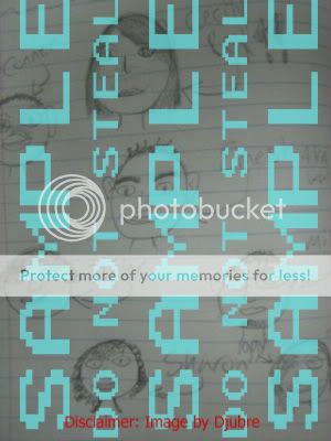
Another note: Gaiaonline says to put 'SAMPLE' all over your artwork that you're sending to a customer before they complete the trade. THAT is a good idea. Putting SAMPLEOMFGBBQ all over samples in your shop is a bad idea. Not only is this a retarded idea, but it makes people NOT want to buy your art.

    LOOK HOW UGLY IT LOOKS.
    I'm already too amused that people who draw like four-year-olds are putting big ol' ugly SAMPLEWLKMSNFBDSJKHD stamps on top of their work D8. Seriously. I would lie about drawing that, if I did draw it, let alone worrying about someone else claiming it as their own. I'd be all "D8 YEAH, IT'S HIS, ME NO DRAW CRAP LIEK DAT". Nobody wants to steal your samples. And even if they wanted to, they could with the watermark and all. Because for all anyone knows, they could have written 'sample' all over their arts just like you. Your best bet is that someone will recognise your art and tell you and/or report them for stealing it. So don't make your samples unattractive by watermarking them with big ugly aqua watermarks.

    Another note, do not post direct samples. They stretch the page and annoy dial-up users even more than your big ugly flashy glittery banners. We're trying to minimise pain here, kthx.
    User Image
    This is an excellent idea if I do say so myself. A lot of awesome artists, from London009 to Silverbleed do something similar to this thumbnail so that people can click on particular samples and let it load on another page. That being said, make sure that it's like a PREVIEW of your art! Not just an eye... or a leg... or a nose... or something stupid like that. An ACTUAL preview! It's like a teaser, it'll get them to click on it just to see the rest of the picture. There's no use in having symbols and star icons or whatever for your thumbnails and then posting up a million of them, because it just teases too much; plus the person is a bit pissed off when they click on a star and see a piece of crap on the other side of the url.


    Hell, you don't even need to make specific images to click on. A simpler way is to right click on the THUMBNAIL of the image you want in your photobucket and select the url to THAT THUMBNAIL. Like so. Notice the "th_" in front of the image name.

    User Image

    So you can do spiffy things like this:

    User Image

    See? Takes the complication out of the process.

    Wolf Tart has notified me about an equally important point--In some shops, sure, they try to avoid page-stretching pictures by placing links to their art, but I've seen a few stupid users who do that and then link to a picture that's 294013845927562893572 by 2049819035812395 pixels and USUALLY it's a piece of s**t. I mean, the larger they scan it at, the more mistakes the customers can see on your crappy artwork. Have it at a normal size, yanno? I usually send my artwork to customers (because I'm one OCD b*****d) in 1000x1000 pixels size if I can make it xD. Or otherwise I do a hell of a lot of cropping to make one side 700 or 600 or something like that. But then again, you should only do that if you're OCD like me. So less than 1000 pixels either way should be fine.

    Too, if you're going to link to samples in your photobucket, don't link to the view of the picture.
    That's this.
    http://s263.photobucket.com/albums/ii156/TrasheDjubre/?action=view&current=lv.png
    See what's wrong with the above? The action-view&current= part. The page takes longer to load and it gives you automatic access to the rest of your photobucket. Alright, your samples also kinda do that, but when you have the link going to view current, people are more inclined to be snoopy. And who knows, you may have n***s and stuff like I do on your photobucket D;. You don't wanna show those off unless you're as good-looking as me.

    Argghhh. Also, too many people are linking to DA pages. It annoys me to hell because DA pages take a while to load--longer than just a plain picture. If you're going to link to them in your samples, don't link to the page itself. Right click on the image, click 'properties' and you'll see the image url. So no linking to below:

    http://moje-djubre.deviantart.com/art/Rem-Romanus-90116207

    Link to this instead:

    http://fc07.deviantart.com/fs29/f/2008/181/f/d/Rem___Romanus_by_Moje_Djubre.png

    It links directly to the picture and dial-up users won't groan and die while waiting for DA to load : D.

PRICES.

    I am going to say, first and foremost, that if you are over 13 and (seriously) price any of your art under 1k as the only way to get any customers, you may as well stop, close this guide and never visit the Art Shop forums again as anything else but a buyer. If your art is only worth <1k, you will never get marginally good enough to begin pursuing a career in arts--you obviously don't have the talent for it, it's obvious to you and it's obvious to everyone else. There is no such thing as a late bloomer. Either you have some signs of discernible talent to begin with, or you don't. I'm not going to humor your pathetic attempts at art like your friends and family will.

    A lot of artists can't price their art properly. I personally think a lot of 'artists' suck nowadays and the R&C is unfortunately full of them, but for the ones who ARE good, generally they can price themselves after looking around a few AST's. If you're one of the people who can't price their arts, go here. Set up a topic and ask people how much your art should be priced at. Don't complain that not a lot of people post there and it's a slow forum because that's your own ******** fault for not being able to compare and price yourself. This is of course, the absolute last resort you want to use because quite frankly, unless the art is really crappy, the majority of people in this forum have no ******** idea how to price. I set up that thread a while ago and you can read through the replies to see just how low people are pricing art (mine) that fetches 2 million gold+ for a piece like that. 150k is the average price they valued me at (keeping in mind that when I do open slots, I usually drown in offers and bribes in the millions, therefore, I am not "overcharging". Simple to understand?).
    These people aren't "stupid" or "n00bs" or whatever; the majority of them are pricing in accordance with what funds they have--i.e. not a lot. This is why I recommend you price your art using that forum as a very last resort as anything they tell you is basically guaranteed to be less than what your art is actually worth (in my case, twenty times less).

    I'm not the kind of person who likes all kind of arts and is warm and fuzzy and thinks that everyone should be treated equally. No, not like that. I wander around some Request threads and see comments like "I set up an art shop but nobody's buying T A T". Doesn't mean you're a bad person, no, just a bad artist. Either that or your prices are "HOLY(*#&@*ITHINKIGOTAHERNIA!" Don't complain if nobody's buying. If they're not buying, chances are they have a very very good reason. Either that or you're using glitteryourway graphics, violet font, type in L337 and enjoy using a lot of emotes. Try the chatterbox, it works better.

    Kay, let's see what else. LET GO OF THE MULTIPLE PRICES (ORLY?). Ohgawd. I saw a shop recently. It had headshot. Bust shot. Waist-up. Hips-up. Knees-up. Fullbody with feet. Fullbody without feet. Couple headshot. Couple bust shot. Couple waist-up. Couple hips-up. Couple knees-up. Fullbody couple with feet. Fullbody couple without feet. Group headshot. Group bust-up. Grou-DO I NEED TO CONTINUE? Why must you people complicate things?! Bustshot, waist-up, fullbody. Those are REALLY the only things you need. Someone only wants a knees-up instead of a fullbody? TOO FRIKKEN BAD. You are an artist, dammit, you decide what they want D<. Don't have seperate pricing for couple and group. It's retarded. It is common sense, even for your average idiot wandering around the R&C that a couple fullbody will be double the price of a regular fullbody. It's common sense. You don't even need shouldn't really have to mention it. Then I go to another shop, on my wanderings through Gaialand and I see: Head: 1k. Waist: 4k. Full-body: 8k. Inked head: 2k. Waist: 5k. Full-body: 9k. Colored head: 3k--I hope I don't need to go on. If you're gonna offer sketches with the option of coloring, inking, watercoloring, crayola-ing, just write underneath the base price something like "+2k for pencil coloring". Don't go through all the option D8. We want to at least assume that your customers can do basic addition.

    Single Characters
    1.) Normal:
    Sketch
    Head : 15k
    Bust : 25k
    Waist up : 40k
    Full Body : 60k

    Black and White
    Head : 20k
    Bust : 30k
    Waist up : 50k
    Full Body : 70k

    Colored
    Head : 25k
    Bust : 50k
    Waist up : 80k
    Full Body : 100k


    2.) Chibi:
    Sketch
    Head : 10k
    Full Body : 15k

    Colored
    Head : 15k
    Full Body : 20k

    Couples
    1.) Normal:
    Sketch
    Head : 20k
    Bust : 30k
    Waist up : 45k
    Full Body : 65k

    Black and White
    Head : 30k
    Bust : 45k
    Waist up : 60k
    Full Body : 75k

    Colored
    Head : 40k
    Bust : 70k
    Waist up : 90k
    Full Body : 120k


    2.) Chibi:
    Sketch
    Head : 20k
    Full Body : 35k

    Colored
    Head : 25k
    Full Body : 40k

    Group 3-4
    1.) Normal:
    Sketch
    Head : 35k
    Bust : 55k
    Waist up : 60k
    Full Body : 70k

    Black and White
    Head : 40k
    Bust : 55k
    Waist up : 75k
    Full Body : 90k

    Colored
    Head : 50k
    Bust : 85k
    Waist up : 110k
    Full Body : 130k


    2.) Chibi:
    Sketch
    Head : 40k
    Full Body : 60k

    Colored
    Head : 50k
    Full Body : 70k

    Group 5-6
    1.) Normal:
    Sketch
    Head : 45k
    Bust : 60k
    Waist up : 70k
    Full Body : 90k

    Black and White
    Head : 45k
    Bust : 55k
    Waist up : 65k
    Full Body : 80k

    Colored
    Head : 60k
    Bust : 90k
    Waist up : 120k
    Full Body : 150k


    2.) Chibi:
    Sketch
    Head : 55k
    Full Body : 70k

    Colored
    Head : 70k
    Full Body : 80k

    Flob
    1.) Normal:
    Black and White
    Head : 20k
    Bust : 30k

    Colored
    Head : 25k
    Bust : 50k


    2.) Chibi:
    Colored
    Head : 15k
    Full Body : 20k


    Quoted from a real shop. Sweet baby Jesus.

7,050 Points
  • Invisibility 100
  • Beta Critic 0
  • Friendly 100
CUSTOMER-RELATED.

FORM.

    Try keep this as minimalist as possible. Nobody likes filling in forms and you don't want to make customers feel like they're doing their tax-return. Username for reference, what kind of art they want, price and other details should be the bare minimum, but see how simple it can be?

    If you're planning on opening a joint shop, I HIGHLY recommend you do not have multiple forms. What the ******** is the point of a joint shop if you can't co-operate, HUH? Agree on a few things that all the artists want on the form, and have a seperate post for it. This is a good idea if you don't want to stretch the page and make it look horribly unbearable to read.

SLOTS.

    This is kind of a self-reminder. I find it useful to have links to the pages the forms are posted, how much the customer is paying and what they're asking for (fullbody, headshot, ect). But that's because I own a bribe shop and need to give other people a reference as to what they should be paying me with. Some artists also have 'quoted' forms on that post. It's a very bad idea to do this because some people can post huge amount of text to describe their OC's.
    So we don't want that to clutter up your front page--Just make links to the forms instead, for your own simplicity.

PREVIOUS CUSTOMERS.

    This is an OPTIONAL post too. Enough said, really. I normally put the username, price and what they were asking for here too. If you want to go all-out, you can also post links to the artwork you did for them. Of course, that takes up alot of coding so I personally don't want to do it.

7,050 Points
  • Invisibility 100
  • Beta Critic 0
  • Friendly 100
LINKING SHOPS.

AFFILIATES.

    Normally you should make yourself a 88x31 banner, a 200x40 banner, and one large one for good measure. NOT TOO MANY. It'll look really silly D:. I also highly advise only to accept one general size for the affiliates section. Look at my affiliates section in my shop. Or better yet, Silverbleed's wall of links. Then you'll SEE how nice an organised one-size-only affiliates section can look.
    Again, no using ms paint to make your own banners, get a professional if you're not confident you can do them brilliantly. NEVER. EEEVVVEEER. Use mybannermaker.com. WHAT. THE. ********. I want to crush the people who invented that putrid website! And all its followers who think that SPARKLES with STUPID-a** PAPYRUS font looks AWESOME. Because it doesn't. NOT. EVEN. CLOSE. DON'T TOUCH ONLINE BANNER MAKERS.
    A very important thing to remember: Use Tinyurl if you can. I see these pretty threads all over the place and then they put in LYKEWHOA huge links that stretch the page horizontally. It looks plain UGLYUGLYUGLY. Not only are most of those banners made terribly in MS Paint, the link to it STRETCHES THE PAGE. It makes it just a remarkably sloppy thread.
    If you think you're up to it, you don't even need to put your link in using [codes].
    Look at this nifty trick:

    User Image - Blocked by "Display Image" Settings. Click to show.
    [url=http://tinyurl.com/yrlldk][img]http://tinyurl.com/628j2r[/img][/url]
    [u[i][/i]rl=ht[i][/i]tp://tinyurl.com/yrlldk][i[i][/i]mg]htt[i][/i]p://tinyurl.com/628j2r[/i[i][/i]mg][[i][/i]/url]

    Just place "[i][/i]" in those indicated places and you don't even need to use the 'code' thing for people to link you. I think it adds that little something C:. Makes the thread look fantastic and organized.

    I've noted that a lot of people enjoy putting... well, the entire thread link and photobucket link with their 'affiliates' section, mostly due to the fact that Gaia is temporarily disallowing tinyurl. So they do weird things like setting the image to be from photobucket, but then also linking to the gaia url instead of tinyurl, which you're allowed to click on. Always keep your settings to allow all pictures. About 99% 80% of the R&C does (statistics changed because of the September 2008 N00blet Influx), so you'll have no major problems with that.

    [url=http://www.gaiaonline.com/forum/requests-and-commissions/a-h-disgustinglyexpensiveart-closed/t.38110893/]
    [img]http://i263.photobucket.com/albums/ii156/TrasheDjubre/gotyaoi.png[/img][/url]

    Like the above. ...Ewwwww D;.

    Not many people know this, but I come from a long line of English Qveens~. No, but seriously, they don't know how to cut down Gaiaonline urls to forums AT ALL. So as a result, you can see the "Setting-up-thread" part of the url which has always bothered me for some reason >____>. This being said, you want to cut down on your url AS MUCH AS POSSIBLE. Don't save your banner under the name of "lolololkawaiisakurasushibannerformyshop.jpg"--Make it AS SHORT AS POSSIBLE. Like. Letters! My current one is "TB1" and "TB2"--Trashe banner 1 and Trashe banner 2.

    Turn this:

    http://www.gaiaonline.com/forum/requests-and-commissions/a-h-disgustinglyexpensiveart-closed/t.38110893_1/#5

    Into this:

    gaiaonline.com/forum/t.38110893#

    The # keeps it from linking to the bottom of your page.

    That's all you basically need. The thread name, http://www, and the rest is all superfluous and if you really really hate tiny url, you can shorten gaia urls that way instead. What has started to reeeaaaally ******** annoy me is the stupid people that create an affiliate post and then grab the url at the top of the page after creating it. NO. YOU IDIOT. YOU'RE GRABBING THE URL THAT GOES TO YOUR AFFILIATES POST.
    HERE'S A BASIC CODING LESSON FOR YOU MORONS. At the end of your Gaia forum url, ANYTHING, ANYTHING AFTER AND INCLUDING THE UNDERSCORE (that's _ <-- this) YOU DON'T NEED. YOU DON'T NEEEEEEEEEEEED. DO YOU GET IT YET? gonk gonk But leaving in _16, you'll be linking to the second page. If you leave in _1/#15, you're linking to the NUMBER FIFTEEN POST ON THE FRONT OF YOUR PAGE. The browser will LITERALLY redirect anyone that clicks on your banner to the last post, and I find this incredibly annoying. Not to mention everytime I get redirected straight to the affiliates post, I have the urge to look at the shiny banners and go somewhere else.

    Photobucket urls, unfortunately, are still gonna be a pain in the a**, so I recommend tinypic.com. By clicking on the 'Show blocked images in post', it will reveal the picture : D. Small note: If you leave the http://www at the front, Gaia will actually recognise it as one of it's pages XD. I just normally keep it without because I like to shorten my affiliates' urls as much as possible ( it's huge, I don't wanna waste space D8 ).

    So then it turns into voila:
    [url=gaiaonline.com/forum/t.38110893][img]http://i263.photobucket.com/albums/ii156/TrasheDjubre/gotyaoi.png[/img][/url]

    Or, yanno, you can also change the options in your 'account' to display all pictures xD. Because I mean, Gaia, come on, since when did we not want to see pictures in forums, huh? D:
    ...
    Except in the GD. That's one scary-a** place, I'll tell you now o____o.

    And I hope that I don't even have to tell you that if you put 'codes' underneath OTHER people's banners, you have little more intelligence than the monkeys at a zoo. I've been told they're quite intelligent, but hey, if you want to take a step backwards in the evolutionary scale instead of forwards... Codes are for YOUR banners, so people can take YOUR banners from the shop.

7,050 Points
  • Invisibility 100
  • Beta Critic 0
  • Friendly 100
IMPORTANT GENERAL INFORMATION ON ART AND AST'S.

ARTS.

    The first thing you have to know is that you should be supplying quality images, not the badly saved ones. This also means that if you want to sell artwork that you've taken with a digital camera, you're ******** <3. It is your duty to be supplying your customers with GOOD artwork. When I first started arting on Gaia, I started out with a low-grade Canon scanner. And yet, I still made it my duty to FIGURE OUT a way to make the lines as dark as they could go without ruining the quality and turn the background into the most pristine white. SAYING YOU HAVE A SCANNER BUT SELLING PENCIL WORK WITH GREY BACKGROUNDS IS NEVER ACCEPTABLE. There is a way to have a white background no matter how crappy your scanner is. It just takes one day of experimenting with the scanner settings. If you're getting paid for your job, do it ******** properly, or stay in Art Freebies until you figure it out. It's not that ******** hard. On another note, NEVER EVER EVER use Photobucket to edit your images to add text. What, are you stupid? There's a whole list of hideous font, everyone by now knows that they're Photobucket exclusive, and girly girls like to use the Cretino font because IT LOOKS KAWAAAIIIII NE?

    Now.. Moving onto other lessons... look at the differences between these two images:

    User ImageUser Image

    Which image looks better? The one on the left is saved in .jpg and the one on the right is a .png.
    For the love of god, save in PNG if you don't want your art to look like crap and in some cases, even more crap than it is now.
    'Nuff said.
    note: ALL WINDOWS ART PROGRAMS CAN SAVE IN PNG. If your program is so neolithic that it hasn't even heard of PNG yet, you're on one of those computers that can take up an entire room <3. Need further proof? Open up two tabs on your browser with these two images PNG and JPG. If you take a close look, artists will be able to see that JPG mutes the colors and makes the image more pixelated. If you STILL can't see it, compare his necklace. Which red gemstone is brighter? Png or jpg? There's your answer.

MAINTAINING YOUR ART SHOP.

    Okay, I've heard a lot of people swagger into this thread and go "I've dooonnneee everything" (which they haven't) "nobodyyyy's buuyyyiiinnggg" (hey, neither would I with an attitude like that). There are a few very very important things you need to do to make sure that your thread doesn't fall over and die with its legs twitching in the air. By this point, n00bs will be asking themselves whether threads actually have legs instead of asking the all-important question: How do I keep my shop ALIVE?

    First of all, you have to BUMP once in a while. For the love of God; don't put 'no bumping' in your rules because that's retarded. It's like saying 'I'll wait for someone to look back a few pages in the R&C to find my thread and buy my art'. It doesn't happen like that. The more you bump, the more you advertise, the more customers you get. So after you're over the hump that is designing your actual shop, you must bump to acquire customers. Maybe once every five minutes or so; doesn't have to be a lot. And if you hate bumping yourself, hire a service. Don't buy too many bumps though, because if after 200 bumps or so, you don't get customers, I'm pretty sure you're ******** 8D;;. Don't let this discourage you though! It's always worth it to give AST's a shot.

    Secondly, you must post often. Bumpers can't do this for you; you need friends to come to your thread and hold a giant chatting fest. Don't give me that "I don't have any friends~~!" excuse. Go to towns and get some friends. Or better yet, start a freebies thread (you'll be befriending a lot of people who are just friendly for your art, but among some of them, you might find a few gems). Better yet, give out little five-minute freebies in your shop if you can. Freebies attract people. As soon as I started offering that in my art auction, a few people started posting there (to get a freebie no doubt LOL) but even when they didn't get one, they migrated to my shop after the auction was over.
    Bumping services are stupid. A crappy art shop normally hires bumpers to keep their crappy thread at the top of the forum. You have to be personable and able to pick up customers when they come along in a good mood and let's face it--Everyone's happy when they chat with their friends! 8D Look at Silverbleed's thread--They can't shut up in there and she's a millionaire <3. (Just ignore the fact that she has really really good art xD)

    Graphics are not enough to sustain you if you have no artistic ability whatsoever. It's a sad fact, but people tend to sell art not for the sake of selling art itself, but just to earn what little they can. Hence why I don't like any art under 10k because the kids selling it generally fall in the too-lazy-to-collect-daily-chance category.

7,050 Points
  • Invisibility 100
  • Beta Critic 0
  • Friendly 100
CONTACTING A MOD.

    Well, while most of us hate these people (they're not the most likable bunch), unfortunately they are a necessity to deal with if you're in the R&C, for various reasons. This is for stuff like scam cases most of the time. Because Gaia has done a WONDERFUL job keeping the place safe from pricks like me (who disregards the sanctity of human life and the right to be a complete idiot), but not art thieves or scammers, oh no, heavens no.

    You can contact any R&C Moderator from this place, but make sure you read the rules. I wouldn't want to be on a Moderator's bad side now, would you? I advise Tiranaki though--Very personable and I'm sure she'd help you out... [/biasbiasbias]

    If your thread is being flamed, harrassed, trolled, whatever, report the posts, and TRYYY to ignore them. If you flame back, you'll get in shitload of trouble. I don't think you'd need to contact a Mod unless it's really out of hand. Otherwise, if you add them to your ignore list, they can't post in your threads anymore, so I guess that's always an option for those extra annoying insects that you just can't seem to swat away.

    Victims of art theft can report the thread itself and/or contact a Moderator. I've seen this happen a few times before--I know that, on occasion, n00bs will get tired of people laughing at their digital camera art and try to pass yours off as their own. No amount of watermarks can stop this from happening though, and as stated before, it's not a good idea to watermark samples.

    Watermarking commissions on the other hand, is a ******** genius idea, which brings me to my next point. If a person doesn't pay for your artwork, at least all they will have is the watermarked version (ALWAYS watermark before the trade is completed and as you both accept the trade for the commission, give the final version). If, for some reason, you believed in the goodness of the human race (a rather stupid, stupid thing to do) and you've just given 'x'k worth of a commission to someone who's run off with it and left you without compensation, fill in a Scamming Report.

7,050 Points
  • Invisibility 100
  • Beta Critic 0
  • Friendly 100
CONCLUSION.

    I do hope that anyone who reads this and finds it funny/inspirational/suicidal or has made their own shop using it comments here and shows/tells me about it : D. Don't worry about me giving you a "mean"/harsh critique--I only give those when they're specifically asked for. I want to know what people have created from it and what they think about the guide in general. And I apologise for sounding harsh in a lot of sections but people just don't listen nowadays D8. I hope you got a lot out of this guide and are on your way to starting your very own awesome gaian art shop <3. Good luck to you.

    Also, if you enjoyed this thread, I hope you spread the word about it ;D. Put it in your signature, even if it's just for a day, and then go romping through the R&C, adventuring into the depths of horror that are n00by art shops, and carefully flaunt your signature xD. If you make your own art shop using this guide, placing the link in your affiliate's section to show your appreciation would be fantastic (I know some people are worried about looking unoriginal, but really, this is just a guide, it did no formatting for you, made no banners, and didn't type up any of the things in your shop, so you don't have to see it like unoriginality)! 8D It's also a way for me to see how far my words have gone~. If you have the link up in your affiliates section, you also have a chance of getting into the 'best art shops' list ;D.

    User Image
    [url=gaiaonline.com/forum/t.43781991][img]http://i535.photobucket.com/albums/ee360/Djubre/highlysarccopy.png[/img][/url]

    User Image
    [url=gaiaonline.com/forum/t.43781991][img]http://i535.photobucket.com/albums/ee360/Djubre/highlysarcminicopy.png[/img][/url]

    Proud affiliate of Strudel-fayce :'D. Otherwise, we do NOT do affiliates. The only 'affiliates' you will find is in the best AST's post.
    User Image - Blocked by "Display Image" Settings. Click to show.

    User Image Gaia Art Con(vention) =D Where people as cool as me and everyone else who likes the guide *ducks as a brick flies over his head* gather to sell art, give out freebies, and share their worldly advice on how you could be a great artist too! Or, if you have no talent, at least they'll try to humor you? =D

    User Image<-- No, I don't do shameless self-promotion, so I ain't gonna be shoving a form in your face and telling you to fill it in and send it to Minishops Rating Center. BUT, I'm listed there anyways, so I may as well return the favour. If you like my guide, just post here and tell me, stupid xD.

7,050 Points
  • Invisibility 100
  • Beta Critic 0
  • Friendly 100
BEST AST'S ON GAIA.

    Do not be fooled, it is HARD to get on this list. To get onto this list, the thread has to be in immaculate aesthetic condition according to my very crazy standards xD. Be PROUD if you got onto this list. Very proud.
    Don't ask to be on the list. Don't even hint. I will look at your shop in my own sweet time and silently add you whether I deem it worthy or not.

    User ImageUser Image - Blocked by "Display Image" Settings. Click to show.User ImageUser ImageUser ImageUser Image - Blocked by "Display Image" Settings. Click to show.User ImageUser ImageUser Image

7,050 Points
  • Invisibility 100
  • Beta Critic 0
  • Friendly 100
RESERVED.

    User Image

    The above is a GAG store only (a.k.a. made by me). No, you can't order from it. You just sit back and laugh your a** off.

7,050 Points
  • Invisibility 100
  • Beta Critic 0
  • Friendly 100
SOME TESTIMONIALS... Well, just a few, but that's because I'm too lazy to update. Read through the forkin' guide for testimonials, okay?

Kyphi Fox
More people definitely need to see the front page of this thread..
im not even making a shop, however its helping me look for good quality sellers.
Thanks <3 just had to say that xD


Chap Ice
ahh, forgot to post.

the other day, my good friend and i were browsing gaiaonline.
he started complaining about all the noobs he has to deal with.

i remembered this guide.

so, my friend and i read it together. ( we obviously have no lives and/or money.)
it took 2 freaking hours because my friend could NOT stop cracking up.

he, of course, noticed things he did wrong and was greatly appreciative of it.

so, just remember.
not only has this guide decreased the amount of DESUKAWAII shops, but now it's bringing friends together too.
good job uniting nerdy teenage kids everywhere!
;D


Lollip0psichord
Djubre
Lollip0psichord
I'll gladly take you up on your offer of reading materials, mi querido. C: I'm having trouble finding customers. xP


Hey, awesome! Always nice to help someone out xD
Do read the note though, because people read a few paragraphs, send me hate mail, then read the rest out of curiousity, and by the end, they're profusely apologising to me because they've "seen the light"...or something. Just go here:

http://n0d.us/LeSarc

Sorry about the url shortening service, Gaia is being a b***h today and I can't even get to "my topics".

Okie dokie. Will do C: Thank you very much.
Some time later...

Lollip0psichord
...you, my friend, are God incarnate. :O I see the light, as well as how vile violet is. I'm appalled at ever using it. Thank you very much. C:

-------------

x_AN0R3XIC
. . . . . . . . . . ☢ oн so . . .
. . . . . . . . . . . . . . . . . . . . .. . . . . т о x і с .

Dju, you honestly must be the biggest pimp on gaia because any one who knows who you are willingly listens to anything you say. Hell, you could start a new ******** religion.

. t o x i c . t o x i c . t o x i c . t o x i c . t o x i c . t o x i c . t o x i c . t o x i c . t o x i c . t o x i c .

Quick Reply

Submit
Manage Your Items
Other Stuff
Get GCash
Offers
Get Items
More Items
Where Everyone Hangs Out
Other Community Areas
Virtual Spaces
Fun Stuff
Gaia's Games
Mini-Games
Play with GCash
Play with Platinum