Welcome to Gaia! ::


Familiar Explorer

6,150 Points
  • Generous 100
  • Gaian 50
  • Dressed Up 200
I also like when they rotate a handful of pages. It helps to give focus on various parts of Gaia without trying to cram it in all on one page. One can be about avatars, the next about the forums, and the next about shopping and games (that includes zOMG!). It would be the simplest way to include a few of those pages, show off what Gaia has to offer with spotlighted pages, and attract a wider audience.

As for which ones I liked best, I have to say that I wasn't that impressed with any of them. They seemed very simple and dumbed down. Here are the ones I liked the best though out of what was given:


A: simple how-to-do
B: 3 things to do
F: avatars 2
I: home 2

Mega Genius

14,100 Points
  • Invisibility 100
  • Nerd 50
  • Mark Twain 100
i like the anime one and the one about how many items there are ("we're not actually going to do the math" is so gaia's sense of humor XD), but i agree that using them all in rotation is the best idea. they all represent gaia in some way or another, and that way none of them go to waste and there's more variety on the front page.

Brainy Bunny

11,550 Points
  • Invisibility 100
  • Bunny Hoarder 150
  • Conventioneer 300
My favorite favorite is H: Avatars 4. I don't know why, but it seems like I'd want to join the site with that one. I also like, F, G, & I. It shows a lot more of what Gaia is really centered around. It might be nice if ones like F, G, H, & I mentioned the forums somewhere. I know they rotate, but people might not really be willing to sit and watch them all.

Quick Favs List:
F: avatars 2
G: avatars 3
H: avatars 4
I: home 2

All these selections are outstanding, I feel like you guys have really found your target audience and what people really enjoy about their avatars and Gaia.

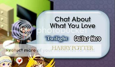
I might avoid things like pointing to television shows and individual movie series, because you may alienate someone who hates those things, and attract only the people who like them. It also starts to build stereotypes about the people INSIDE Gaia. It's not as if we all enjoy Twilight and Harry Potter and talk about them all day long, and making a direct reference to it when they JOIN the site, may give them the wrong impression.

That said, this advertising is DEFINITELY a step in the right direction. I'd be proud to see just about any of these on the first page. Much better than that "be the real you" that looks like a mini-portrait of yourself. You've captured how I feel when I dress up, like I'm being somebody else. The internet cosplay XD

ElectricTerra's Senpai

Salty Bilge rat

44,725 Points
  • Abomination 100
  • Team Carl 200
  • Alchemy Level 10 100
User Image - Blocked by "Display Image" Settings. Click to show.

I'm not a fan of any of them for reasons that others have stated. I think that it's slightly misleading to show avatars decked out in old collectibles and cash shop items on the splash page; it took me a long time to figure out how to make any amount of gold on Gaia (granted, that was in the days when it wasn't raining down from above like it is now), and I know that if I kept seeing enticing images like that when I was thinking about joining I'd be disappointed when I finally got around to seeing how expensive they were.

I also think that the splash pages are dumbed down too much. Gaia's supposed to be attracting teenagers and adults, and it looks like the only ages they'll be attracting with those landing pages are about 10-14 - not individuals who are old enough to help support the site with donations and merch purchases.

On the other hand, there is a current landing page in rotation that I think is wonderfully entertaining. I love the big button and the rotating avatars that say things like, "I want to click so badly it feels like I have to pee." I think THAT landing page is cute, but not dumbed down so much that it won't appeal to older users.
User Image - Blocked by "Display Image" Settings. Click to show.

tora-gen's Fangirl

Eco-friendly Kitten

27,900 Points
  • Falling For You 25
  • Beta Gaian 0
  • Cat Fancier 100
User Image

My favorites are C (avatars) and D (anime)... "we're not going to do the math" was epic xd
However, I have some criticism about some of them. For example, all the ones that use Homes as backgrounds. Homes has been point less than forgotten in this site, we haven't had an update since 2007, and the flash is so weird that half the users cannot even use it. It's quite misleading to use them as the central focus if it's not anymore an important feature.
Also, some of the avatars you used are very, very misleading. There's an user there with an angelic halo User Image I understand you want people to quest and use their time in the site and all that, but... let's face it, 99.99999% of the new users have no chance to ever get a halo. Maybe change the avatars for some more... uh... realistically affordable ones?
Other than that, I like the selection of pages, and I agree that rotating them is the way to go 3nodding
......................................................................

User Image

450 Points
  • V-Day 2011 Event 100
  • Member 100
  • Gaian 50
D)
Perhaps I'm immature, but this made me lol:
User Image
His crotch is talking.

xd

Anyway, I really like the one that says "Be a Badass". Very nice. The "Light or Dark" one is really nice, too.

3,000 Points
  • Dressed Up 200
  • Forum Explorer 100
  • Member 100
I see a few people commenting on the "Light or Dark" thing, whether it be positive or negative, but truthfully, some of the main items, especially MCs, are a choice between "Angelic and Nitemare/Demonic"
I think the idea represents the site well
All of the "avatars" ones are great. The represent Gaia the most out of any of them. And I think that the customization of an avatar is what drew a lot of people to Gaia originally.

Greedy Bloodsucker

6,800 Points
  • Peoplewatcher 100
  • Trader 100
  • Entrepreneur 150
Click Here for Awesomenes
hmmm to tell you the truth i dont like the how to first page.umm...because its telling new users that GAIA is about making money instead of connecting yourselves with other people and expressing your inner self or doing things you cant do in real life.

I must agree.
I really like C and F and hope one of these makes it.

B D G H and I, I could take or leave - if they are chosen, that's cool.

I really don't like A and I almost hate E. A is so simple it verges on the ugly and E is so juvenile it almost feels like an insult to our intelligence.

By the way, I thought the big red button was awesome, better than any of these choices. It was just so fun and funny. (Yeah, I know, my sense of humor needs help. lol)

Questionable Prophet

7,700 Points
  • Bunny Spotter 50
  • Timid 100
  • Megathread 100
They all look really nice, but honestly the first one is stupid and just insulting.

Romantic Werewolf

15,950 Points
  • Mega Tipsy 100
  • Cats vs Dogs 100
  • Threadmaster 200
I could do without the "simple how-to" one I keep seeing, it looks like it would encourage spam. :/

Anyway, can we get that fabulous mermaid one back in the rotation? I really liked that one. :*(

Quick Reply

Submit
Manage Your Items
Other Stuff
Get GCash
Offers
Get Items
More Items
Where Everyone Hangs Out
Other Community Areas
Virtual Spaces
Fun Stuff
Gaia's Games
Mini-Games
Play with GCash
Play with Platinum