My favorites are:
B:
3 things to do (Not my favorite, but if they're rotating I like it.)
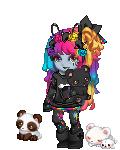
F:
avatars 2
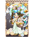
G:
avatars 3
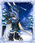
H:
avatars 4
I really like the idea of keeping them rotating because what pulls me in might not attract the next guy. A bit more focus on the forums might help each of these too. Gaia is forums
and avatars. It's not WeeWorld. It's so much better than all the "competition" out there.
I have to admit it is hard to convey what Gaia is on a single splash page and advertising a concept as simple as a bunch of message boards might not seem attractive to the average teenager. Maybe your trying to lure them in with the graphics and then keep then here with the substance in the forums. That could work.


 "IMAGINE"
 "You May Say I'm A Dreamer"