Sveetea
(?)Community Member

Tipsy Faun
Offline
- Report Post
- Posted: Wed, 30 May 2012 23:25:27 +0000
I LOVE this feature, but I don't use it. Here is my list of fixes that would make me LOVE centering the cite all the time!
1. The links at the bottom. It looks so awkwardly alone. It should span the whole bottom to fill in the blanks to the right of all the links - much like the links are in normal viewing mode, just made to span that little space in the middle.
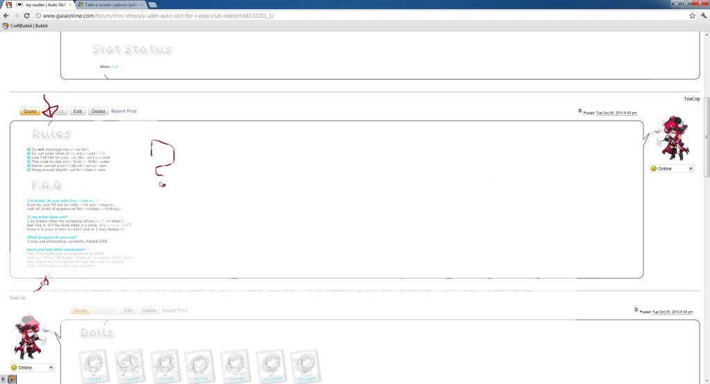
2. The bar at the top image looks HORRIBLE with another background image! One of two things could fix it, 1 contain the top image with a boarder of some sort to distinguish the middle more from the background image 2. Scrap the top image altogether (I would choose 2). The avi could just hover there, it would look far better.
3. The forum view looks silly, since the white is not contained by any boarder! I think that if you put a boarder around the white, then much like on the home page added that gray polka dot background around it it would make it feel much more self contained and look nicer.
Let me know what you think of my suggestions! c: Keep up the good work, and I hope to see this remain in development because with some fixes this would be how I choose to view the site all the time. Especially using a wide screen monitor! The forums look awful in widescreen:
1. The links at the bottom. It looks so awkwardly alone. It should span the whole bottom to fill in the blanks to the right of all the links - much like the links are in normal viewing mode, just made to span that little space in the middle.
2. The bar at the top image looks HORRIBLE with another background image! One of two things could fix it, 1 contain the top image with a boarder of some sort to distinguish the middle more from the background image 2. Scrap the top image altogether (I would choose 2). The avi could just hover there, it would look far better.
3. The forum view looks silly, since the white is not contained by any boarder! I think that if you put a boarder around the white, then much like on the home page added that gray polka dot background around it it would make it feel much more self contained and look nicer.
Let me know what you think of my suggestions! c: Keep up the good work, and I hope to see this remain in development because with some fixes this would be how I choose to view the site all the time. Especially using a wide screen monitor! The forums look awful in widescreen: