Welcome to Gaia! ::


Virtuous Saint

1,050 Points
  • Member 100
  • Gaian 50
  • Statustician 100
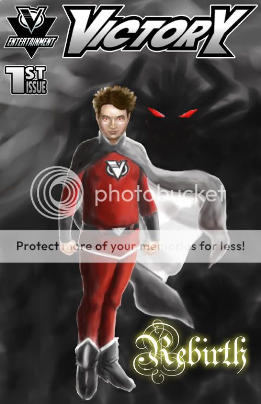
i don't know if i can do this but, what the heck! i have a webcomic called victory. i just finished issue 1 and i would like to show it to you guys. so let me know what you think.
User Image
Victory-Neo
i don't know if i can do this but, what the heck! i have a webcomic called victory. i just finished issue 1 and i would like to show it to you guys. so let me know what you think.
User Image


Not bad. Might wanna watch for typos though; for example, on page 17 Chris says "I couched" instead of "I coughed". xd

Virtuous Saint

1,050 Points
  • Member 100
  • Gaian 50
  • Statustician 100
Veritas Fate
Victory-Neo
i don't know if i can do this but, what the heck! i have a webcomic called victory. i just finished issue 1 and i would like to show it to you guys. so let me know what you think.
User Image


Not bad. Might wanna watch for typos though; for example, on page 17 Chris says "I couched" instead of "I coughed". xd


thanks. gotta remember that xp rofl
First impressions:

--Loud red background is loud. I'd suggest toning the color down; no need to blind readers before they get to the content.

--Why is the second page of each chapter completely blank? Put something there or have nothing at all. (In print books, sometimes there are blank or minimal content pages for various reasons, but in a webcomic it's pointless and inappropriate.)

--The name "Darkus." Err....comes off as being too hokey, as in "Hmm, what should I name my dark villain? How about Darkus?"

--The backstory is fairly standard and uninteresting. "Blah blah blah group of superheros trying to stop a dark, evil villain, blah blah blah magic sword as powerful as the group of mages, blah blah blah, harnessing energy, blah blah blah." Seen it before.

--Spell and grammar check. There are typos and grammatical errors everywhere, the most annoying being where you cut off a word at the end of a balloon and then continue it on the next line. Do what you need to do to make it fit properly (without letting it run into the sides), but don't cut a word off mid-letter. Also, have a friend proofread the things you might miss, like "it's" instead of "its."

--I like the segue into the museum bit. Just as I was starting to get bored with the derivative exposition, real people/story are introduced.

--The characters seem to have distinct voices and personalities. That's good. Until...

--VICTORY IS A BLOODY MARY SUE. How can one character have every epic power? He can fly, has super strength, breathes ******** fire, can HEAL PEOPLE, can't be harmed by any conventional weapon, and some s**t where he just magically knows when something bad is happening? All better than everyone else, of course. Why is it necessary for him to have just about every awesome power in the book to be useful? I don't care whose amazing energy he absorbed or inherited. It's unrealistic and feels like you were just trying to cram every awesome thing into your main hero.

Not to mention that the "danger sense" power doesn't make sense. Do you know how big a space a radius of 1000 miles is? Do you know how much "danger" takes place in a space that big? That kid would be dead from sensory overload. The mileage is ridiculous, wouldn't something like a 5-10 mile radius be sufficient?

He doesn't seem to be much more than a generic do-gooder, besides the fact that we are supposed to assume that under his friendly, compassionate facade lies a darkness he probably doesn't know how to control or reconcile with (trope trope trope!). The problem with Mary Sues is that they are a symptom of bad characterization. I've seen nothing that makes this character human, or interesting. His only function so far has been to be everyone's little hero, and piss off his colleagues who he's now replaced. What are his likes? His dislikes? His opinions of the world? His personality? What does he do all day besides Fighting Crimeâ„¢ and reading comics about crime fighting crime fighters?

I will say, though, that I appreciate he has a chubby face.

--The art is mostly alright, but you get pretty lazy with backgrounds (especially people who are far off in the distance). Don't rely too much on drawing shortcuts, because while they have their time and place, after awhile they really bring down the quality of the work.

--There is far too little crime in the city they live in. You make it seem like just the one guy (since Adonis walked out on it, right?) is taking care of the crime in the city, but do you have any idea how much crime actually takes place in a given day? Read the police blotter for any given city. Hell, read the police blotter for a small town of 4,000. There are loads more activities going on for police than you've got going on for your bored MC.

Alright, those are some of the thoughts I had while reading this. Overall, the source of tension where everyone is wondering when the villain's persona will pop out of him could be interesting. I'm guessing the plot will be something along the lines of "I am my/the world's greatest enemy, what nao?" While that subtext exists in every superhero story I've ever been exposed to (summed up with "with great power comes great responsibility," ergo, every superhero's dilemma), it could still turn out interesting if you develop it.

What I don't really care for is how much this story seems to be regurgitating a lot of cliches of the superhero universe, without caring to develop them further (so far). There's not a lot of material to go on here, so this is my first impression based on what I've seen. I'm not seeing a whole lot to distinguish this from other works that seek to emulate tenets of this well-trodden genre. What is this story bringing to the table that's different?

Virtuous Saint

1,050 Points
  • Member 100
  • Gaian 50
  • Statustician 100
Zeo
First impressions:

--Loud red background is loud. I'd suggest toning the color down; no need to blind readers before they get to the content.

--Why is the second page of each chapter completely blank? Put something there or have nothing at all. (In print books, sometimes there are blank or minimal content pages for various reasons, but in a webcomic it's pointless and inappropriate.)

--The name "Darkus." Err....comes off as being too hokey, as in "Hmm, what should I name my dark villain? How about Darkus?"

--The backstory is fairly standard and uninteresting. "Blah blah blah group of superheros trying to stop a dark, evil villain, blah blah blah magic sword as powerful as the group of mages, blah blah blah, harnessing energy, blah blah blah." Seen it before.

--Spell and grammar check. There are typos and grammatical errors everywhere, the most annoying being where you cut off a word at the end of a balloon and then continue it on the next line. Do what you need to do to make it fit properly (without letting it run into the sides), but don't cut a word off mid-letter. Also, have a friend proofread the things you might miss, like "it's" instead of "its."

--I like the segue into the museum bit. Just as I was starting to get bored with the derivative exposition, real people/story are introduced.

--The characters seem to have distinct voices and personalities. That's good. Until...

--VICTORY IS A BLOODY MARY SUE. How can one character have every epic power? He can fly, has super strength, breathes ******** fire, can HEAL PEOPLE, can't be harmed by any conventional weapon, and some s**t where he just magically knows when something bad is happening? All better than everyone else, of course. Why is it necessary for him to have just about every awesome power in the book to be useful? I don't care whose amazing energy he absorbed or inherited. It's unrealistic and feels like you were just trying to cram every awesome thing into your main hero.

Not to mention that the "danger sense" power doesn't make sense. Do you know how big a space a radius of 1000 miles is? Do you know how much "danger" takes place in a space that big? That kid would be dead from sensory overload. The mileage is ridiculous, wouldn't something like a 5-10 mile radius be sufficient?

He doesn't seem to be much more than a generic do-gooder, besides the fact that we are supposed to assume that under his friendly, compassionate facade lies a darkness he probably doesn't know how to control or reconcile with (trope trope trope!). The problem with Mary Sues is that they are a symptom of bad characterization. I've seen nothing that makes this character human, or interesting. His only function so far has been to be everyone's little hero, and piss off his colleagues who he's now replaced. What are his likes? His dislikes? His opinions of the world? His personality? What does he do all day besides Fighting Crimeâ„¢ and reading comics about crime fighting crime fighters?

I will say, though, that I appreciate he has a chubby face.

--The art is mostly alright, but you get pretty lazy with backgrounds (especially people who are far off in the distance). Don't rely too much on drawing shortcuts, because while they have their time and place, after awhile they really bring down the quality of the work.

--There is far too little crime in the city they live in. You make it seem like just the one guy (since Adonis walked out on it, right?) is taking care of the crime in the city, but do you have any idea how much crime actually takes place in a given day? Read the police blotter for any given city. Hell, read the police blotter for a small town of 4,000. There are loads more activities going on for police than you've got going on for your bored MC.

Alright, those are some of the thoughts I had while reading this. Overall, the source of tension where everyone is wondering when the villain's persona will pop out of him could be interesting. I'm guessing the plot will be something along the lines of "I am my/the world's greatest enemy, what nao?" While that subtext exists in every superhero story I've ever been exposed to (summed up with "with great power comes great responsibility," ergo, every superhero's dilemma), it could still turn out interesting if you develop it.

What I don't really care for is how much this story seems to be regurgitating a lot of cliches of the superhero universe, without caring to develop them further (so far). There's not a lot of material to go on here, so this is my first impression based on what I've seen. I'm not seeing a whole lot to distinguish this from other works that seek to emulate tenets of this well-trodden genre. What is this story bringing to the table that's different?


thank you very much for reading my comic and i just want you to know that this is just the thing i needed to help me with my comic. it's better than to hear "this comic sucks!" so again thank you and i'll take it all (seriously) under consideration. and hopefully you'll come back to victory sometime soon.
You're very welcome. biggrin

Virtuous Saint

1,050 Points
  • Member 100
  • Gaian 50
  • Statustician 100
no more critiques? cry
Thought I'd check back in to see how you were doing, and read back over the comic now that I have a bit of spare time. I noticed a couple more things now that I'm not in a hurry.

Overall your figures are well done, but I think you should work on anatomy and perspective a bit more. Those two aspects are definitely off in a few spots.

I think it's awesome that the main dude is not super buff Hotty McHotterson. That said, wow, he has a lot of superpowers...I think watching a battle against him would actually be pretty boring. Either that or I'd be rooting for the bad guy just because it'd be so hard to defeat this dude sweatdrop

Also, Chronos definitely resembles Santa Clause. A LOT. xd

On page 30, it's hard to follow what's going on at the very bottom of the page. It may be the way you have the panels set up, or the particular shots you chose, but it's sorta confusing

The kissing panel on page 31 looks a bit odd, like the perspective is off or something.

Red text on page 41 is painful.

All of this critique is for issue one, by the way. I just started part 2, so I guess I'll let you know what I think of it later. Hope this was helpful.

Virtuous Saint

1,050 Points
  • Member 100
  • Gaian 50
  • Statustician 100
very helpful. thank you. and trust me victory's battles are going to be very difficult in the future.

Virtuous Saint

1,050 Points
  • Member 100
  • Gaian 50
  • Statustician 100
bump

yeah i bumped, wanna fight about it?! blaugh rofl wink

Virtuous Saint

1,050 Points
  • Member 100
  • Gaian 50
  • Statustician 100
aaaaaaaaaannnnnnnnd i'm gonna bump again!
So...

1) This is more of a nitpick thing... but it drives me nuts when people draw planets that have more land than water, and the entire planet is still somehow green. On one of the pages, you mention that the sword transformed some desert in california, but it still irks me a little.

2) Page 3 reminds me a little bit too much of Zelda with the 7 distinct sages. (Although the Santa was entertaining.)

3) On page 10, the text bubbles seem a little chaotic to me. It's a little hard to follow the line of dialogue smoothly. Perhaps try working on the placement to make the flow smoother so the reader doesn't have to think about what bubble to read next... it should come naturally and without thought.

4) Page 19... make sure you break up the text a little. Even if it's the most fascinating couple of lines in the universe, when I see a lot of text in one area, my eyes glaze over and I usually just skip it. (Assume all your readers are as lazy as me... lol.)

5) The colors can tend to be a bit harsh sometimes. I would just try to tone down the colors a bit, but I did enjoy the light feeling of the comic.

6) The character designs were pimpin'. I especially like that you made the main character look physically "real"... and the star girl (I forget her name) had a great design too.

7) Exposition is a bit heavy, but beginnings can always be a bit harsh that way. Make sure to include more action.


Overall, I would definitely read more of this comic. It's got some good art to it, and definitely has potential! Good luck!

Virtuous Saint

1,050 Points
  • Member 100
  • Gaian 50
  • Statustician 100
zhiren
So...

1) This is more of a nitpick thing... but it drives me nuts when people draw planets that have more land than water, and the entire planet is still somehow green. On one of the pages, you mention that the sword transformed some desert in california, but it still irks me a little.

2) Page 3 reminds me a little bit too much of Zelda with the 7 distinct sages. (Although the Santa was entertaining.)

3) On page 10, the text bubbles seem a little chaotic to me. It's a little hard to follow the line of dialogue smoothly. Perhaps try working on the placement to make the flow smoother so the reader doesn't have to think about what bubble to read next... it should come naturally and without thought.

4) Page 19... make sure you break up the text a little. Even if it's the most fascinating couple of lines in the universe, when I see a lot of text in one area, my eyes glaze over and I usually just skip it. (Assume all your readers are as lazy as me... lol.)

5) The colors can tend to be a bit harsh sometimes. I would just try to tone down the colors a bit, but I did enjoy the light feeling of the comic.

6) The character designs were pimpin'. I especially like that you made the main character look physically "real"... and the star girl (I forget her name) had a great design too.

7) Exposition is a bit heavy, but beginnings can always be a bit harsh that way. Make sure to include more action.


Overall, I would definitely read more of this comic. It's got some good art to it, and definitely has potential! Good luck!


thank you very much for the positive yet fair critique. yeah, first issue was a bit rough. but hey. it
happens, and i'm glad you like it anyway. that means a lot to me.
Victory-Neo
bump

yeah i bumped, wanna fight about it?! blaugh rofl wink


Bumping is not allowed in this forum. Things tend to move very slowly here, so please only bump if your thread leaves the first page.

Quick Reply

Submit
Manage Your Items
Other Stuff
Get GCash
Offers
Get Items
More Items
Where Everyone Hangs Out
Other Community Areas
Virtual Spaces
Fun Stuff
Gaia's Games
Mini-Games
Play with GCash
Play with Platinum