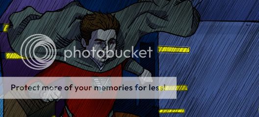
Something you can do to help with the stiffness of the drawings is like 10 min of gesture drawings before you start working on each page.
http://www.pixelovely.com/gesture/figuredrawing.php
http://www.lovecastle.org/draw/
I'm gonna try to give some advice I didn't see anyone else give.
- Some panels are kind of wordy. Sometimes it feels like, "I hope this character has time to take a breath in between all these words!" Try to say people's dialog in a single breath. If it's tough to do it or it feels like they would naturally breath in a certain place, maybe make a new panel.
The other problems I noticed are both color theory problems. It seems like you've got a decent natural ability for choosing colors, but there are some things you can do to improve.
- Lots of different hues. Narrow range of values and saturation. For example, almost all of the colors are either at full intensity or are almost gray. There's a lot of room in the middle! Also most of your colors are around the same value. Differences in value come only from shadow. But, sometimes something is just a darker value than the objects around it regardless of lighting. Of course the shaded areas on such objects will be even darker. Don't be afraid of contrast.
A good book about colors in general is "Color and Light" by James Gurney. It's focused on realistic painting, but what he says about color is applicable to any style.
If you don't have time or money for a book, here is a good tutorial:
http://purplekecleon.deviantart.com/art/How-I-See-Color-A-Tutorial-184642625
- No harmony between colors. A lot of the time you are ok with color harmony, but sometimes you just throw a color out there that clashes with everything else. Unfortunately it looks kind of bad. The solution here is to mix all of the colors you use out of the same 3 primary colors. You can also use tints and shades of the palette you create. This will prevent you from picking a color that ruins the image.
Here is a tutorial on how to mix a palette in Photoshop. In the beginning, she is talking about making a palette using a color wheel. If you want to skip ahead, she gets to mixing colors at around 5:45. The specific brush she is using for blending is (I believe) the smudge tool with scattering turned on.
http://www.youtube.com/watch?v=slm9uZQ4mqQ
Something that I like about your comic is that it is very diverse. Something I usually don't like about super hero comics is that everyone is the same weight, the same age, and the same race.
I hope this post was helpful for you.


 100
100