So...
1) This is more of a nitpick thing... but it drives me nuts when people draw planets that have more land than water, and the entire planet is still somehow green. On one of the pages, you mention that the sword transformed some desert in california, but it still irks me a little.
2) Page 3 reminds me a little bit too much of Zelda with the 7 distinct sages. (Although the Santa was entertaining.)
3) On page 10, the text bubbles seem a little chaotic to me. It's a little hard to follow the line of dialogue smoothly. Perhaps try working on the placement to make the flow smoother so the reader doesn't have to think about what bubble to read next... it should come naturally and without thought.
4) Page 19... make sure you break up the text a little. Even if it's the most fascinating couple of lines in the universe, when I see a lot of text in one area, my eyes glaze over and I usually just skip it. (Assume all your readers are as lazy as me... lol.)
5) The colors can tend to be a bit harsh sometimes. I would just try to tone down the colors a bit, but I did enjoy the light feeling of the comic.
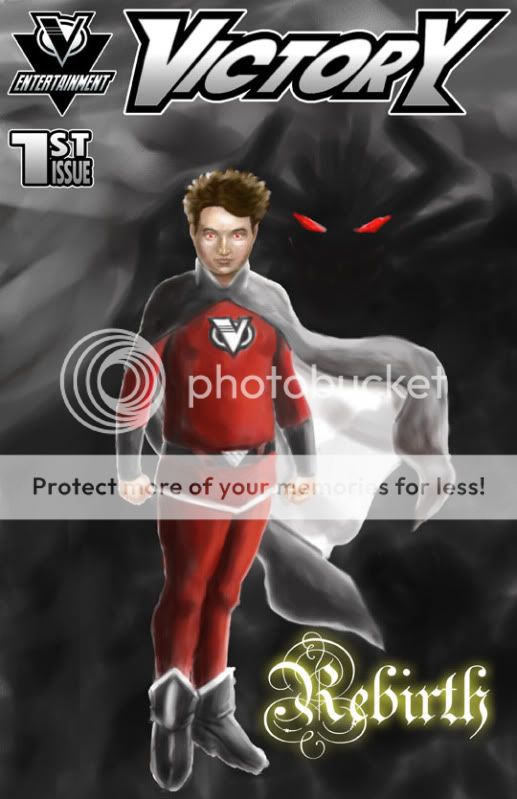
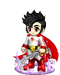
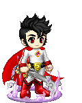
6) The character designs were pimpin'. I especially like that you made the main character look physically "real"... and the star girl (I forget her name) had a great design too.
7) Exposition is a bit heavy, but beginnings can always be a bit harsh that way. Make sure to include more action.
Overall, I would definitely read more of this comic. It's got some good art to it, and definitely has potential! Good luck!


 100
100
 50
50
 100
100