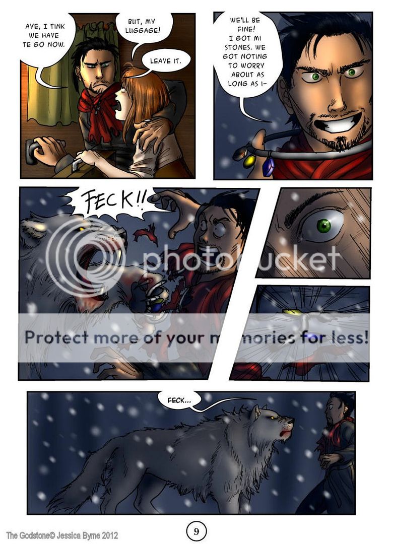
I'm not sure how I feel about it yet. It is too early to say. Your story seems ok, but it's kinda flimsy at certain points. Like with the snow lion and the god stones. Why didn't he just pick them up? The lion was dazed, and the stones were right there, it's not like he even had to go out of his way to get them. I am enjoying the characters and the interactions though.
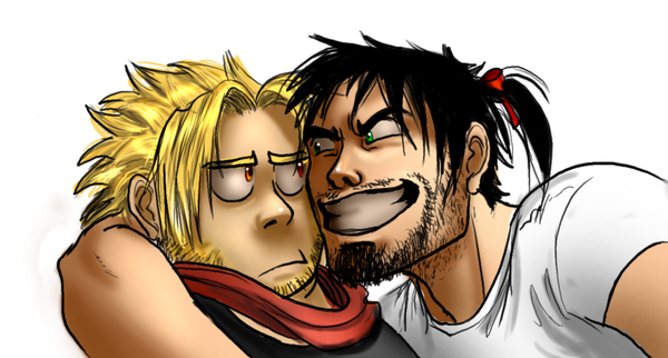
Artwise, your drawing's are solid, but you should pay more attention to linework/inking and coloring. I'm not sure which one's putting me off more. I think the colouring's really just going to take practice to get better. I feel like you're starting to get the hang of it in your latest page. Using textures does kind of clash with the feel of everything else. The inking is very very distracting though. It's easy to see where you got lazy. The lines are pretty wobbly, but that'll probably get better with practice. You should think about adding some (more) line weight and variance to break things up a bit.
You might also want to spend some more time with the lettering. Some bubbles doesn't have enough white space in them, and some have uncentered text.
Here's a decent lettering tutorial (though it is in photoshop). Also, your watermark is very distracting, especially since it's larger than the dialogue.
As for the design of your site, the layout is (more or less) fine, but the graphics and colour choices are very garish. The font is a bit hard to read, and the buttons on the bottom are obnoxiously large. I also think there are too many items in your menu up top, but that may just be me.