Welcome to Gaia! ::


Generous Fatcat

9,700 Points
  • Signature Look 250
  • Forum Dabbler 200
  • Person of Interest 200
soooo...this is my first time screen toning. i admit, i kinda suck at it. it's waaay more challenging than i thought. i was wondering if anyone wants to give a few pointers? extra bonus if anyone knows how to do screen tones in photoshop. i'm working in manga studio 4 debut right now and it kind of irritates me. or if anyone knows any tutorials they can shoot my way about manga studio, that'll be awesome.

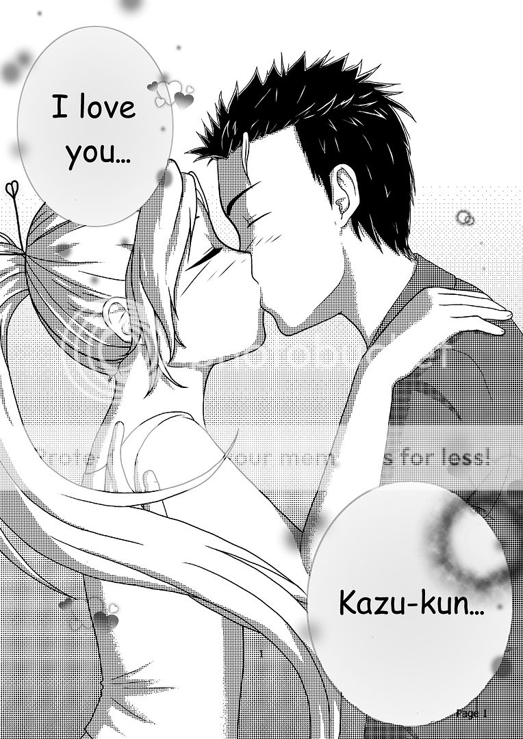
i made this to test not only screen tones in manga studio, but also to try out balloons and lettering.

User Image

i know the guy's hand is jacked up ><; i'll actually probably redo his entire arm later on...and i'm sorry for the page number. i tried to make it go away, but it wouldn't. ugh.

Fashionable Shopper

7,450 Points
  • Profitable 100
  • Money Never Sleeps 200
  • Forum Sophomore 300
Uh, what is that font you're using in the page? You should probably... not use it. Try Blambot for downloadable fonts. Many are free to use. And would be better suited for shojo and other manga style art.

Anyway, I pretty much despise Manga Studio, so if you've already got Photoshop, definitely practice with that. 3nodding I actually downloaded some free-to-use tones from deviantArt a while back and I apply them as brushes. I don't tone often these days, but it's super easy to use and to edit when you install them that way.
Lemme know if you have any questions on toning in PS, I'm currently looking through my tones folder to see what I have on hand. :v

Your drawing is very cute btw!

Generous Fatcat

9,700 Points
  • Signature Look 250
  • Forum Dabbler 200
  • Person of Interest 200
Sera Michaelis
Uh, what is that font you're using in the page? You should probably... not use it. Try Blambot for downloadable fonts. Many are free to use. And would be better suited for shojo and other manga style art.

Anyway, I pretty much despise Manga Studio, so if you've already got Photoshop, definitely practice with that. 3nodding I actually downloaded some free-to-use tones from deviantArt a while back and I apply them as brushes. I don't tone often these days, but it's super easy to use and to edit when you install them that way.
Lemme know if you have any questions on toning in PS, I'm currently looking through my tones folder to see what I have on hand. :v

Your drawing is very cute btw!


4laugh thanks! for the compliment and for the links!

and the font is comic sans...i thought it was a fairly common font for manga...so much to learn! T.T

i would LOVE some help in getting manga studio quality tones in photoshop. i actually have some tones already downloaded as patterns, but i can't seem to use them :/ photoshop can be complicated, but i'm much more familiar to the work space than manga studio. it also cooperates better with my tablet. i have CS 6 extended, so if you can maybe talk me through using these screen tones, i'll switch back over to photoshop in a heartbeat. ^^

Fashionable Shopper

7,450 Points
  • Profitable 100
  • Money Never Sleeps 200
  • Forum Sophomore 300
It's a pretty common misconception really, Comic Sans is actually not used in comics. It's just a silly font that's popular in kid's stuff. :u

The way I do tones is simple, though I suck at explaining in just words so I whipped something up and screencapped it. Here we go. I select the area I'm about to tone with the magic wand, then I apply the tone with a really large brush at 100% opacity. I often put the brush diameter to max if I'm using a big canvas, so I won't get any overlap. I add the tones on separate layers in case I want to change them later.

e: My way's not the only correct method btw. I'm self-taught and just do whatever seems most effective. There might be better methods too that I don't know about!

Generous Fatcat

9,700 Points
  • Signature Look 250
  • Forum Dabbler 200
  • Person of Interest 200
Sera Michaelis
It's a pretty common misconception really, Comic Sans is actually not used in comics. It's just a silly font that's popular in kid's stuff. :u

The way I do tones is simple, though I suck at explaining in just words so I whipped something up and screencapped it. Here we go. I select the area I'm about to tone with the magic wand, then I apply the tone with a really large brush at 100% opacity. I often put the brush diameter to max if I'm using a big canvas, so I won't get any overlap. I add the tones on separate layers in case I want to change them later.

e: My way's not the only correct method btw. I'm self-taught and just do whatever seems most effective. There might be better methods too that I don't know about!


XD ok i'll try it out and browse around for other tutorials too. thanks!

Hilarious Genius

3,350 Points
  • Gaian 50
  • Window Shopper 100
  • Forum Explorer 100
Hmm... What you have is imho not really a screentone-problem but an overall contrast problem. Screentone only really works well when it is used as an extra to polish up contrasts you already indicated with your ink work. Right now your screentone just fills up white space and as the dots you used are quite big, it looks chunky. I used Manga Studio 3 for toning in the past and it can be a nifty program when used right. Sure, you can do most of the stuff in Photoshop also but it has some functions that I personally prefered better. In the end it does not matter which program you use, just don´t use too much screentone. Try to mix different kinds of screentone (shape, brightness, texture) and please use more black/white contrasts in your inking. This is an advice that I got from an editor once:

Screentone works best and improves your drawing when the inking job alone looks so good that it does not need screentone! ^____^

Generous Fatcat

9,700 Points
  • Signature Look 250
  • Forum Dabbler 200
  • Person of Interest 200
Canary-sama
Hmm... What you have is imho not really a screentone-problem but an overall contrast problem. Screentone only really works well when it is used as an extra to polish up contrasts you already indicated with your ink work. Right now your screentone just fills up white space and as the dots you used are quite big, it looks chunky. I used Manga Studio 3 for toning in the past and it can be a nifty program when used right. Sure, you can do most of the stuff in Photoshop also but it has some functions that I personally prefered better. In the end it does not matter which program you use, just don´t use too much screentone. Try to mix different kinds of screentone (shape, brightness, texture) and please use more black/white contrasts in your inking. This is an advice that I got from an editor once:

Screentone works best and improves your drawing when the inking job alone looks so good that it does not need screentone! ^____^
do you have an inking tutorial that'll help me out? Or elaborate on what I should do to make it better. And I wasn't'tsure about the tones at all. Didn't INS anything to tell me how big the dots should be or how many lines would be good XD I'll learn.

Hilarious Genius

3,350 Points
  • Gaian 50
  • Window Shopper 100
  • Forum Explorer 100
I did a quick search and found some tutorials that I think are useful. For example this:

http://meisan.deviantart.com/art/contrast-digital-ink-tutorial-35973729

This sums up what I mean by "good picture even without screentone". I know, it is difficult in the beginning to be bold with black colour but have courage and try things out. smile Don´t fear using black. It not only looks good on hair but on clothes also. And shadows. And structure! wink

Here is a tutorial for Photoshop:
http://pandabaka.deviantart.com/art/How-to-basic-screentone-on-PTS-171673878

And here one for Manga Studio:
http://yuurei-onnanoko.deviantart.com/art/Screentone-Tutorial-Prt-1-186970131

Finally, here is a tutorial for digital screentone, contrasts and other stuff:
http://minyi.deviantart.com/art/Digital-Manga-Tutorial-134439901


If I were you I would really work on the inking first before trying to learn screentone. At the moment you use outlines of the same thickness with a lot of white and just a little black. Turn the game around! biggrin Imagine that you are sitting in front of a black canvas and you have to paint in white. Also I would advise you to try to use lines of different shape and thickness. Or even dots! And lots of structure and patterns! Like this:
http://www.artgraphica.net/free-art-lessons/pen-and-ink-tutorial.html
http://www.artinstructionblog.com/how-to-draw-leaves-on-a-tree-pen-drawing-tutorial
http://www.kunstkurs-online.de/Seiten/zeichnen-technik/tusche-zeichnen.php

Generous Fatcat

9,700 Points
  • Signature Look 250
  • Forum Dabbler 200
  • Person of Interest 200
Canary-sama
I did a quick search and found some tutorials that I think are useful. For example this:

http://meisan.deviantart.com/art/contrast-digital-ink-tutorial-35973729

This sums up what I mean by "good picture even without screentone". I know, it is difficult in the beginning to be bold with black colour but have courage and try things out. smile Don´t fear using black. It not only looks good on hair but on clothes also. And shadows. And structure! wink

Here is a tutorial for Photoshop:
http://pandabaka.deviantart.com/art/How-to-basic-screentone-on-PTS-171673878

And here one for Manga Studio:
http://yuurei-onnanoko.deviantart.com/art Www/Screentone-Tutorial-Prt-1-186970131

Finally, here is a tutorial for digital screentone, contrasts and other stuff:
http://minyi.deviantart.com/art/Digital-Manga-Tutorial-134439901


If I were you I would really work on the inking first before trying to learn screentone. At the moment you use outlines of the same thickness with a lot of white and just a little black. Turn the game around! biggrin Imagine that you are sitting in front of a black canvas and you have to paint in white. Also I would advise you to try to use lines of different shape and thickness. Or even dots! And lots of structure and patterns! Like this:
http://www.artgraphica.net/free-art-lessons/pen-and-ink-tutorial.html
http://www.artinstructionblog.com/how-to-draw-leaves-on-a-tree-pen-drawing-tutorial
http://www.kunstkurs-online.de/Seiten/zeichnen-technik/tusche-zeichnen.php


Thanks! I'll give it a shot. smile

Big Member

now, i'm not claiming to be an expert or anything, but why did you pick that criss-cross tone for the skin? in my opinion, the one used in the background might give it more of a manga feel, but again, that's just my opinion. otherwise, page looks great! 3nodding

Generous Fatcat

9,700 Points
  • Signature Look 250
  • Forum Dabbler 200
  • Person of Interest 200
spritzi
now, i'm not claiming to be an expert or anything, but why did you pick that criss-cross tone for the skin? in my opinion, the one used in the background might give it more of a manga feel, but again, that's just my opinion. otherwise, page looks great! 3nodding


actually, in manga studio, it's just a regular dot tone. i don't know why it came out like that when i saved it. it may be because the dots are too big or maybe too spaced out? i'm still trying to figure out how to use this program. deciding the proper spacing and dot width is the most challenging part...good thing i'm not starting any mangas till next year XD gives me time to try and figure out what i'm doing.
Really cute Picture 4laugh

I would use a differient font than Comic Sans MS I like to use "Anime Ace" or "LetterOMatic!"
when it comes to a good comic book font but then again to each their own heart

Generous Fatcat

9,700 Points
  • Signature Look 250
  • Forum Dabbler 200
  • Person of Interest 200
Redfox44
Really cute Picture 4laugh

I would use a differient font than Comic Sans MS I like to use "Anime Ace" or "LetterOMatic!"
when it comes to a good comic book font but then again to each their own heart


XD i'll check those out. i was actually going to start looking up fonts soon, so this helps! thanks! ^^
XMegantronX
Redfox44
Really cute Picture 4laugh

I would use a differient font than Comic Sans MS I like to use "Anime Ace" or "LetterOMatic!"
when it comes to a good comic book font but then again to each their own heart


XD i'll check those out. i was actually going to start looking up fonts soon, so this helps! thanks! ^^

I had the same problem going on with my manga people liked the story but the they all kept saying I should change the font XD I have to say when I look at it now It looks more pro and clean.

Generous Fatcat

9,700 Points
  • Signature Look 250
  • Forum Dabbler 200
  • Person of Interest 200
Redfox44
XMegantronX
Redfox44
Really cute Picture 4laugh

I would use a differient font than Comic Sans MS I like to use "Anime Ace" or "LetterOMatic!"
when it comes to a good comic book font but then again to each their own heart


XD i'll check those out. i was actually going to start looking up fonts soon, so this helps! thanks! ^^

I had the same problem going on with my manga people liked the story but the they all kept saying I should change the font XD I have to say when I look at it now It looks more pro and clean.


i see ^^ i'll play with a few to see which one fits best. thanks!

Quick Reply

Submit
Manage Your Items
Other Stuff
Get GCash
Offers
Get Items
More Items
Where Everyone Hangs Out
Other Community Areas
Virtual Spaces
Fun Stuff
Gaia's Games
Mini-Games
Play with GCash
Play with Platinum