moeotaku1
I agree with The Drunken Jester that it's not print-worthy art. It's still got that nooby feeling to it, but I would prefer to see this art than a lot of art that I've seen. XD Please do study anatomy though. What I do is go on DeviantArt and search for anything I need (in this case "Anatomy tutorial" ) and than Cntrl+click to make a new tab for each tutorial that sounds helpful. Then, I read them. Once I finish I take my newfound knowledge and test them out in my sketchbook.
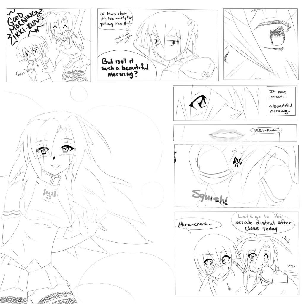
It looks to me like the art in the first two panel isn't as good as the other panels.
Also, try experimenting with varying thickness in the lineart to add depth and shadow. Lastly, put some tone in it, even if it's just a little gray. The page looks so...naked, especially because of your uniform line width.
Of course, this is just my opinion.
I had no doubt it wasn't print worthy, after all this is just a test . I've taken shading into consideration even if its not colorful, like you said it gives off that naked feeling. The first panels were test subjects in their own; Somewhat Chibi, sketching, and sudden surprise. But thanks for the tip for the anatomy tutorials. I'm not the best, but i'm making slow progress. thanks again.