Welcome to Gaia! ::


Dapper Dabbler

8,250 Points
  • Contributor 150
  • Signature Look 250
  • Full closet 200
I'm working on a 52-page comic that I'm gonna do in watercolor.

I'm having trouble deciding on a font. I don't think my handlettering would be consistent enough and I don't really like doing handlettering either. The closest my hand gets to nice writing is if I do calligraphy and I'm not sure if that reads very well. I'm kind of crummy with fonts and lettering in general.

Well, my previous watercolor comic, I used Chalkduster font, but my current comic is gay beauty and the beast and Chalkduster doesn't feel fairy tale-ish. I liked chalkduster because it had a slight grain-y-ness to it which I think works with the textured paper. I paint on cold press so there's always going to be texture. And I've hoarded too many pads of cold press during sales at Michaels to switch to smoother hot press right now.

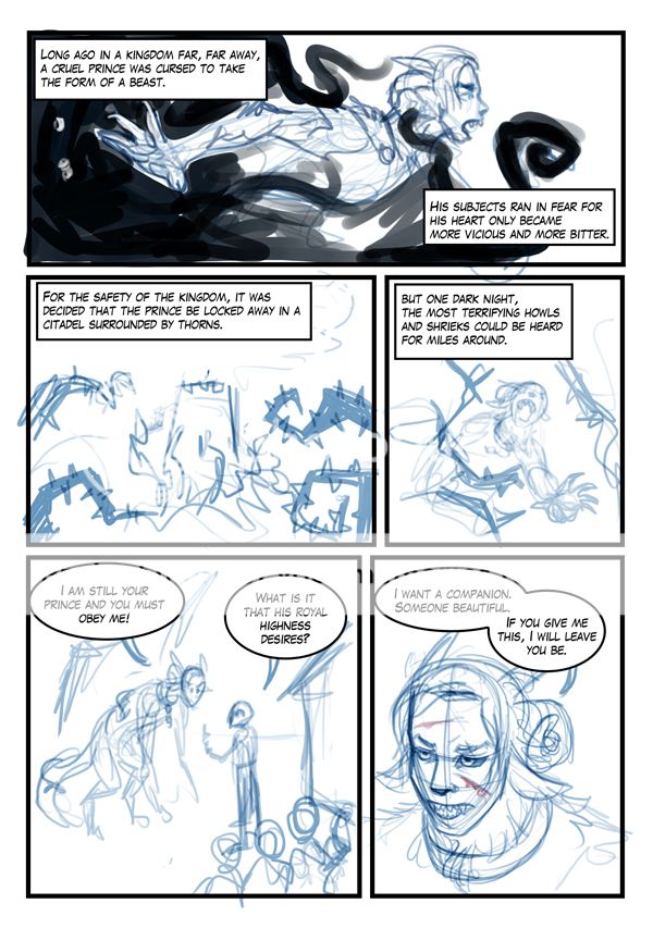
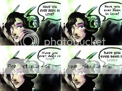
I currently have Lafayette Comic Pro while I thumbnailing, but I don't think it fits the mood at all?

User Image
((need to fix those two tangenting speech bubbles...))

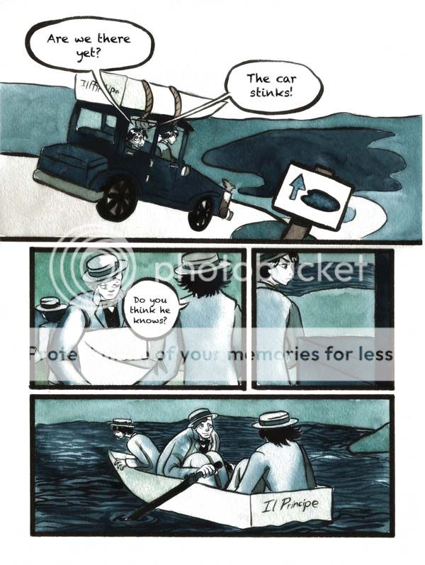
My previous comic for example of the watercolor look since I haven't started painting my new comic yet since I wanna thumbnail the whole thing first. ((holy christ this is old and everything looks bad........ oTL))
User Image

Newbie Noob

6,950 Points
  • Signature Look 250
  • Autobiographer 200
  • Streaker 200
try using anime ace... it's being used by some manga translators..

check it out here
most traditional cartoonists I know of hand-letter or at the very least lightbox a font. just dropping in text digitally stands out too much in a really weird way and doesn't really work in traditional mediums; its just weird to jump from seeing the artists hand to see the artists computer you know what i mean? even when a font is lightboxed you can still tell that it came from the artist's own hand.

Dapper Dabbler

8,250 Points
  • Contributor 150
  • Signature Look 250
  • Full closet 200
cocker spaniel puppy
most traditional cartoonists I know of hand-letter or at the very least lightbox a font. just dropping in text digitally stands out too much in a really weird way and doesn't really work in traditional mediums; its just weird to jump from seeing the artists hand to see the artists computer you know what i mean? even when a font is lightboxed you can still tell that it came from the artist's own hand.


I guess I could try tracing a font, at least it would pick up the paper texture.

Shadowy Phantom

Kaxen
cocker spaniel puppy
most traditional cartoonists I know of hand-letter or at the very least lightbox a font. just dropping in text digitally stands out too much in a really weird way and doesn't really work in traditional mediums; its just weird to jump from seeing the artists hand to see the artists computer you know what i mean? even when a font is lightboxed you can still tell that it came from the artist's own hand.


I guess I could try tracing a font, at least it would pick up the paper texture.

A paper texture can be applied to digital lettering to give it a "traditional look" that breaks up the smooth letter shapes, so I wouldn't consider that to be the major advantage of tracing a font.
The point of tracing is to introduce natural variation in the letters, something most fonts lack. Think of the font you're tracing is a guide to keep your text aligned and of consistent size and shape rather than the final thing, little more than the guidelines like you would draw for normal hand-lettering.

A well-made font for lettering comics will include contextual variants (for example, so that in "MILLING", the LL isn't made of identical Ls, and even the two Is might be different because they're so close to each other), but this is very rare, especially among free fonts. If you are so inclined, you could create a font of your own handlettering with this type of variation. It would be a time investment up front, but it might save you time later since you won't have to print lettering guides or worry about neatness.

Unbeatable Prophet

15,475 Points
  • Battle Hardened 150
  • Bookworm 100
  • Normal Everyday Human 50
handlettering is nice if you have the time. but i certainly don't. i've been picking up a few new fonts every year at comicraft's yearly new years' sale, when all the fonts at $20. godsend uses "holier than thou." i had another prior webcomic that i used cutthroat for (which is easily my favorite comics font). you're just going to have to test several against your art style. that first font you're showing really doesn't suit your style at all. the second font is much kinder, though i feel you could find better. i've also found some decent fonts at blambot.

Kyousouka
A well-made font for lettering comics will include contextual variants (for example, so that in "MILLING", the LL isn't made of identical Ls, and even the two Is might be different because they're so close to each other), but this is very rare, especially among free fonts. If you are so inclined, you could create a font of your own handlettering with this type of variation. It would be a time investment up front, but it might save you time later since you won't have to print lettering guides or worry about neatness.


this suggestion of contextual variants sounds ******** AMAZING. how do you do this?

Shadowy Phantom

megrar
Kyousouka
A well-made font for lettering comics will include contextual variants (for example, so that in "MILLING", the LL isn't made of identical Ls, and even the two Is might be different because they're so close to each other), but this is very rare, especially among free fonts. If you are so inclined, you could create a font of your own handlettering with this type of variation. It would be a time investment up front, but it might save you time later since you won't have to print lettering guides or worry about neatness.


this suggestion of contextual variants sounds ******** AMAZING. how do you do this?

Comicraft's fonts sometimes provide variants in the form of ligatures consisting of lower- and uppercase versions of each letter (if you haven't noticed them, you might have Ligatures turned off so check for that, but perhaps your specific fonts lack them entirely), and/or you can use the lower/upper case letters in a mixture by hand. That's not as good as real alternatives, especially for fonts that aren't all-caps. They also use the lamest possible way to do the serif-I (it's just a capital I), which means I can't have variants of its own.

OpenType supports better ways.

It has a contextual substitution feature (a couple of different versions of it for different situations). It can be very powerful and can handle a large number of variants. There are other ways to achieve variants (including some that are not context-based), but I haven't looked into them in detail. Contextual substitution does well enough for me and I'd rather spend my time drawing comics.
I use FontForge for my font work, it's free and supports every feature of OpenType.
If you just want to modify an existing font, you can do that; Fontforge can import most existing formats (although I think it can get a little weird with some poorly defined fonts).

Edit: I made a tutorial about one of the many ways to add letter variants to a font in FontForge. It's for double letters, which is the case in which digital perfection is most obvious. The other cases (like proximity variants) are similar, but done By Classes (since we need a short way to say "X followed by anything-but-X followed by X").
The description has links to the official tutorial, so I edited my post above to remove them.
Edit2: I also added a part 2, about proximity variants.

Dapper Dabbler

8,250 Points
  • Contributor 150
  • Signature Look 250
  • Full closet 200
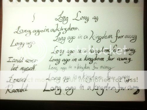
Still futzing with it... must actually start this damned comic at some point. sweatdrop

Starting to skew more towards handlettering.

Not sure what look I really want though.

My lettering is neatest when I use a calligraphy pen but I'm not sure if that is fast to read.

I also considered lettering with a brush because the comic is inked with a brush.

......I have no idea what I am doing...

User Image

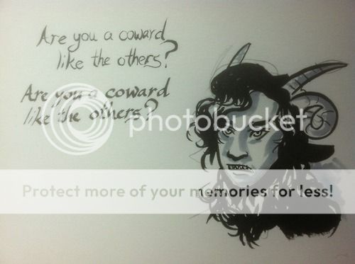
User Image

earlier futzing... I put in Comic Creators Talk instead of this thread.

User Image

Distinct Prophet

I remember reading that Spike uses the handwriting generator font but makes both upper and lower case be upper letters, so that if you do have a repeated letter, you can just hit shift and get that slight variation without going into an in-depth font program.

And I like example number 2 if you're typing it.

Feral Phantom

8,200 Points
  • Timid 100
  • Contributor 150
  • Super Tipsy 200
I think your hand lettering looks great and will probably be the most natural looking with your comic.

my biggest suggestion to you is to try and straighten them a bit more (I mean on the bottom as though you were writing on a line) n make sure all of the ups and downs and middles n all them wigi jims are consistant. natural inflections are fine, I just think if you pushed a little further with the consistency youd be right where youd need to be. so pretty much practice, but really, your hand lettering looks great!

make sure to post a link to your comic onces you start yes? ;3

Dapper Dabbler

8,250 Points
  • Contributor 150
  • Signature Look 250
  • Full closet 200
Static Sludge
I think your hand lettering looks great and will probably be the most natural looking with your comic.

my biggest suggestion to you is to try and straighten them a bit more (I mean on the bottom as though you were writing on a line) n make sure all of the ups and downs and middles n all them wigi jims are consistant. natural inflections are fine, I just think if you pushed a little further with the consistency youd be right where youd need to be. so pretty much practice, but really, your hand lettering looks great!

make sure to post a link to your comic onces you start yes? ;3


Yeah, trying to work up enough consistency.


I think I'm gonna letter with a brush since all the inking is with a brush. Takes a little longer, but I think it matches a little better. The calligraphy pens gets me kind of stiff.

I will post once I start... eventually? Probably in July or something.

Feral Phantom

8,200 Points
  • Timid 100
  • Contributor 150
  • Super Tipsy 200
Kaxen
Static Sludge
I think your hand lettering looks great and will probably be the most natural looking with your comic.

my biggest suggestion to you is to try and straighten them a bit more (I mean on the bottom as though you were writing on a line) n make sure all of the ups and downs and middles n all them wigi jims are consistant. natural inflections are fine, I just think if you pushed a little further with the consistency youd be right where youd need to be. so pretty much practice, but really, your hand lettering looks great!

make sure to post a link to your comic onces you start yes? ;3


Yeah, trying to work up enough consistency.


I think I'm gonna letter with a brush since all the inking is with a brush. Takes a little longer, but I think it matches a little better. The calligraphy pens gets me kind of stiff.

I will post once I start... eventually? Probably in July or something.


well boy-o I am curious xD ive seen the older posts before n was like wuzzat.

wow, brush you must have a very precise hand. I can only do big Chinese calligraphy with brushes , writing smaller I cant even... lol good luck!

Dapper Dabbler

8,250 Points
  • Contributor 150
  • Signature Look 250
  • Full closet 200
Static Sludge
wow, brush you must have a very precise hand. I can only do big Chinese calligraphy with brushes , writing smaller I cant even... lol good luck!


Well, I might take a short cut and letter larger and edit into the panels.

But the gung-ho part of me wants to do it straight on the comic panels all hardcore.

Because I can letter small if I want to... though I can't remember what size font I traced on my Machiavelli piece....

Well, I draw my comics on 11x14" paper... though I sometimes wanna go bigger, but then scanning gets really awful since I would need to scan it in more than two pieces unless I bust out for a large format scanner.

...though I sort of do want to get a nice scanner just for art because my HP All-in-one sucks at scanning so much.

....watercolor comics are expensive... but god I love watercolor so much and I'd rather do watercolor traditionally than spend time trying to make Photoshop mimic watercolor.

Feral Phantom

8,200 Points
  • Timid 100
  • Contributor 150
  • Super Tipsy 200
Kaxen
Static Sludge
wow, brush you must have a very precise hand. I can only do big Chinese calligraphy with brushes , writing smaller I cant even... lol good luck!


Well, I might take a short cut and letter larger and edit into the panels.

But the gung-ho part of me wants to do it straight on the comic panels all hardcore.

Because I can letter small if I want to... though I can't remember what size font I traced on my Machiavelli piece....

Well, I draw my comics on 11x14" paper... though I sometimes wanna go bigger, but then scanning gets really awful since I would need to scan it in more than two pieces unless I bust out for a large format scanner.

...though I sort of do want to get a nice scanner just for art because my HP All-in-one sucks at scanning so much.

....watercolor comics are expensive... but god I love watercolor so much and I'd rather do watercolor traditionally than spend time trying to make Photoshop mimic watercolor.


wait, holy smokes you hand lettered that onto that piece? mine would be a hand print cus like Id smear it all to hell XD I'ma go watch you on DA after this. its nice to see another water color enthusiast.
personally I love watercolor too, for me I prefer painting with it then adding it to comics (I have a couple stories that need to be painted but not the majority)
dude , keep painting, its not that digital painting can't be phenomenal, but I have mad respects for the traditional water color(or w.e medium)

'sides, lots of European comics use traditional paints ^^ looks beast too~

I draw on 11 x 17, but I know water color paper is more expensive then Bristol board. do you use smooth or rougher paper? I always liked the heavier textured.
mines an Epson wf-7510. works pretty well (still have to edit in PS just to darken inks mostly) I had a A3 scanner from I forget who, that broke on me in 3 months .-. this allinone I got was cheaper than that scanner too *sigh*

anywho im off to go watch y ou *notcreepyatallrightIknow*

Dapper Dabbler

8,250 Points
  • Contributor 150
  • Signature Look 250
  • Full closet 200
Static Sludge
I draw on 11 x 17, but I know water color paper is more expensive then Bristol board. do you use smooth or rougher paper? I always liked the heavier textured.
mines an Epson wf-7510. works pretty well (still have to edit in PS just to darken inks mostly) I had a A3 scanner from I forget who, that broke on me in 3 months .-. this allinone I got was cheaper than that scanner too *sigh*

anywho im off to go watch y ou *notcreepyatallrightIknow*


I use rougher paper. I'm more fond of cold press than hot press.

I usually just buy tons of paper pads whenever the art store has a 50% off or buy-one-get-one sale on watercolor paper in an attempt to cut costs, but if money was no object (or at least if I freaked out a little less) I would wanna do a whole comic in 300lb watercolor paper. But that would cost like... $200 for my 60-some page comic. burning_eyes I think I spent like $50 on my hiatused webcomic which is a trainwreck of terrible writing, but I think I learned something at least...

Quick Reply

Submit
Manage Your Items
Other Stuff
Get GCash
Offers
Get Items
More Items
Where Everyone Hangs Out
Other Community Areas
Virtual Spaces
Fun Stuff
Gaia's Games
Mini-Games
Play with GCash
Play with Platinum