I can't read the text so I can't comment on the story, but hopefully I can still give useful feedback on the art and panelling.
(FYI: Most image editing programs can raise the contrast on an image. I recommend doing that here, it would make the art here easier to see even though the source photo isn't good.)
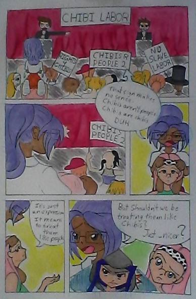
You have a variety of shots, which is great. You
seem to be aware of the panel size - importance correlation, but I can't tell since I can't read the text.
I'm not fond of the three-face panel at the bottom. If they're meant to be reacting to what the purple-haired girl says, then you should position your speech bubble differently, or move the reactions to a different panel. As it is now, it looks at first glance like the talking and the faces are happening at the same time, not as an action-reaction sequence.
If the "chibi labor" thing is your central plot conflict/idea, you did a great job of establishing it. It's a "cheap" way, but it works very effectively in this context. Assuming the last panel is reaction shots, then you've also done a good job establishing the characters' stances on the issue, which is impressive for a first page. Hopefully, the details of their opinions will be explored in the forthcoming pages.
I do not know what sort of comic this is meant to be, but I think for an opening page, this is rather boring. We have no sense of space and place here. Usually, when you have a "claustrophobic" opening like this, where you get right down to the characters and their issues instead of showing the setting, you need a strong personality or an exciting conflict to catch the reader's attention, but there's nothing like that here.
Of course, most readers will give long-form/narrative comics more than just one page to grab their attention, so you still have time.
Are there both chibis and non-chibis here? It
looks like the purple-ponytail girl is tall while everyone else is short, but I can't tell if that's intentional or not. If you're going to make a comic about chibis and non-chibis as distinct groups, then make them visually distinct through more than just height. Change the body proportions
and facial proportions.
And of course: obligatory "work on your anatomy." You're relying a lot on symbols for facial features and don't seem to have a good grasp on how they work, ditto for other parts of the body. If you put the work in to
understand how bodies work, you'll have an easier time drawing them, and using them to express your story.