Welcome to Gaia! ::


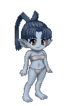
Hi, I did an original character for a possible manga project for my final art course piece. would anyone mind taking a look and see if she looks interesting enough? =)
[LINK]
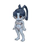
here's another one I'm requesting feedback from since I'll be getting a commission of him soon =) sine I need to know what colours to request (as well as any major design flaws) here's the link [LINK]

Unforgiving Duelist

It's not everyday you get to see a necromancer who ISN'T dressed in dark clothes, so I must say that your character design -from her looks to her outfit - is definitely a sight for sore eyes ! I'd like to see how the manga she's in works out.

Rainbow Pusher

She's pretty. But I can't say if she's interesting until I can actually see her IN her story's context. In these cases, I'd say if you think she's interesting, then she's interesting enough (not sure if you'd still want that same standard for a graded project though).

13,665 Points
  • Invisibility 100
  • Peoplewatcher 100
  • Conventioneer 300
I have to agree with Margravine, it is definitely neat to see a necromancer in light colors.

She has a nice design, though her leggings don't really say necromancer to me. They more so look like something a knight would wear. I mainly think it is the knees that is getting this feeling across.

It's a bit harder to give a full critique without knowing what the rest of the cast looks like. Just be sure to keep her silhouette very different from the rest of the cast, especially if she is the main character. It is very important to have each character's silhouette read well so that the reader never gets confused as to who is who. Also if there is a main supporting character with her, it might be nice to see you play with shapes to give the character a nice contrast with her. One example of what I mean is batman and robin. Batman is very tall, broad build, and just made of very bulking box-like shapes. Robin is short, slender, and made of thin rectangles.
thanks guys I'm taking everything people say into consideration
also I updated for a new character to hopefully appear in the same series. =)

Fashionable Ladykiller

11,550 Points
  • Money Never Sleeps 200
  • Signature Look 250
  • Popular Thread 100
They look like they're from two completely different time periods.

Benevolent Genius

13,900 Points
  • Grunny Harvester 150
  • Bunny Hoarder 150
  • Mark Twain 100
The difference in designs, like Carnation said, makes me curious about where, when, etc. this manga is set. That said, I like the right color scheme for the guy more.

Fashionable Ladykiller

11,550 Points
  • Money Never Sleeps 200
  • Signature Look 250
  • Popular Thread 100
Also came back to look at this just now and that boy's neck is about the same length as his forearms.

I do like his outfit but as I said earlier, I have no idea how these characters would even live in the same story with each other.

13,665 Points
  • Invisibility 100
  • Peoplewatcher 100
  • Conventioneer 300
Yeah. I agree with everyone else on the fact that these two don't look like they belong in the same story.

Also, which of the two styles are you going with? The more naturalistic as you used with the girl, or the more stylized as you used with the guy? When character designing you need to be sure that all the characters look like they belong together and are all drawn in the same style type.

I also agree with the comment on his neck. He does have a giraffe neck.

A personal issue I'm having is the two are roughly the same build. I know I had mentioned this before.

Another thing is his pants are competing for attention with his face. The dark patch of hair does help bring the eye to his face, but all the rendering on the pants makes it be the first thing I want to look at. This might also be an issue because you did rendering on them and the shoes, but not really anywhere else.
celestrialdarkmoon
Yeah. I agree with everyone else on the fact that these two don't look like they belong in the same story.

Also, which of the two styles are you going with? The more naturalistic as you used with the girl, or the more stylized as you used with the guy? When character designing you need to be sure that all the characters look like they belong together and are all drawn in the same style type.

I also agree with the comment on his neck. He does have a giraffe neck.

A personal issue I'm having is the two are roughly the same build. I know I had mentioned this before.

Another thing is his pants are competing for attention with his face. The dark patch of hair does help bring the eye to his face, but all the rendering on the pants makes it be the first thing I want to look at. This might also be an issue because you did rendering on them and the shoes, but not really anywhere else.
ah, I'll keep that in mind. I wanted to show how the pants were a different fabric but I had only been aiming for just the base colours for a commission. and yes the styles are different, I was going to redraw him for the commission but since I'd wanted to order that day and I'd had an almost-finished lineart of him I'd done about two years ago I just went with that XD
any suggestions on how I should draw attention away from the pants?

Friendly Heckler

How is her skirt staying on? The belt is cinched to the widest point of her hips - any motion or weight shift would cause it to fall. Unless the top edge is tucked into her armored pants?
And yeah, he seems to be from a completely different time period and culture than her.

Quick Reply

Submit
Manage Your Items
Other Stuff
Get GCash
Offers
Get Items
More Items
Where Everyone Hangs Out
Other Community Areas
Virtual Spaces
Fun Stuff
Gaia's Games
Mini-Games
Play with GCash
Play with Platinum