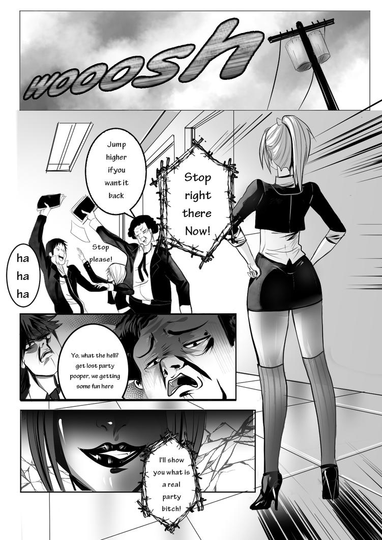
Panel 1:
This is outside, yet the panels below tell the reader that the characters are inside, which make me wonder why this panel shows the outside. If it is a lead out from the last scene that takes place before this, then that's okay. If not, then unless it will be tied in later, it doesn't seem like its really there for any reason.
The sound effect is huge. Because of its size, I want to think that the wind is strong. Is there a storm coming? As a writer and/or artist, be sure that the reader's questions are answered.
Panel 2: Honestly, a bit of a boring shot. While the perspective helps draw the eye towards the three figures, a good camera tilt would help make the shot far more interesting.
Also, I don't know where these characters are. I can see that they are inside, but inside what?
The speedline shadow under the full bodied girl is not following the perspective. It's giving a weird arcing effect to the floor.
Panel 3: Great faces.
But why is the word balloon cut by the panel border? Also, the balloon is so large around the words that it feels like the speaker is whispering. Also, who's talking? The balloon tail looks like it too is being cut off, and both guys mouths are open, so the reader may think that someone not shown is talking.
Panel 4: Nice shot. But be careful on the rendering. The gradient is flattening her face a bit. Also, be careful with the highlights. They look like she is made of plastic or metal, not flesh. (but if she is made of a reflective material, then its fine.)
Over-all:
Story and Pacing:
Not enough given to really critique it.
Character Design and Characterization:
Not enough given to really critique it.
Lettering:
First thing I noticed is lack of punctuation. Just because this is a comic does not mean that this needs to be forgotten.
Why does the lettering keep changing sizes? This looks really unprofessional (I get that its something you see in manga, however it is done like that because if you are reading English translations, they had to fit the correct translation in the balloons given.) This brings me to the next thing, if the comic's first language is English or any other horizontally read script, then the balloons in-turn need to be horizontal. Doing this will help with some of the lettering issues. (Again, I get that you're showing your manga influence, however, balloons in translated manga are vertical because Japanese is read vertically, and the translating company may not get a layered document to fix the balloons to hold the horizontal language better).
The spacing between the letters could stand to be spread a bit, and the spacing between lines could be brought together more.
Is there a reason that the letters are not in all capitals. It's not exactly a rule, but comics tend to be in all caps to help with the spacing between letters.
The girl's (I assume) word balloons are confusing. Why are they barbed? If there is a reason, be sure to establish that early so that the reader knows that they are word balloons and not thought balloons. (Possible reasons for a different balloon: She's speaking another language, she has an accent, she's using some sort of power to speak, etc. Whatever the reason, just be sure to let the reader know so they do not get confused.) Also if they are indeed word balloons, be sure that you incorporate a tail pointing towards her.
Figure work:
From what I see in this page, your figure work is quite nice. Main thing I see you should watch for is some times your arms become a little too noodlely, and disproportionately long (Mainly noticed on the small center figure in panel 2).
I hope this critique helps you. Just remember to explain everything to the reader so they do not have any questions or get confused. If you do something out of the comics norm, so long as it has reason and can be explained and supported, then its usually fine (But also find out why its not the norm If you're going to break the rules, know the rules). Good luck to you.


 200
200
 200
200
 250
250