Welcome to Gaia! ::


Demonic Phantom

So i recently just finish this picture and I don't know which version I like

User Image
User Image

Demonic Phantom

Witty Humorist

12,500 Points
  • Popular Thread 100
  • Forum Junior 100
  • Champion 300
First one has more depth, I vote first! 3nodding

Demonic Phantom

Orange Dweeb
First one has more depth, I vote first! 3nodding

Yah I kinda like the first one too

Wheezing Gekko

5,050 Points
  • Peoplewatcher 100
  • Risky Lifestyle 100
  • Conversationalist 100
First, but both of them are terrible.

It's not showing enough of the body to tell me if your anatomy should be improved massivly, but from what I can see it looks quite good.
Practice your shadows and your composition. It won't hurt you at all to practice folds and colouring either. Look up tutorials on the net, they help.

Good luck.

Winner

I think both are fine.
I prefer the first one though because the second seems to cover up most details and it doesn't look like as much effort was put into it than it really was.

Timid Dabbler

5,750 Points
  • Money Never Sleeps 200
  • Forum Sophomore 300
  • Signature Look 250
both. because the second one looks like the kill screen for the first. xd

Genius

Zagachan
First, but both of them are terrible.

It's not showing enough of the body to tell me if your anatomy should be improved massively, but from what I can see it looks quite good.
Practice your shadows and your composition. It won't hurt you at all to practice folds and coloring either. Look up tutorials on the net, they help.

Good luck.


You are quite too harsh. The drawing is far from terrible. Shading and coloring really depends on your own personal style. As far as I can tell, the drawing was probably done with markers and/or pencils and then scanned. Scanner might change the shades as well. Moving on to the composition, I, myself, would only move the window slightly to the right side. Other than that, I think it's put up quite well.
First, but this seems a bit to dark for me. But if I had to pick it would definitely be first.
Tho I think it would come out better if you used a tablet rather then hand drawn. -^.^-

Aged Hunter

First one. The second one looks like you threw a filter or something over it while the first one at least looks like you took the time to consider the colors.

Demonic Phantom

Zagachan
First, but both of them are terrible.

It's not showing enough of the body to tell me if your anatomy should be improved massivly, but from what I can see it looks quite good.
Practice your shadows and your composition. It won't hurt you at all to practice folds and colouring either. Look up tutorials on the net, they help.

Good luck.

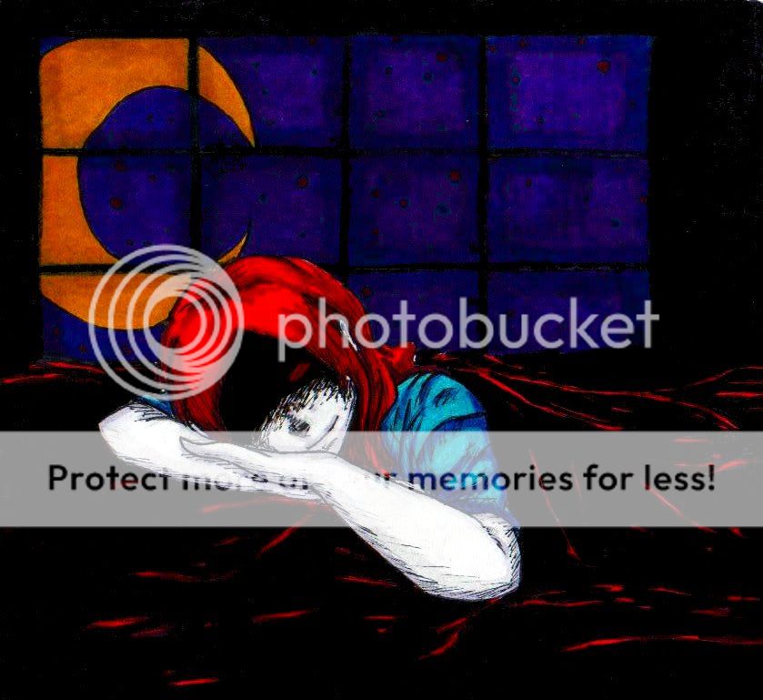
Dear Zagachan the coloring in this picture shouldn't be taken seriously. I was testing some of my copic markers. As well as the picture its was done out of fun not out of any seriousness. The original picture is done a lot differently and doesn't have much relation to this picture. (that one is the one you should critic not this one.) Also this done by hand then i scanned it. I tried to get the original colors back but as you can tell I couldn't. A Lot of the shading is gone. There is no way I can fix it.

This also is my cartoonish style, folds and everything else is warped and again is not to be taken seriously. Your critic would be greatly appreciated on some of my other pictures but this one is one that didn't really need it.

thank you for understanding!

Demonic Phantom

chortlexu
First one. The second one looks like you threw a filter or something over it while the first one at least looks like you took the time to consider the colors.


LOL that's exactly what i did! XD
The first one is the original! (though i didn't really take time to consider the colors XP )

But i do like the first one as well. I was just planning on using a small piece of the second picture as my icon on other sites.

I was just wondering which one everyone liked more

Demonic Phantom

LucysSiren
First, but this seems a bit to dark for me. But if I had to pick it would definitely be first.
Tho I think it would come out better if you used a tablet rather then hand drawn. -^.^-


Ah the original picture will be done digitally. This was just a fun little piece.
I also like the first ver. too

Demonic Phantom

OneFriendOnline
Zagachan
First, but both of them are terrible.

It's not showing enough of the body to tell me if your anatomy should be improved massively, but from what I can see it looks quite good.
Practice your shadows and your composition. It won't hurt you at all to practice folds and coloring either. Look up tutorials on the net, they help.

Good luck.


You are quite too harsh. The drawing is far from terrible. Shading and coloring really depends on your own personal style. As far as I can tell, the drawing was probably done with markers and/or pencils and then scanned. Scanner might change the shades as well. Moving on to the composition, I, myself, would only move the window slightly to the right side. Other than that, I think it's put up quite well.


Thank you ^^

The original picture of this was a whole lot bigger so the window would be somewhat more balanced. (Honestly, I just didn't really feel like editing any of the picture. XD )

And yes the picture is done with copic markers and permanent markers, then scanner and edited with gimp. ( which i really don't know how to use.)

Demonic Phantom

Madam_SexFlush
both. because the second one looks like the kill screen for the first. xd


LOL
that was kinda my intention.

Quick Reply

Submit
Manage Your Items
Other Stuff
Get GCash
Offers
Get Items
More Items
Where Everyone Hangs Out
Other Community Areas
Virtual Spaces
Fun Stuff
Gaia's Games
Mini-Games
Play with GCash
Play with Platinum