Nakuya-chan
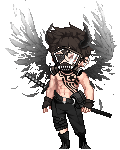
To be honest I'm kind of not sure if the character is male or female. The anatomy reads kind of as both (the chest area is undefined but the hips are kind of ladylike? though the clothes suggest there's a corset of some sort so that could explain that.) but the posing definitely reads as female.
Your line work is pretty awesome, not much you really need to worry about there, maybe a little more consideration to line weighting would help push you along some. Otherwise keep it up in that department.
Angle or not the feet ARE a bit too small, and the hand are inconsistent in their sizing.
My biggest beef with this is the posing, it's very stiff and doesn't add a lot of life to the character. The whole knock kneed and pigeon toed look is a really cliched pose and makes for a weak looking character. if you're going for that "cutsie ditz" look its fine but if you want your character to read as someone with strength it is not the way to go. To be honest whenever I see poses like that all I can think of is the character needs to go to the loo. And the posing here doesn't really give me any idea as to what is going on.
The clothes design is great however, I quite enjoy the detail added. Something though I would consider looking out for is the legs. Legs are for all intents and purposes cylindrical in their shapes, so fishnets and other grid like designs on clothes should have a slight curve to them to suggest that.
Thanks for the reply and advice~
It's actually a girl, but flat-chested
dramallama I'm not sure how to imply that, other than not drawing breasts
razz
To be honest, I know the pose is kinda boring, but I was really only focused on the clothes this time around! I'm still working on drawing poses
wink


 100
100
 100
100
 100
100