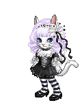
The only thing I can really think of is that the eyes need more depth. Generally if there isn't a whole lot going on in a drawing the viewer is drawn to the eyes of the subject. I'm assuming that it's meant to be cartoon esque then there may not be much more you can do to it. You have to think about where this image will be placed. If it's on T shirts, how big or small will it need to be printed? For example, if you put in a bunch of detail it will definitely have to be bigger so that nothing is lost/distorted.
The thigh gap is really uncomfortable to look at- that's not how legs connect to the pelvis. It's too unrealistic, even for a chibi, ad because it has the shading at the crotch and it's in the center of the image, it's the main focus for me.
As for the rest of it, the pose is very static and the knees are missing. Anatomy is important, even when you're stylizing the piece. The oversized head is fine because of the style, but I would choose a less straight-on pose if you want to promote finess and movement in your work. The weight doesn't look like it actually weighs anything from the way she's holding it, and while I understand that she's not going to be jump-roping and lifting at the same time, it strikes me as odd that she would have both of them at the same height given their vastly different weights.
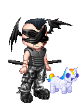
Good start, and best of luck with your company!
Thank you for your critique. We know that she needs more work. We aren't the best artists. lol
The thigh gap is really uncomfortable to look at- that's not how legs connect to the pelvis. It's too unrealistic, even for a chibi, ad because it has the shading at the crotch and it's in the center of the image, it's the main focus for me.
As for the rest of it, the pose is very static and the knees are missing. Anatomy is important, even when you're stylizing the piece. The oversized head is fine because of the style, but I would choose a less straight-on pose if you want to promote finess and movement in your work. The weight doesn't look like it actually weighs anything from the way she's holding it, and while I understand that she's not going to be jump-roping and lifting at the same time, it strikes me as odd that she would have both of them at the same height given their vastly different weights.
Good start, and best of luck with your company!
I totally agree with this,
especially the thigh gap. What I have to add to this is the way the legs are bulging with the spandex is not how legs work with spandex (i wear a lot of spandex for cheerleading) Spandex squishes everything in and pushes the fat/skin/loose muscle up over the top and down, so if you are going to have a bulge the one you have isn't natural. And the shading needs to be drastically changed in that are, the way it is to me it looks like she peed.
Flashstick has the best reply to me. Go you flashstick great advice I was also gonna say what you said smile
Also is this a raster image?
Otherwise. I personally hate that graphic. I'd be embarrassed if that was an image used for my business. It screams unprofessional and childish. Especially with that jump rope though. It's in tangent with the type and I also at first glance I thought the jump rope was a whip :/
A logo is what people see first and it gives immediate impressions. If I would see this, I'd run for my life even though I like anime and cosplay. I agree with getting a professional to do the art.
But I like the font :3
I'd go with a much simpler and more refined image. Maybe a silhouette of the character's head [like tokyo pop!] or body holding a barbell or kettlebell?
If you plan on keeping her image make her a mascot for promotional items like posters, flyers, t-shirts and etc.
Thank you for all your advice and opinions. We've decided to go with a silhouette or outline of her so it would be better for screen printing. I will upload the new artwork for her when we finish it so I can ask for you guys again. Thanks.