Welcome to Gaia! ::


I'm essentially editing these first two posts to include everything I've done so far and to show what I still would like critiques on.

All constructive criticism welcome. I need help with anatomy/coloring/basic art theories/essentially everything. I'm open to (and encouraging) all of it.

(I tip all constructive critiques!)
These first pictures... I'm now embarrassed that I ever posted them in the first place... But I suppose it serves to show how much progress I've made... so they'll stay... for now.

Avi Art Contest Entry - Apologize for the watermark. Too lazy to remove it at the moment.
Secondary Entry WIP
Chibi Gaia Halloween
Couple Avi Art


Now for the better stuff:
Kitten & Butterfly
Stuffed Dog
Finally, a person
Landscape - kinda
Hand/Foot study
Archer
Abstract 1
Abstract 2 - these abstracts could be a little odd when you look at them without any context... if it helps, I was listening to this while drawing both of them.
The best advice I think I can give you is to watch the weight of your lines and shadows. Your drawings can become more "alive" if you relate the drawing to real life in subtle, harmonious ways. For example your first link, Avi Art Contest Entry, the weight of your outline does not change throughout the entire figure. Should the representation of shadow be a thick, unchanging black line? What represents form? Especially on the pale face, instead of using black to outline everything, think of the colors of a shadow. There could be multiple tones, and colors to represent highlights, as well. If I were to edit that drawing, the first thing I'd do is go for the facial features, cleaning up and reshaping the thick black lines that are used to represent the nose, mouth, and eyes. I would perhaps use mostly a color that we would see in real life when there's a shadow beside our nose, etc. Think of depth and contrast, even if you're not using solid black to outline, you will not lose depth and contrast if you use both shadows AND tints of the color. Shadow means adding varying amounts of black to a color, and tint means adding white. Learning how to add reflections of light to your drawing where they're needed will help your drawing come to life, also. Using black to outline isn't "wrong" necessarily it's just something that doesn't look so nice when it's not done with finesse and some careful planning. Line weight.
magboots
Line weight.

Wow, thank you!

I've never heard that before, but it makes a lot of sense. I'll definitely have to play with that in the future. Thanks for the advice. Anything else you have to add would be extremely appreciated.

Don't feel like you're overdoing it by pointing everything out and giving all the advice you have to offer. I'm a new born child when it comes to art.
sora4ever
magboots
Line weight.

Wow, thank you!

I've never heard that before, but it makes a lot of sense. I'll definitely have to play with that in the future. Thanks for the advice. Anything else you have to add would be extremely appreciated.

Don't feel like you're overdoing it by pointing everything out and giving all the advice you have to offer. I'm a new born child when it comes to art.


I'm glad you like my advice, I feel douchey giving advice but I didn't want to be some a** wagon just saying, "that's wrong...and that is wrong...blah blah" I hope it made sense.
I can see you have talent and I wanted to share what I learned in my art classes. yum_puddi
magboots
I'm glad you like my advice, I feel douchey giving advice but I didn't want to be some a** wagon just saying, "that's wrong...and that is wrong...blah blah" I hope it made sense.
I can see you have talent and I wanted to share what I learned in my art classes. yum_puddi


No no, don't feel douchey! And you definitely weren't an a** wagon! Haha.

No, you did exactly right. It helps SO much when someone not only points out what looks weird, but gives tips on WHAT to DO to make it better. It definitely made sense, and I appreciate the compliment.

But honestly, I hope you won't hold back on constructive criticism because you feel bad about saying it. You'd be helping me by pointing out all the ways I could make it better. cool
I'll gladly be what magboots considers an a** wagon for you.

Your anatomy is totally off. Draw from life. Stop drawing anime. Put the chibi on pause. Step away from that side of yourself; resist the urge. Draw people that you see. The way you see them. Don't represent the eye with a fake eye, try drawing a real eye; use photo references or use a live model (a friend can help immensely). Then lips, noses, arms, chests, abdomens, legs, etcetera. You've much to work on and I do hope that you work hard, or you'll not get better any time soon.

Look up a fellow named Andrew Loomis; he's a few good books that will definitely help you with your anatomy.

Once you can draw the human figure without stylization, -then- draw anime. You can exaggerate the body only when you know how far the exaggeration will go before breaking.
Erik Stalson
I'll gladly be what magboots considers an a** wagon for you.
Draw from life.
Look up a fellow named Andrew Loomis; he's a few good books that will definitely help you with your anatomy.
Once you can draw the human figure without stylization, -then- draw anime. You can exaggerate the body only when you know how far the exaggeration will go before breaking.


I don't consider this to be a**-wagonish at all, either.
Thank you for your tips, and I've known I needed to work on anatomy, I've just never really known how to effectively do that other than to keep drawing and seeing what works/what doesn't.

I'll definitely look at doing some real life drawings soon. Would you mind if I quoted you when I post them as to get your opinion?
erik already told you the basic mistakes you do

whether you stick to manga-style or real ..whatever ...I think everyone has their own opinion on this...I started with manga too and than my style became more and more natural

BUT that's not an excuse for anatomical -mistakes!!

if you want to stick with manga than here some tips:
find a mangaka who is GOOD or even a GOD ( I refere to mangakas like oh great, obata aka tenjo tenge, air gear, death note etc etc. ) (NOT oda aka one piece who's anatomy is TOTALY off )
try to copy them and while copying, try to UNDERSTAND why he/she draws it this way and not different. if you don't get it, try to do the pose yourself in front of a mirror
for faces: find a mangaka who's faces you like and copy them as well...also try different emotions but only when you get the face PROPORTIONS

when you go for realistic humans (which is a lot harder because you easily get sidetracked by details like muscles, shadows and so on ) use books, internet or other references
also go for fast sketches, and set time limits like 5 minutes
this way you won't get sidetracked too easily because you don't have the time for details

tip: start with the basic structure of the human body (like a manikin ) draw a circle wherever the human body has an ariculation
than go for the outlines, this way you prevent basic mistakes or it's easier to correct them


I tried to show you with a few pictures I took while overdrawing your wip

but first: try to use easier positions first...sorry to say that but you can't use foreshortenings because you don't understand dimensions yet
you figures also lack dynamic, they look too stiff
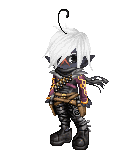
here's your version:
User Image
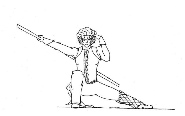
FIRST THING I DID is, to draw the basic anatomy, I already corrected a few mistakes you did and added a bit dynamic....
as you can see this position is unnormal...try this position yourself and you see it's pretty hard to keep your balance (I didn't try it but i'm sure you'd fall over lol )

User Image

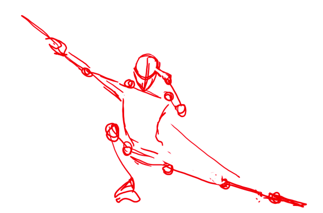
SECOND I drew the outlines and corrected the unreal position your character is in:
I shortened the leg and let him bow a little bit, also added dynamic

User Image

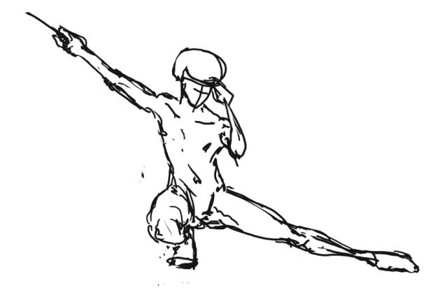
looks a lot better, doesn't it??
it doesn't give the impression that it's completely wrong ( yeah I know I still did mistakes but it was just a fast 2 minute correction to show you the basics lol )


well I hope that helps a little bit, good luck with it ^^
sorry for my bad english lol, I'm not a native speaker and way too lazy to read it once more lol
Berath
erik already told you the basic mistakes you do

well I hope that helps a little bit, good luck with it ^^
sorry for my bad english lol, I'm not a native speaker and way too lazy to read it once more lol


This does help - it's easier to practice the right thing when you can see what that is next to the wrong. However, it would help me out if you'd be a little more specific in the mistakes I made. I can obviously compare your picture to mine and see some obvious differences, but if you could point me in the right direction with... "That leg couldn't possibly twist that way" or "you put his thumb on the wrong side of his hand" so that I can pinpoint areas where I got it wrong, that'd be extremely helpful.
Here's two examples of my more realistic style of art. 2 still lifes. Click for larger images.

User Image
I'm aware that his right front leg is off in a big way. Other comments?

User Image
Why the hell are people disliking my thread?

If you have constructive criticism then let's hear it. I can assure you I want to know what you think.

If you're just looking to trash people's work, then GTFO and find something productive to do with your life, a*****e. You don't get a free b***h pass just because you're on the internet. Grow up.

Quick Reply

Submit
Manage Your Items
Other Stuff
Get GCash
Offers
Get Items
More Items
Where Everyone Hangs Out
Other Community Areas
Virtual Spaces
Fun Stuff
Gaia's Games
Mini-Games
Play with GCash
Play with Platinum