1st, 2nd, 4th one:
- lines are delicate. need more weight. try thicker line where there is depth/weight.
all of them:
- great start on anatomical knowledge, need more practice. try quick figure studies before sitting down to start a project.
here is great tool for practice. also!! flip your image as you work on it - great benefit of working digital. in photoshop, you can select "flip layer horizontally", in SAI, you can press "H" on your keyboard. helps point out anatomy wonkiness.
- colors - study more! too "pure". i.e., you're using a pure green, or a pure black, and nothing really quite looks like that IRL. your palettes arent UNIFIED try more subtle. BUTTT! colors are hard. so it's ok, just practice more.
here is a unified how-to, and a
color tutorial 1, and a
color tutorial 2.
2nd one:
- too similar value, (value = darkness or lightness, black --& white, that thing). if you made this image only grayscale, you would see it's mostly dark!! so that means not enough contrast, and not enough range.
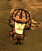
3rd one:
- very strong! lines this time are ALL too heavy - not enough variance, not enough subtlety. also!! using pure black can be too much. thsi is the case here. the background trees are great!! the grass though - not varied enough. it looks too uniform. natural things arent uniform.
great work! keep drawing! i know nothing about pricing, sorry.
3nodding