ikeikepantsu
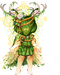
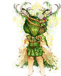
A bit art nouveau, no?
I dig it. The hair leaves are bit put-offish though?
Unless he was intended to have leaves for hair?
I really dig the colours in the smoke and the contrasts between the greens and oranges.
Did you use a vector program to make this?
From what I can see in the lines, they look like the paths got a bit jumbled.
I mean, they're not smooth.
For your style ( which is neat btw ) I would like to see smoother lines and perhaps gradated colours rather than chunky shading.
Keep up the good work imo.
thanks!!!
yeah, i was going for a art nouveau feel!! n n im glad you picked up on that.
and no, it wasnt intended for him to have leaves for hair. when i look at it, yeah, it does look a little off. probably because it's the most detailed thing in the picture (???? idk).
and i didnt use any vectors, but i did use paint tool sai and i think i put the stabilizer to S-1. my hand can get shaky so i can prolly do more line drawing exercises or whatever. and i'll try experimenting with gradated colors, too.