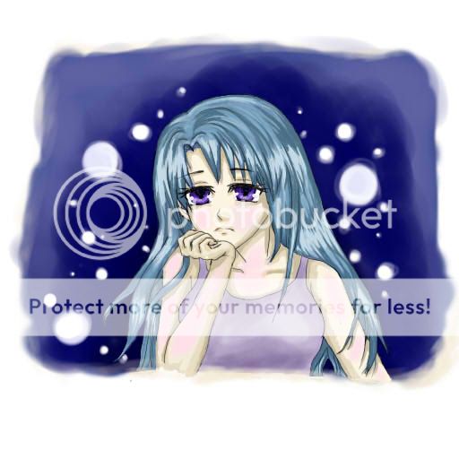
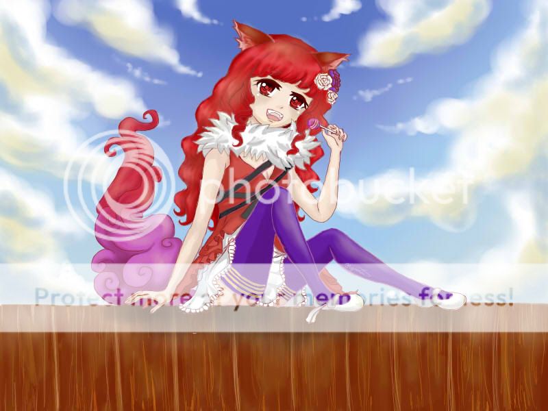
I think you have the same issue I did when I started colouring digitally. When selecting your darker shades you look like you're selecting colours by just selecting the same colour but closer to black. While doing that can work for some pictures(it works quite well for your first one
smile ) it can make pictures with a lighter mood appear dull, lifeless and dreary. Also when selecting the skin tone I prefer to lean away from yellow based tones and lean to more orangey and red tones(again awkward for me to explain) as it makes them that more human and lively but it will depend on the mood you're trying to express.
One other thing I'll add for shading is not sticking to one line on your colour selection box(ie going from your basecolour and going from there). I'm not sure how to describe the next bit properly so I'll use an example. Just say your base colour is orange- don't just use a darker/lighter orange for your shading try getting another orange with more red or yellow and then adjust how light/dark it is.
May I ask what program you use because, different program, different tools to be simple about it.
Basing the next opinion from the program I use I'd say that the smudge tool is your friend? I might suggest that you try using a brush with a lower opacity/hardness which can make your shading that much smoother without as much effort
biggrin (If it's lighter towards the edge it can make blending the next lighter or darker shade a lot easier)
One final note is making some of your shadows a bit narrower.
Ulitimately you will need to find a colouring style you like and are happy with and over time you will find your own little tricks to get the desired affect.
I'm sorry I'm such a rambler and that this book is at least understandable
smile